With the announcement of Google’s Mobile Update coming on April 21st, there’s been a strong movement in the last few months to make our sites “mobile-friendly“. And no surprise, when Google says sites don’t have a good mobile experience are going to get a traffic hit, it gets people moving.
However, I think the sudden announcement is going to lead to a bigger issue—lots of really bad mobile experiences. And worse, some people will make their sites “mobile-friendly” around a test based on HTML structure, not on humans—without any real consideration for what their actual users want.
A Case Study in Real Mobile-Friendliness
To give you a real life example of this in action, let’s turn to the NBA. I’m a big fan of the Golden State Warriors, who just clinched home-court in the NBA playoffs. Before that happened, I would almost daily check the NBA standings to see where they stood—and mostly on my phone.
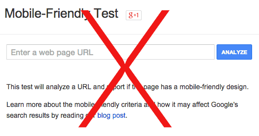
ESPN doesn’t have a “mobile-friendly” version of their page (at least according to Google)—but in reality, it’s a great mobile experience (at least for a stats geek like me).
This is a snapshot of the bottom half of the rankings page. It has lots of valuable data on a wide line, and because Golden State was below the fold, I’m able to pinch and zoom to my specific team and interest in quick fashion, and if I want, get a glimpse at all the data—even if at a small font size.
If this data had a defined mobile viewport, ESPN would be forced to remove some data to make it work, such as win streak, point differential and etc.
The second option for ESPN would be to display all the data on multiple lines, which would make interpreting the difference between teams more difficult. For that reason, this version of the page—which is technically not “mobile-friendly” according to Google—is actually quite so.
If we compare this to a page that’s actually “mobile-friendly” as defined by Google, CBS Sports, we see the problem that exists. On this version, you have to click the dropdown to get to the Western Conference, and there are very few stats available for the inquisitive basketball geek. To add to the problem, CBS Sports shows us an annoying popup on first click.
Worse still, CBS Sports actually dumbed down this page just for mobile, removing all of the same stats that exist on their normal page that ESPN also displays. Creating a mobile page shouldn’t mean reducing the utility of the page that existed previously, or it’s very possible the net value of your page will actually be lower than the non-mobile page—such as is the case here with ESPN having a better experience, at least in my opinion.
As you can see, it’s possible to optimize every page to look good on a phone. But it’s very possible that doing that will actually make the overall user experience worse. Therefore, “mobile-friendly” isn’t easy to fit in a pre-defined box.
Thinking Beyond “Mobile-Friendly”
This brings up a general problem with the way people are thinking about mobile-friendliness. “Mobile-friendly” is not a rich-snippet in a Google search result. Mobile-friendly is a statement about user experience.
Those who think about “Mobile-friendly” as a snippet in the Google search result will long-term experience a feeling of hurt—because that can’t possibly be the optimal way to be thinking about a phone-friendly experience.
In general, if Google is building this algorithm right, they aren’t going to reshuffle the search results to put those who are technically mobile-friendly according to their tool first, and then everyone else second. They’re going to put the sites with the best mobile-friendly experience according to user engagement signals first, and then the rest after that.
If the algorithm is formulated based on who gets the green check marks on their tool, they’ve built a crappy algorithm. It’s possible they’ll do that, but I hope unlikely.
In my opinion, the way this algorithm should look is an iteration of Panda specifically for mobile devices—a sub segmentation of Google traffic to look at things like time on site, search history and pogo sticking to the search results when using a tablet or mobile phone specifically to determine when a page is truly a good result.
What Does This Mean For Your Site?
The problem I see for many sites out there is that many of them will expedite out mobile versions without real consideration for the actual quality of that experience. It’s easy to make a blog post a good mobile experience, but when your search query has unique needs and your page has unique features beyond text, it gets a lot, lot more complicated.
As an SEO, I would take a look at your bounce rate from mobile/tablet and compare it to desktop. Prioritize pages with a differential towards the negative.
For pages with mobile bounce rate and engagement that’s even or even better on mobile/tablet even though there’s no responsive experience, consider not even updating—or if you do update, be deliberate in the consideration of how this change will actually improve user experience—and not arbitrarily make the page “mobile-friendly”.
My fear is that many people will make their pages “mobile-friendly” and actually tank their engagement with poor experiences—something that’s actually the opposite of what Google intended, and will likely cause long term issues for them that many will have trouble identifying.
A truly good mobile-focused search algorithm will actually rank sites by the quality of their mobile experience, not their ability to get some green check marks on a mobile-friendly test. If Google hasn’t figured that out, they soon will. And I hope you figure it out before they do.
Post Update: By some stroke of luck (or the looming mobile update), ESPN updated their standings page today to be responsive. While it doesn’t necessarily allow comparison between statistics (or to view everything at once), overall it does feel like a more elegant experience when viewing on the phone. Turns out that it is possible to create an equatable mobile experience without sacrificing some of the content you created.


