When you look at websites ranking page one, there’s likely a few similarities between them. The UI and UX is well thought through, links are SEO-optimized, and every bit of real estate serves a purpose. It’s what we think of as a digital work of art.
Video Transcription
Editor’s Note: SEOs are often suspicious of “link drops” in blog posts. None of the sites in this post are our clients and all of the links are nofollowed and will stay that way to retain integrity.
Hey everyone. I’m Ross Hudgens, founder of Siege Media. Today I want to talk to you about the importance of thinking of your website as an SEO work of art. Now, this might sound a little fluffy, a few of you might troll me, but the idea here is really every single pixel on your website should be thought through and really deeply considered.
I think even more so from a linking perspective, because the funneling of that internal link equity is so important, and also just the overall economics of that site in performance from a site speed and user experience perspective, it matters. There’s clear delineations when you look at high performing and high-value verticals of the people who are winning and the people who are not. There are basically “Picassos” ranking very high.
There is stuff that you would hang up in a Paris museum in the digital equivalent ranking high when you uncover that they’ve thought through ever single detail. This might sound strange on the surface, but if you look at your own website, anyone who thinks this is off, you’re probably guilty of not considering it in this fashion.
NerdWallet
So, the first vertical we’ll look at is life insurance, and NerdWallet ranking number one. What is great about NerdWallet is everything is thought through. They’ve very clearly thought through the UX of their site nav, every link looks great. It’s optimized but it’s not over-optimized. They’re also pushing the SEO pages throughout their nav in a way that makes sense still for their users.
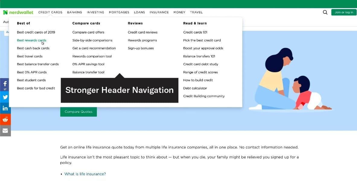
They link out mostly internally, but not externally very often. They’re keeping you on page and only link out to a few authorities. The footer is focused. You can tell every link there has been considered deeply. If a link is going there and is funneling equity away from best checking accounts, it better be a valuable link that is building towards long-term brand equity, or is otherwise being a important part of a real business and how it operates.
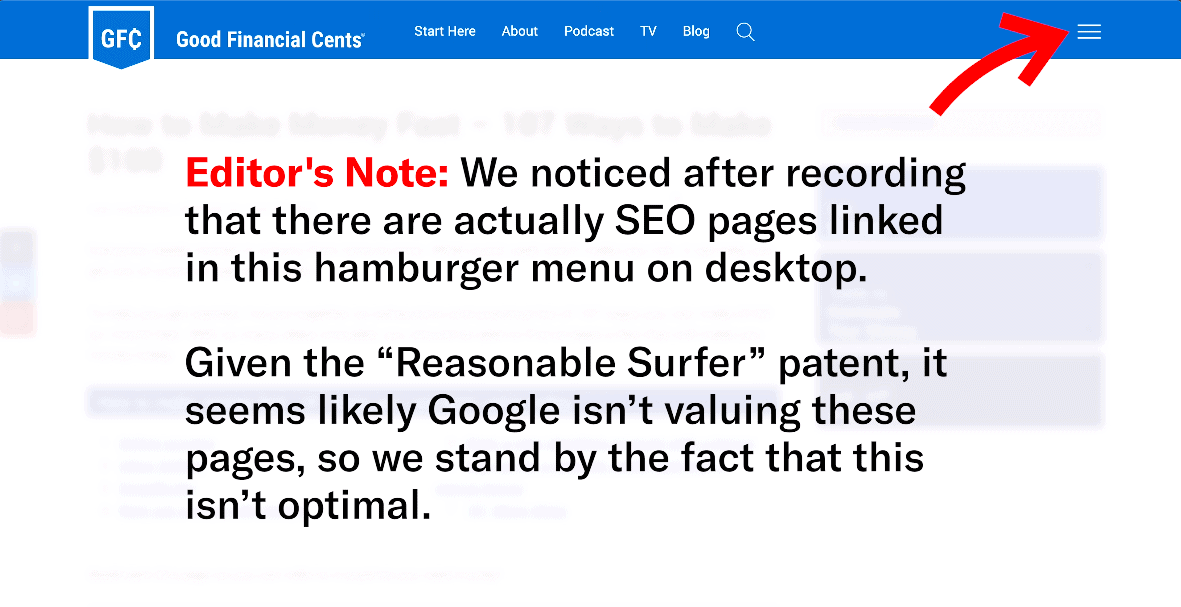
Good Financial Cents
If you look at a comparison site, Good Financial Cents, not art. It’s not as good-looking. The nav is not pointing to any SEO pages in this situation. Just back to the main site. That’s a waste of equity.
There’s also a poor user experience in terms of helping people find other elements. If you scroll down, you can see these people are a lot more giving in terms of links.
They’re linking out with frequency, it’s messy and there’s not as much internal linking. This is not a good page. It’s not a Picasso by any means. Even if you go to the footer, there’s a similar issue.
They do this related linking thing that also doesn’t look great. The sidebar, the share buttons are not custom to that business, it’s not luxury-feeling. The footer links aren’t pushing the SEO pages.
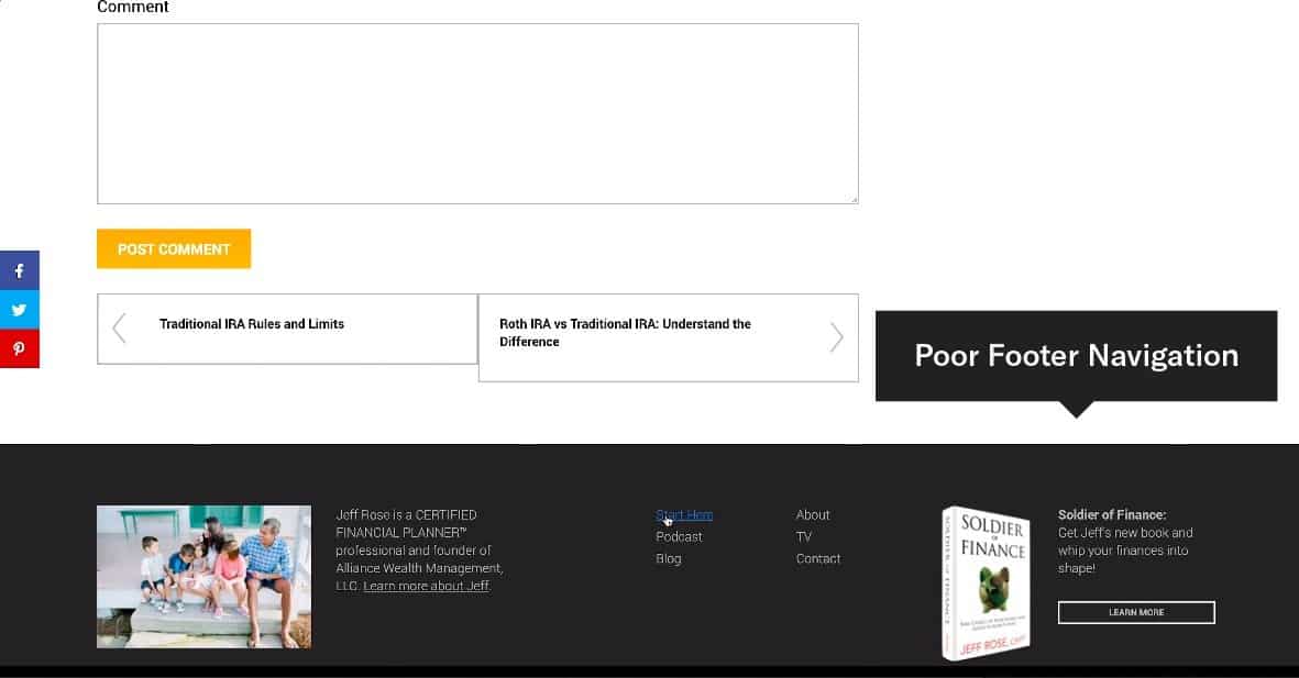
They basically decided, “Hey, let’s push all of our equity to these other sites, and actually not harness any of it ourselves through internal linking.” That’s not a smart way of using and thinking about every pixel and thing they link out to on their site.
Progressive
Another space business insurance, Progressive, has a lot more focus. They’ve thought clearly about SEO pages, they’re optimized but not too optimized. It’s clean, it’s great for both users and search engines, and this site performs well because of that.
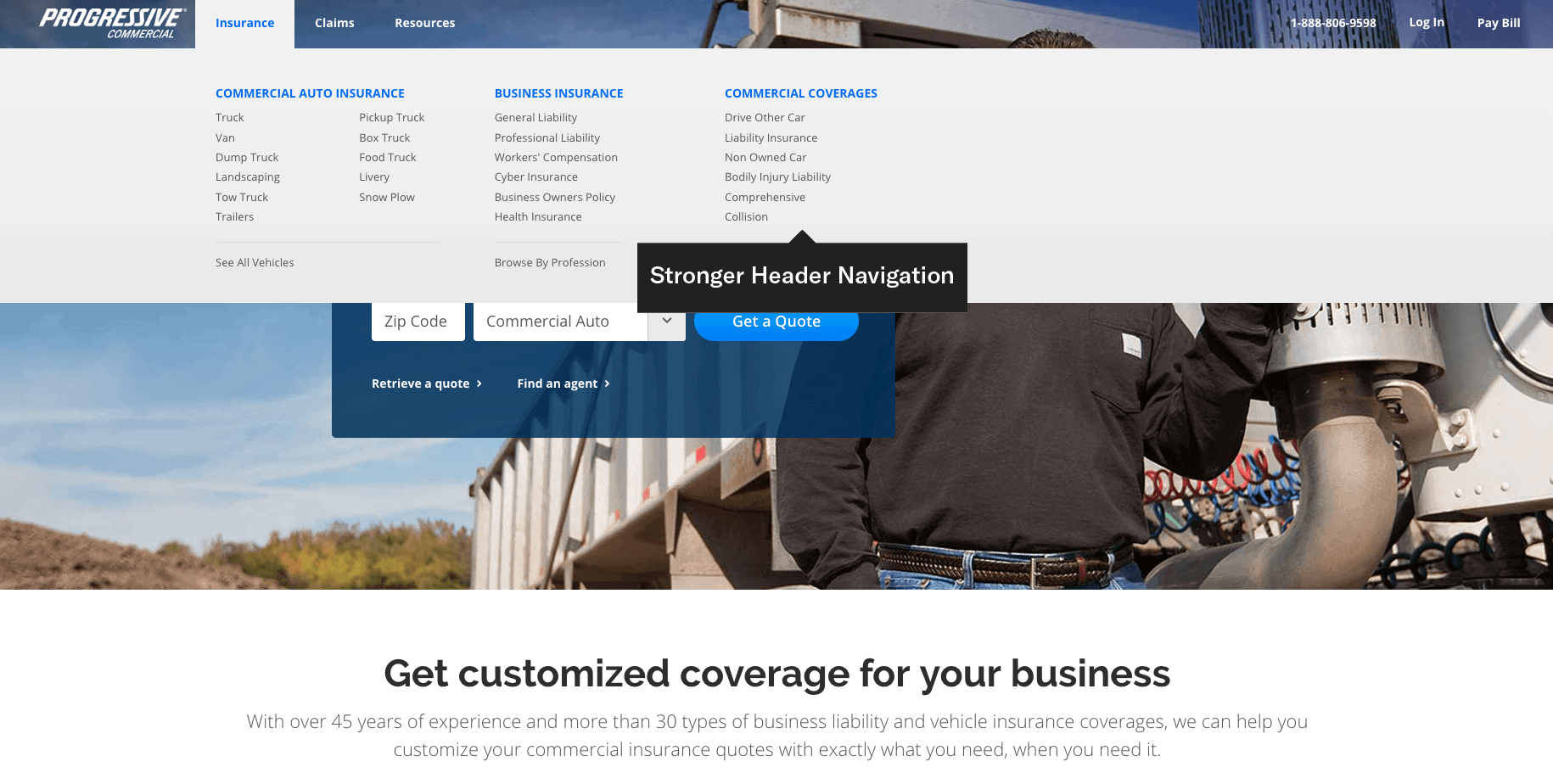
It’s beautifully designed, they’re pushing out very rarely, but they’re doing so to other relevant pages that they own. They’re occasionally linking out, but it’s still focused. On the footer, every page is clearly thought through in terms of what they have there. They do have an Investor section because they are a public company. They have contact info, but they also link out to other important SEO pages.
They also are smart about it, you can see how it’s gray on a gray background, which likely gives them the equity, and people who want to find it can find it, but also draws the eye to that quote in the top right-hand section. That is Picasso worthy, that’s Banksy worthy in this situation because of that.
EInsurance
Look at competitor, EInsurance. I apologize if I offend this company, if they see this video. The site is not good above the fold. The nav links are optimized, but not good for users. They’re spammy feeling. Every keyword is exact. The text is not easy to read on the background, and the site is using a lot of stock photos.
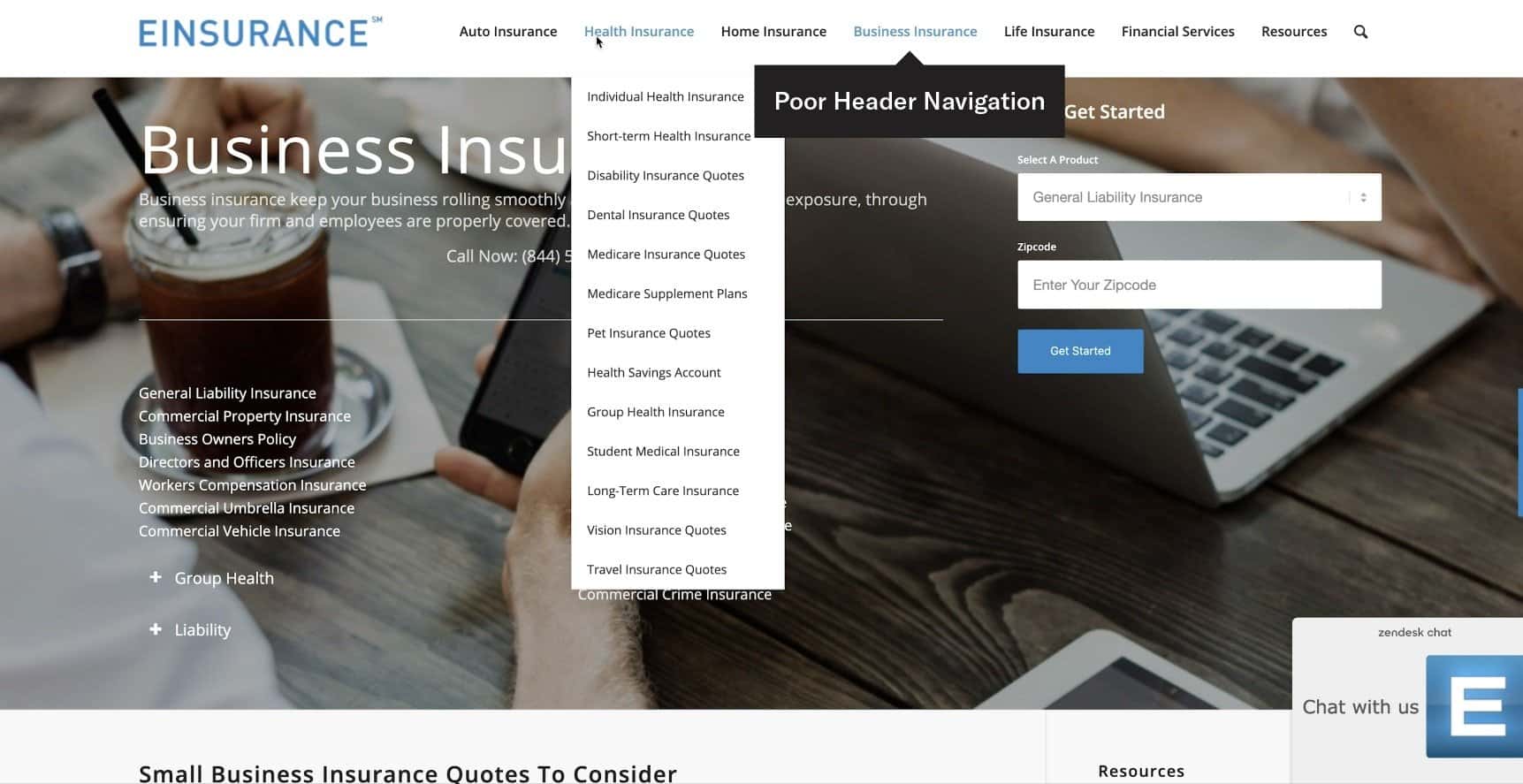
They’re over-optimizing internal linking. This is the kind of thing that is a very common practice when SEOs think, “Oh, we need to basically get that exact keyword in there in order to rank.” But, they don’t realize those subtle nuances of those changes compounded over time, actually become the reasons they don’t rank.
Even if they help you rank in the moment, these things add up and become a site like EInsurance that does not rank at all. This was found on the desolate regions of Page 2 or 3 of the search results, which might as well not exist. And you can see in their footer, it’s not as thought through. They do link out to a few things but by no means, something worthy of inspiration. You can see the difference in performance for these two sites.
American Family Insurance
We look at another one, American Family Insurance. Their main site is not anything special. It’s not focused, and if you actually get to the footer, this is a clear situation where you know that they haven’t thought through every element.
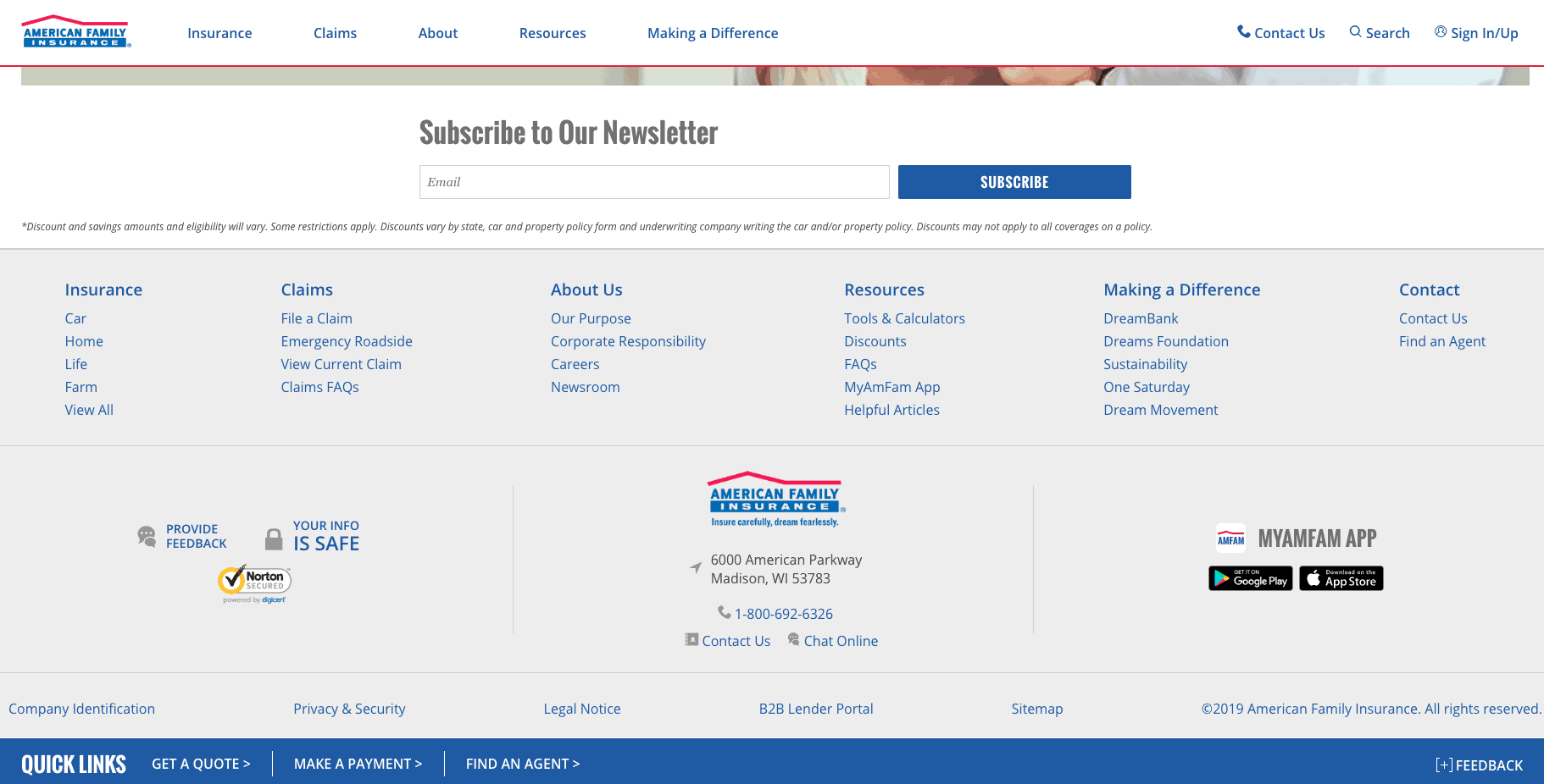
They’re linking to things that likely do nothing for them. I don’t know who’s going to download an app from them. Does anyone care about American Family Insurance Pinterest page? I sure don’t. I’m sure no one else does either. Instagram, no one’s going to follow them. YouTube, maybe.
But, those links are going places that could instead gone to more important pages internally. We see the same thing with some of these other pages, like MyAmFam app, even though it’s already linked in the bottom right, these are repetitive links that don’t add value. Contact information is fine, but there’s this Making a Difference. What do these things mean to the random person?
No one likely knows what One Saturday means. That is wasted effort and internal linking equity, that also distracts from conversion. It’s not just SEO. These are things that we saw comparatively from Progressive, they had the nice Get a Quote section on there.
This page, I would bet every single dollar I’ve got that this converts better than that other page and is the reason why you don’t find it on Page 1. Progressive is ranking number one for business insurance because of the focus and the pixel-by-pixel thought process they have had.
So, if you’re not operating with that pixel-by-pixel thought process, you maybe should start considering it. We need to think of this page as a work of art and consider every single thing we do in order to create the compounding effect to rank like Progressive, to rank like NerdWallet, and that’s why they rank as well as they do.
So, hopefully, this will help you build towards that museum in Paris as your website. Thanks for watching.