The sidebar is an important piece of real estate because it sits right next to your content. It can distract, attract or get completely ignored by your readers.
When it comes to setting up a blog, publishers naturally focus on how the posts will look: will the photos be large or small, should we highlight the author’s name to build authority, how big is too big for a pull quote. These are all important design choices, but what about the sidebar?
In the sidebar debate there has been research both for and against. I’m usually pro-sidebar, but recognize that the decision is as unique as your website. If you decide to incorporate a sidebar, keep these dos and don’ts in mind.
- Don’t let your sidebar be an afterthought.
- Don’t add widgets just to fill space.
- Do add smart CTAs.
- Do use a designer or developer to customize your content.
Two Sidebar Must-Haves
Sidebars don’t have to include everything and the kitchen sink, so take some time to evaluate the most important elements. Our top two recommendations are the following:
1. Utilize a Call to Action
Tell users what you want and make it easy for them to do it. Want more sales? Highlight related products. Want more email subscribers? Promote your eBook or newsletter. Keep it clean, keep it classy.

This minimalist CTA on CarRentals.com gets straight to the point. The orange button pops without being too slick.
Even better, make the calls to action appear custom to your website. According to the Nielsen Norman Group, if it looks like an ad, users are more likely to ignore it. Instead of just saying “Sign up for our newsletter” use branded tone and voice that fits your audience.
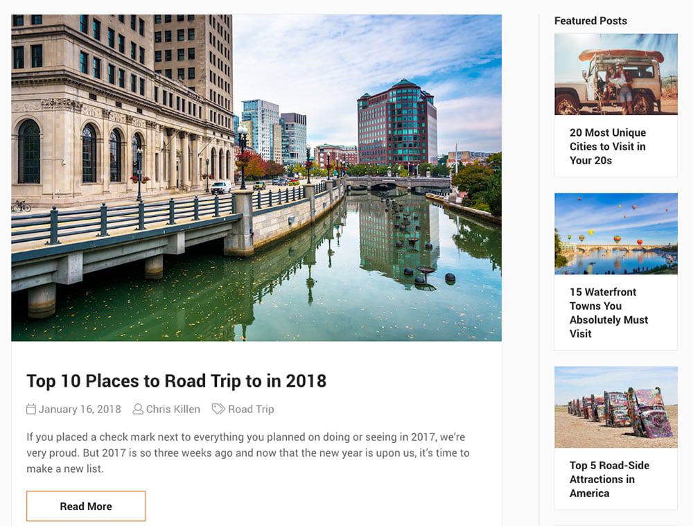
2. Popular/Featured Posts
I’m not suggesting that you grab a popular posts plugin and let it ride. I’m suggesting a curated list of evergreen and seasonal articles that you might choose to call “popular posts” or “featured ideas.” Use this widget to highlight your best content and rotate the links on a regular basis — at least monthly, more often if you have repeat visitors. Consider limiting this list to just 1-3 top articles and using a larger thumbnail to help this content stand out.

Three examples of how to style Post Widgets. Whether you use images or not, style counts. Left to right: Bloomberg.com, WSJ.com, LATimes.com.
This can also help internal linking, which of course can also help rankings. By making the popular posts area more attractive to click, you’ll increase engagement, improve likelihood of return visitors, and on a long enough timeline, generate more links to those posts as well.
Four Widgets to (re)Consider
Although fairly common on “fresh-out-of-the-box” blog installations, the following widgets are completely optional. They should really only be utilized if you have the dev and design resources to customize them for your site.
1. Recent Posts
If you’re updating content on a regular basis, a recent posts widget might encourage users to read your newest content. On the other hand, if your content is more sporadic or your blog covers a range of unrelated topics, consider whether your “recent” posts will be targeted enough to get readers to click through. If you do opt for a list of recent posts, it’s a good idea to include an image thumbnail to attract attention.

Another potential problem with recent posts is duplication. On this page, the most recent post happens to be the one the reader is currently viewing.
Similarly, it’s worth thinking about how those recent posts may semantically hurt the focus of your pages. Topic clusters are a frequently referenced SEO strategy that breaks down when you start referencing off-topic content through recent posts.
A good alternative to recent posts is related posts. Or better yet, use dynamic placement to highlight recent posts on archive pages and related posts on article pages.
2. Social Proof
If you’re a review site, you might want links to prestigious publications quoting your work. If you’re a new business, you might benefit from customer testimonials or a logo from a industry-recognized trade organization.
However, if your business is a household name and you’ve already earned a good reputation, file this under “widgets to reconsider.” You can always add important awards or reputation links to the footer, but don’t give up valuable sidebar real estate for anything that won’t influence your readers to take action on your CTA. If they already know your reputation, give them a better reason to click.
This isn’t to say that social proof isn’t important. It definitely works, but you’ll get better results from selectively highlighting testimonials, great storytelling on landing pages or blog posts, and informative case studies. Be strategic, don’t just toss a few logos in the sidebar.
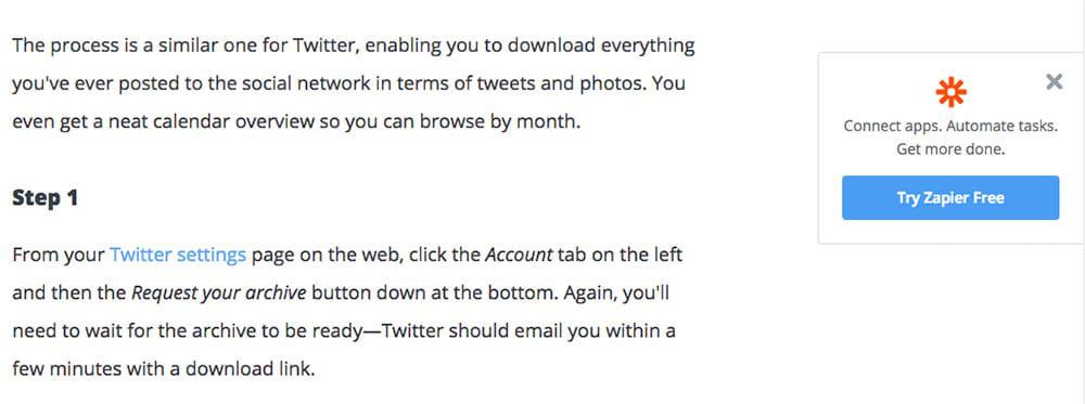
Zapier’s blog uses a series of straight-to-the-point CTAs spread evenly down the sidebar. As readers scroll down they see each CTA as a standalone banner without distraction from other widgets.
3. Search Bar
If you have a direct sign-up form in your sidebar, consider putting the search bar somewhere else. It’s amazing how similar a search input and an email input can look. Don’t water down your CTA with anything that can compete with what you want users to do.
As an aside (pun intended!), it’s best to place search boxes where users expect to find them. Usually this means in the header. Less than 1% of users think to look in the right-hand sidebar when they’re ready to search.
4. Categories
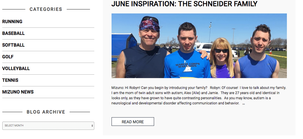
A list of categories is visual shorthand for telling visitors what your website is all about.
Displaying your site’s categories is like listing your interests in a personal ad. It’s a quick way to show site visitors what you’re into. Take a look at the Siege sidebar and you’ll notice that we’re all about Strategy, SEO, Creation, and Promotion. It gives you a feel for what we do, right?
Search engines are smart enough to discount sidebar content as less relevant overall, but it’s still a nice indicator of your key topics.
This works best if you can have an open list of links rather than a dropdown menu. An open list works best if you have five categories or less. Like so many thing in life, it comes down to focus. If you have a long list with a dozen different categories, it might be time to think about consolidating — or leaving this widget off your sidebar.
Five Widgets That Don’t Belong in The Sidebar
Some widgets are workhorses, others can barely pull their own weight. These widgets rarely offer enough value to earn a place on your sidebar.
1. Tag Cloud

Even the best-intentioned tag clouds can devolve into a jumbled mess of text.
Clockwise from top left: Creative Glossary Widget, Jquery Sphere 3D, Cool Tag Cloud, Creative Glossary Widget, Tag Cloud Widget
Are your tags meticulously well-managed? If not, a tag cloud will be a disjointed collection of links that are unlikely to garner clicks or provide any value to users. Also, they can be a large waste of crawl budget.
If you want a better way to help users explore content consider a category menu. If you really have been strict about your blog’s taxonomy, then you might be itching for a way to show off your hard work. A better option is a link to a tag page organized by topic or alphabetically to help users find content applicable to their interests.
2. Social Buttons

Sharing recent social posts on your blog can take up a lot of sidebar space and gives readers no reason to click through. A well-craft CTA is a better way to drive traffic to your social media profiles.
Of course you want to link to your social sites, but putting those links in the sidebar will compete visually with the share buttons on your post.
![]()
Are you more likely to share this post or click the follow button? Prominent follow buttons in the sidebar might distract or confuse readers who want to share your post.
Don’t confuse readers with too many choices. Place share buttons prominently in the post, and place links to external social properties in the header or footer of your website. If new YouTube subscribers are this quarter’s KPI, then create a unique CTA to entice users to click and direct them to your channel. A generic YouTube icon isn’t going to do much good anyway.
3. Latest Tweets/’Grams/Pins

Sharing recent social posts on your blog can take up a lot of sidebar space and gives readers no reason to click through. A well-craft CTA is a better way to drive traffic to your social media profiles.
You may be a top-notch social media user filled with witty observations, but pulling content from third-party sites will slow down your page load speed. As of 2017, Facebook and Twitter held 4 of the top 12 slots on Yottaa’s “Dirty Dozen” list of Javascript files slowing down the web.
While native sharing buttons are part of the problem, the most egregious offenders are social widgets that show content like “recent Tweets” or “popular pins.” If you want to highlight your social content, create a single page that pulls several of your social feeds into one easy-to-read layout. WordPress Social Stream is a great plugin for building out attractive feeds from your top social accounts.
4. Recent Comments
At best, a “Recent Comments” widget will highlight things that strangers say about articles your current user isn’t reading. At worst, the widget will show comments from months ago, or, possibly, no comments at all. Even if one of your KPIs is engagement, a comments widget in the sidebar is irrelevant to most users and won’t give them a good reason to interact with your content.
5. Date/Month Archives
A list of dates doesn’t give readers any incentive to click. Another option to highlight older content could be a “This week in history” widget featuring a single post with a photo.
When was the last time you visited a blog and thought to yourself, “Gee, I wonder what interesting things this author wrote about in August 2013?”
My favorite is adding related posts to the bottom of articles. It’s a natural fit because the reader has just finished the post and is ready for something new. Plus, by design, related posts are a good match for the content your visitor is already interested in. Related posts can reduce bounce rate and turn search queries into repeat visitors.
6. Blogroll

1998 called; they want their blog roll back.
Back in the day, sidebars were a party and all your favorite blogs were invited. Blogrolls were a popular way to link to related sites, your friends’ blogs or just generally show off how well-read you were. Nowadays, the sidebar is more like a private club and exclusivity matters.
Rather than sitewide links, consider a carefully curated post with sites grouped by topic. You’ll create a shareable resource and have a chance to connect with influencers in your community.
If you’re the site being linked to, know this: blogroll links were often abused and Google stopped counting them. While there is no need to disavow blogroll links, don’t expect to get a boost from them either.
Five Tips for Effective Sidebars
Choosing the right widgets is just part of the journey to successful sidebars. Take your sidebar to the next level with thoughtful design and development.
1. Curate Your Sidebar
Just like with writing an effective blog post, editing is key. Make a list of the widgets you think you need, then cut it. Be ruthless. Does each widget bring value or is it a distraction from your real goals? Anything that doesn’t help you meet your goals for clicks or conversions doesn’t belong.
It’s also worth noting that every item you link to is a potential dilution of link value away from your most important pages. Choose wisely.
2. Create Targeted Sidebars
There’s no rule that says your sidebar has to be static across your whole site. Build custom sidebars for pages, blog posts and archives. Use a plugin like Widget Logic to dynamically load specific widgets based on page, category or other WordPress conditions.
Here’s a few ideas for how to customize content on your sidebar.
- Put a CTA for your new DIY wedding eBook on posts in the “Wedding” category.
- Change the wording of your email sign-up to include the category of the post: Want more posts about Gardening, subscribe here.
- Show “Related Posts” on blog pages, and “Recent Posts” on archives with older content.
- Use Tags to show a YouTube CTA on posts with video or a Twitter CTA on round-up posts listing Twitter thought leaders.
3. Clear The Clutter
Have you done a good job of clearing the clutter from your sidebar? If you’ve narrowed it down to one or two important widgets, you now have access to more choices for how to display your sidebar. Consider using a sticky sidebar to keep your carefully selected widgets in view no matter how far down the user scrolls.
UX testing by Smashing Magazine found that sticky menus were 22% faster to navigate and preferred by 100% of users who had a preference. A fixed sidebar is a little different, but it’s probable that the benefits would be similar.
4. Earn Style Points
Take the time to style your widgets. Most widgets don’t look great out of the box. Even if you have a gorgeous theme, if your widget didn’t come with it, then the CSS probably won’t apply. Give your developer or designer an hour and you’ll be amazed how much better it will look. A stylish widget is an effective widget.
Before

This is how most recent/featured/related post widgets look out of the box — a very simple list of links.
After
This is how it looked after our designer Eric mocked it up with images and a subtle background. Which one are you most likely to click on?
As noted above, it’s not enough to just link to popular posts if you want them to rank better. The goal is to get more people to engage. That will result in return visitors via search, social sharing, and links that inevitably will add-up to the real “umph” you need to make those posts even more trafficked.
5. Always Be Testing
Put your sidebar to the test. Not sure if you should highlight recent or featured posts? Run an A/B test and see which widgets keep visitors reading. Not sure whether your featured posts need a thumbnail? Try it without and count the clicks. Whether your goal is increasing the time readers spend on your site or seeing how fast you can send them to your store, A/B testing is the best way to make sure your widgets are working for you.
A/B testing can be as simple as changing your sidebar for a few weeks and looking at your analytics. If you want to dig deeper, tools like Nelio have WordPress plugins to make it easier to set up test pages and gather data.