Infographics have gotten a bad rap in the industry due to overuse, poor quality and design. But when done correctly, infographics and shareable assets are still a highly effective choice for content marketing strategies.
Video Transcription
Hey, everyone. Vince Nero here, Senior Content Marketing Manager with Siege Media. Today, I’m going to talk to you about a staple in the content marketing world, and that is the infographic. We’re going to talk about why they get a bad name and what you can do to create a good one.
I think infographics still work. They have a special place in my heart because that was one of the first things I ever created when I was freelancing before I even started working with Siege Media. They’re really effective but, like I said, they do have a bad name.
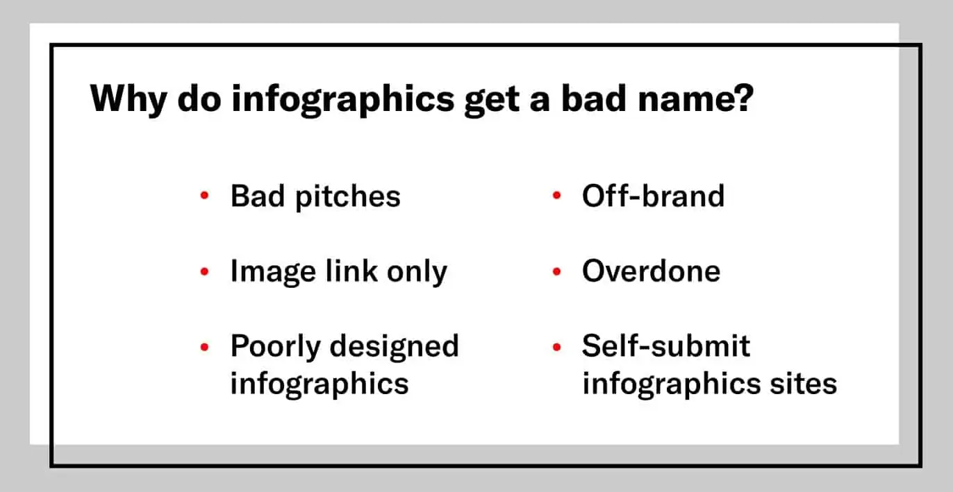
Why Do Infographics Get a Bad Name?
So, let’s get into why they get a bad name. There are a few reasons.
1. Overuse
I think one of the biggest parts of why infographics have a bad name is that they are just overdone.
That’s kind of obvious. It’s gotten to a point now where we know of journalists who have put on filters where, if they’re getting pitched the word infographic, it’ll go right to their spam folder. It does have that negative connotation across the industry, but there are some things that you can do to get around that.
2. Self-Submit Infographic Sites
Another bad thing is this bad practice that’s out there, and that is these self-submit infographic sites. I’ll list a couple here like this and this. But, the thought behind that is if everybody can submit to these and post an infographic, it’s less valuable to you.
It’s less valuable as a link, and I think it devalues the infographic on its own. Not all those sites are not valuable but, at scale, it’s a tough thing to really draw value out of, and it’s a tough thing to show a client value out of.
3. Image-only Links
The next one here is just the idea of getting an image-only link. A link without anchor text isn’t going to drive as much value from SEO, obviously.
What would happen is people would just get a link to their infographic, like a .JPEG link, and obviously you don’t get the benefit of the anchor text, so no SEO value there.
4. Poor Design
The next one is the poorly designed infographic, and it’s one of those things that you know it when you see it. There’s even a whole Tumblr devoted to bad infographics. I thought it was pretty funny.
Putting just written text right into an infographic, no images, that doesn’t really mean it’s an infographic. So let’s get that out of the way right now.
Stock images, stock icons, people are getting smart enough to realize and recognize these things, and they’re going to feel fake.
![]()
So it makes sense to put the effort, put the time, put your resources financially into hiring a great designer that is going to create something that is going to be really effective.
5. Off-brand Topics
Another important thing to think about here is if the images or the infographics you’re creating are off-brand. To dig in a little bit more to that — when you’re creating something, you want to create something that fits in your industry.
It shouldn’t be just pulling information randomly to try to make it fit into your website. It should have some connection to what you’re working on and what product you’re selling.
6. Bad Pitches
The last thing I think that really hurts infographics and gives them a bad name is the idea that people are just bad at pitching them. We’ve all gotten these terrible pitches, but I can do an entire video on how to pitch infographics. If you want that, please let me know in the comments.
The idea here is that you want to make sure you’re pitching to the right audience.
You want to make sure they’re open to infographics.
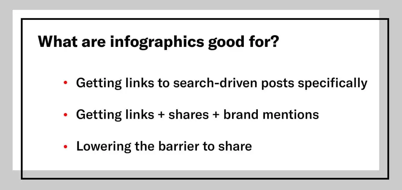
What Are Infographics Good For?
Let’s kind of flip it and think about what infographics are actually good for. When you create these infographics, you always want to tie a goal to them. You want to create something that is shareable on a post that is purely search-driven, where you want to lower the barrier of entry to enable someone to share it.
So, infographics are good for:
1. Getting links, getting shares, getting brand mentions.
You’ll want to give them something useful, such as listing out the best content marketing tools, or something like that.
Find something that’s really useful in that post and create an infographic about it. That will get you those shares.
2. Getting links to search-driven posts
Give them something that is an ancillary product to your search-driven post because typically your search-driven post, on its own, isn’t something that you can pitch to get links.
But by creating an infographic that ties into that topic, you can create a sharable and create something that is going to get you a link.
3. Lowering the barrier to share
That gets to the last point here, and that’s the idea that sometimes when we refer to infographics, we think of them as a “shareable asset”. That’s a term that we use here at Siege because essentially what you’re doing, is lowering the barrier of entry for a user, and you want them to have something that they can put on their blog and then link back to your piece.
So, when should you use infographics?
3 Questions to Ask Before Creating an Infographic
Question 1: Does your audience actually want an infographic?
Some audiences are super open to infographics, they like shareables, whereas others create their own shareables, their own images, or they might not even want images at all.
For example, there’s resource pages for senior citizens and veterans. They don’t want infographics. Sometimes you can create them just to have it, but if you’re on a budget, they don’t need them.
Learn about how you can identify linkable outreach markets in your industry.
Question 2: Does it belong on your site?
Also, is this topically something that you should be writing about? Does it tie back to your product, to your business?
You can tell if you’re getting links from places where your audience is not spending their time on.
Question 3: Are you providing something that’s really, really useful?
This might seem like a really obvious question, but at the end of the day, the easiest thing you do is just ask yourself, “If I was pitched this, would I share it? Is this really something that I’m interested in, I’m going to make use of?”
6 Simple Ways Infographics Can Be Used to Effectively Get Links
Let’s get into these share triggers and what you can do to create an effective infographic.
1. Simplifying a Complex Topic
First one is going to be to simplify a complex topic. And here’s an example from Save on Energy on how wind turbines work. Kind of a complex topic, but what they did was created an animated infographic that shows you all the different parts.
And this was really effective for conveying this complex idea of what wind turbines are.

2. Visualize Data/Survey
Visualizing data and survey results I think is a really effective tactic for creating infographics and getting links and making your surveys and data pieces really shareable. So, here’s an example from EBI. They asked employees how they feel about their jobs.
You could see it’s really well laid out. Each section has their own different color and you can kind of understand it starts really broad and it gets really specific to the data that you’re conveying.

3. Impressing with Artwork/Design
The next one is to impress them with an art style or your artwork.
Here’s an example on Halloween treats. It’s this kind of pseudo photography piece that also has some graphical elements that are merged together and mesh well. I think it levels up this piece and makes it more shareable.
You’ll notice how this style actually matches the outreach market.

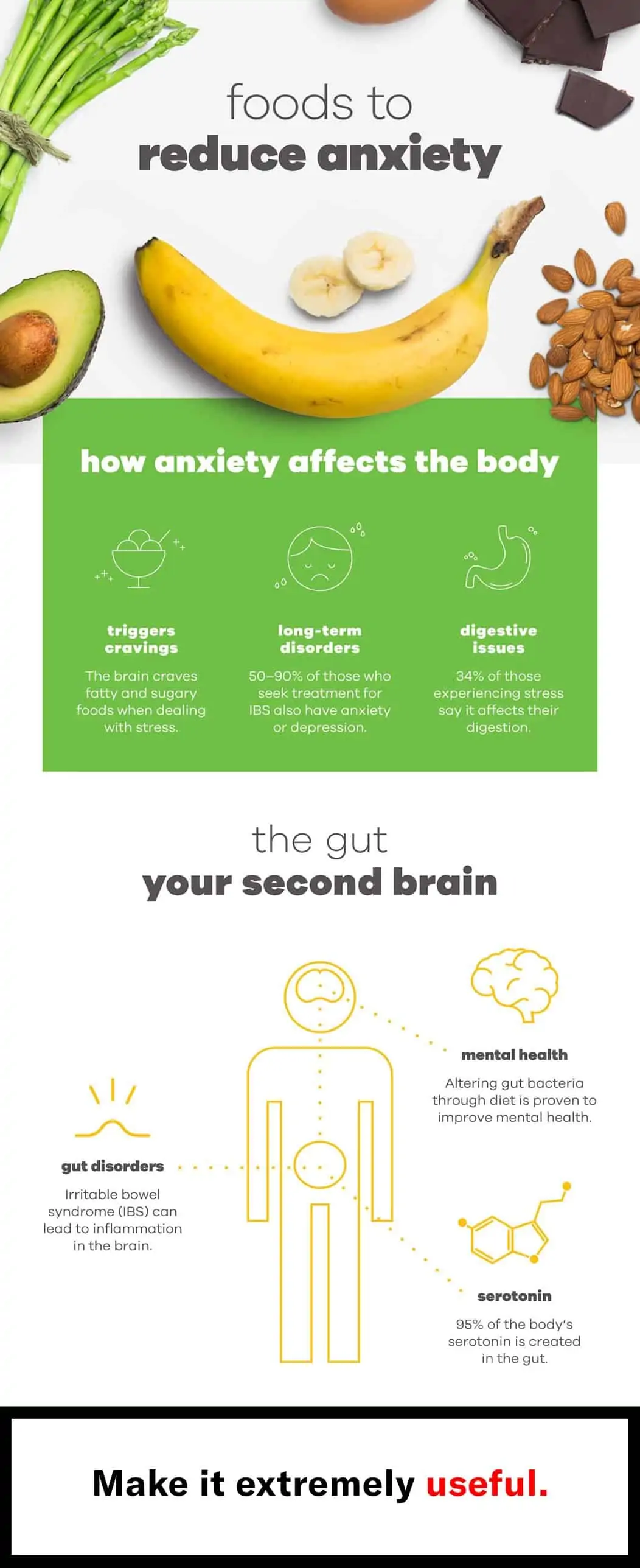
4. Giving the User Something Incredibly Useful
The next thing is you want to create something that’s really, really useful. And I’ve kind of mentioned this before, but essentially you want to create something that is going to give someone an actionable takeaway—something that they can do right away.
Here’s an example about foods that reduce anxiety.
5. Recapping Your Post
Another here is to recap your post. This might seem obvious, and there is a little bit of nuance to how you can do this, but essentially this piece is about About Us pages where we essentially created a whole page about how to create an About Us page and examples of other people that have done it well, and the infographic to makes it a shareable asset.
Again, I’m taking a kind of search-driven post and creating a shareable, and I can then pitch to get links back to it.
But this is recapping the findings of the post and what it is that makes an About Us page great.

6. Providing a “Complete” List
One more I want to touch on is this idea of the “complete” list. I know you’ve seen these posts before, but in some cases, they do work well as infographics.
Conveying this information visually, obviously is really important, and this example of every car from Comedians in Cars Getting Coffee with Jerry Seinfeld. It’s got a little pop culture slant to it, and this was really successful and I love the art style here.

Let’s briefly recap when infographics don’t work. One reason is the bad pitches. If you’re not pitching it correctly and, or if you’re pitching it to the wrong people, you’re not going to be successful with an infographic.
How to Tell if Your Infographic Topic is Overdone
Another reason is if the industry itself is saturated with infographics, it’s going to be tough if you’re trying to hit a topic that’s been overdone. One of the ways you can actually see this is if you’re searching Google and you just tell on the search results, if you see roundups of that specific infographic, this example here is pet food infographic.
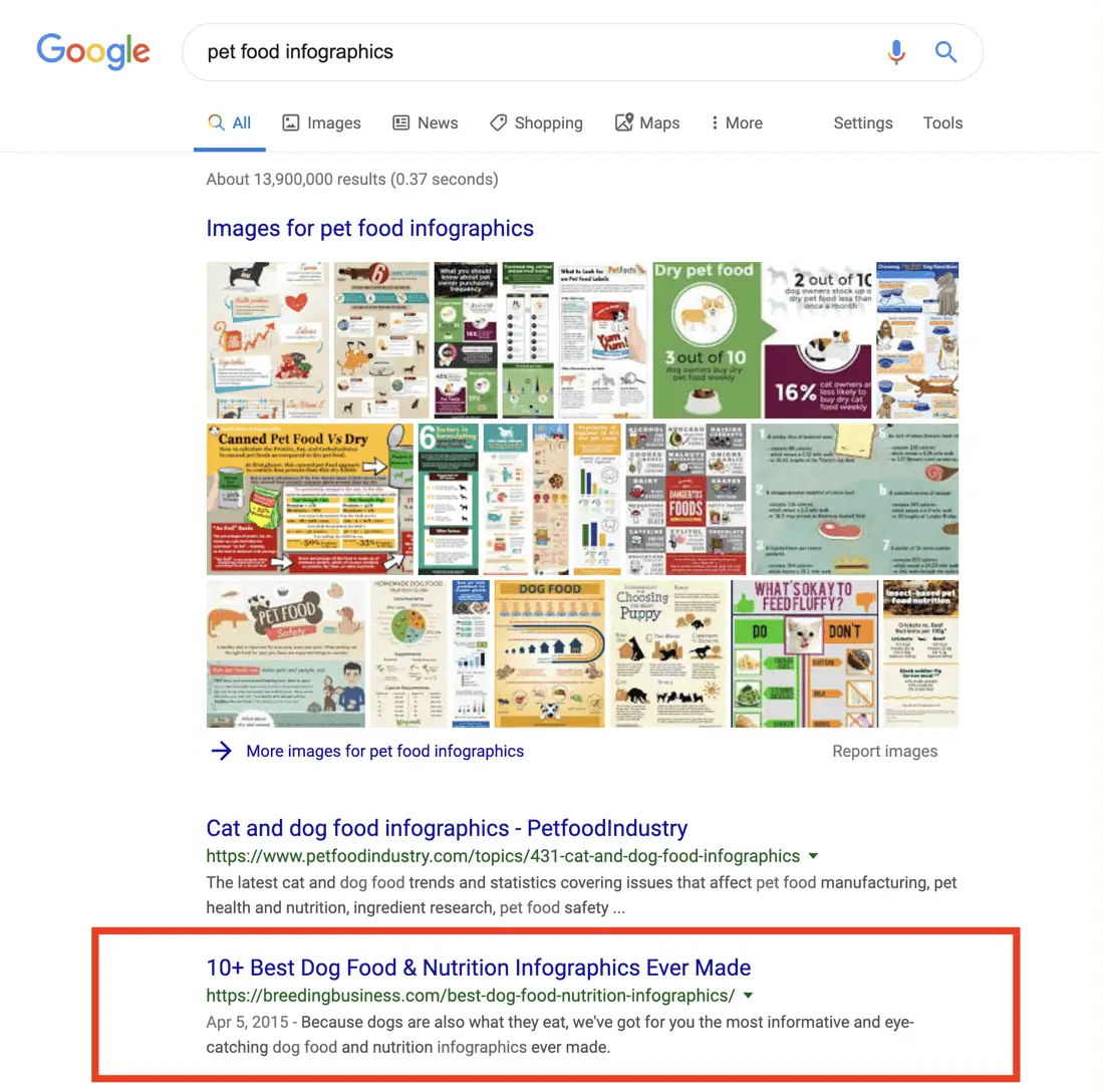
You’ll see that there’s some roundups on there of every single pet food infographic that’s out there. So that tells me, “Okay, this is kind of saturated.” It’s been overdone to the point where people are making roundups of other infographics.
Hopefully this helps kind of demystify and helps you understand how to do infographic design effectively. If you like what you see, please give it a thumbs up. Let me know what you think in the comments. Like I said, if there’s a couple of videos ideas in there, hit me in the comments and we’ll create them. So, thanks for watching.