If you’re looking for inspiration from some of the best infographics out there, this post is for you.
Chances are, you’re here not just to admire the best infographic examples, but to learn how to create infographics that stand out. However, in 2025, creating well-designed visual content remains challenging – nearly half of marketers struggle with finding the right design layout for their data and copy.
Many teams are embracing AI tools to brainstorm and streamline content creation, but only ~24.6% use AI for design inspiration – there’s still no substitute for human creativity in infographic design.
So, we instructed our team to start bookmarking those examples of great infographics that we really liked. We passed them around the team. We pinned. We shared. We curated.
Over the past few years, our team began bookmarking every great infographic we came across. We passed them around, pinned our favorites, and gradually curated a huge collection of examples across different industries and infographic types.
This repository of amazing infographics helped inspire new content ideas, train our hires, and keep us innovating. Eventually, we decided to take it to the next level and compile the best of the best.
We handpicked 100 of the most diverse, high-quality infographics we could find – not just to share with you, but to challenge and inspire our own team as well.
How We Picked the Top 100
This post is the result of 20+ years of experience designing, creating and sharing visual assets. We started with that experience and jotted down every great infographic we could think of, giving us more than 300 pieces.
Then I spent an additional few days scouring the internet, grabbing the best of the best from infographic lists, and asking the opinions of experts I respected.
To make sure we didn’t leave any rocks uncovered, we read through every infographic detailed in the Best Infographics books, and included or annotated any we had listed that came from them, with the knowledge that they would be great sources for a post like this.

At that point, I chopped down from there. I removed any infographics that didn’t blow me away, or otherwise, followed design or idea frameworks that other infographics on the list also utilized.
This gave us a list of 100 infographic examples that were not just great on their own, but also worked great as a collection – thereby making the list stronger overall.
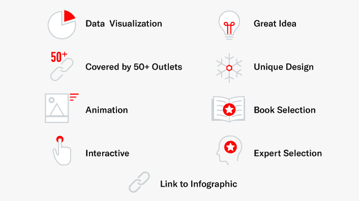
Each infographic on the list is annotated with an icon that allows you to subsegment by the types that interest you the most. We plan to keep this list updated, too, so check back for updates or otherwise, feel free to suggest infographics worthy of inclusion.
What the Infographic Icons Mean
The 100 Best Infographics
30 Shots


Mixed shots are a popular pastime for many people, and they are represented well in this infographic. Using gradients to represent each, the designer found a way to create an elegant landscape to represent the alcoholic concoctions. It's useful, too — such simple recipes mean the details below make the shots easy to recreate.
3D Agriculture

This infographic is my favorite on this list in terms of sheer visual beauty. It uses photo manipulations, compositing, 3D tools and drawing to construct its aesthetic.
42 North American Butterflies


The wings flapping in this animation is the part that really grabs you, so make sure you click through to see it in full. The illustration of these very unique butterflies is nothing short of amazing, too — so don't forget to be impressed by that, also.
A Brief Introduction to Typography

As a general rule, we try to avoid "guides" when doing infographics. This is because infographics don't support copy, and also, effective infographics generally contain unexpected content. However, Downgraf makes it work because their design is world-class — it might be a basic concept, but this shows that can be overcome with amazing aesthetics.
A Compendium of Glowing Creatures


Eleanor Lutz of Tabletop Whale is a world class infographic designer and animator, and it shows from her work showing up five times on this post — almost certainly the highest of any singular artist. This piece starts the trend of impressiveness.
A Well-Balanced Blog

Photography is something that rarely finds its way into infographics, which makes its inclusion that much more effective. This infographic from Column Five shows how a basic concept can be elevated dramatically with photos.
Bloomberg Billionaires


Although there might not be anything especially amazing about the data presented here, Bloomberg stands out with a few things — execution and freshness. Sadly, though, it's not very optimized for SEO, as there's no reason it shouldn't surface for lots of queries around the world's richest people.
Caffeine in Popular Products

A great infographic can create change. This is one of those. If you find your drink or food at the top of this list, it might make you rethink consumption — or otherwise, push you towards a secondary option that's available.
Can I Make Stuff Up?

This brilliant piece shows us how okay it is for different positions to make up what they do, from a journalist to a fantasy writer. It's nothing crazy, but the idea is absolutely original and is represented well in the visualization.
Cheetah: Nature's Speed Machine


This was the first animated infographic I had ever seen, and it still stands as one of the best. The repetition of the cheetah is just awe-inspiring, and in combination with the other elements of the piece, makes this a best-in-class animation. Suggested by AJ Ghergich of infographic design company Ghergich & Co.
Common MythConceptions

Tell me I'm wrong and have the credibility to convince me. That single sentence is the biggest reason this interactive went viral, as it combined dozens of common misconceptions into one piece. The interactivity is nice, but a similar, static version was created and also had similar effect, showing that sometimes, idea (and execution) is everything.
Creative Routines of Successful People

Another take on the creative routines concept found a few times on the list, this static version also went viral — showing that we really do want a shortcut to a better life. InfoWeTrust was one of the first to debut the trend (and do it well), so they are definitely worthy of being on this list.
Daily Routines of Famous Creative People

You've probably seen a few "rountines of famous people" posts out there, but Podio is the only one who managed to execute in interactive format. It worked like a charm, generating 656 linking root domains.
Emotions That Can't Be Expressed in English

The English language is known for its weird idiosyncrasies and idioms that make it difficult for non-native speakers to pick it up. But did you know that there are also some emoitons the language completely misses? Using almost impossible to replicate research, this piece shows us the gaps in our less-than-perfect language.
Every Active Satellite Orbiting Earth

A scrolling interactive piece that fits perfectly with a representation of the Earth's atmosphere. Another element of a great infographic — it uses its format because that's what best for it, not just because it's the design or development trend of the moment.
Famous Writers' Sleep Habits

Everyone likes a shortcut, and many believe that learning the habits of successful people means they may become successful if they do the same. Whether or not that's true, this infographic visualziing the wakeup times of famous writers, is interesting and well laid out. Suggested by Courtney Seiter.
Fantastical Fictive Beers

Nostalgia, fun illustrations, and a quasi-compendium. We must be pretty close to an equation for success there — and that's how Pop Chart Lab can sell this, and other pieces like it, as prints.
Fastest Ship in the Universe

This infographic does several things well we've mentioned in this post: grabs unique data, starts a conversation, and generates nostalgia. Science fiction also allows the artist to capture the ships with solid illustrations, and the result is a piece that went viral and was covered 245 times.
Flight Videos Deconstructed

A common occurrence in great animated infographics is repetition. In order for the graphics to not be jerky/suddenly start over, they have to return to the beginning. The wing paths is an example of how that, when done well, can blow you away.
Flights in the Sky

No infographic on this list, besides this one from The Guardian, can claim to have live data. Doesn't get much more impressive than that — unless you actually interact with the infographic, and realize this is also a piece that recaps 100 years of aviation.
Food and Wine Pairings

The pairing concept of lines from one thing to another is something an infographic is very apt to support. Wine Folly shows us a best-in-class example with this food and wine pairing chart.
Gay Rights in the U.S. — State by State

Combine a sensitive subject with an interactive, radial layout that is well thought-out, and you have a piece that captures coverage from 125 unique outlets. It's hard to come up with a concept that properly uses the radial format that doesn't impress.
How a Car Engine Works

Another amazing animation from Animagraffs, how a car engine works shows the power of the medium through effective communication of engine motion using color. Suggested by Neil Patel, founder of content marketing company Quicksprout.
How a Handgun Works

Transparency is part of the reason this animation, as well as "how a car engine works" from Animgraffs, communicates their ideas so well. The detail combined with that effect demonstrates a level of quality few other pieces do. Suggested by Jon Cooper, founder of Point Blank SEO.
How Common Is Your Birthday?

This data visualization took off like a viral firecracker when it was first released. Appealing to the vanity of the reader, we all — or almost all of us — wanted to know just how common our birthday was. While not the prettiest graphic ever, it was easy to interpret, and using such interesting data, that was all it took to create a widely spread piece.
How Family Income Affects College Chances

Who knew drawing could be so effective in telling a really important story? The New York Times did, and that's why they created an interactive much unlike any other piece of content on the web. Suggested by Rand Fishkin, founder of inbound software company Moz.
How Far is it to Mars?

TL;DR — it's pretty far. This interactive does a brilliant job of communicating the distance, while also making the experience of reaching the destination a lot of fun, too.
How Fast is the Fire Department?

We commonly refer to the power of emotion in creating marketable ideas -- and this piece takes the concept to a whole new level. If you live in LA, it almost certainly pisses you off -- which means this definitely belongs on every best of list that's ever created.
How Fast is Usain Bolt?

Simulating the difference between past and present is a pretty cool use of infographics. Using a short video to explain the infographic? Cooler still. This piece from the NYTimes is the only one that utilizes video on this list.
How Many People Do Drones Kill?

The emotion generated by this stunning interactive made it it a no-brainer inclusion on the list, showing just how ineffective drone strikes are in Pakistan while also doing so in a way that's undoubtedly unique.
How Much Do Music Artists Earn Online?

Musicians simply aren't paid enough. We already knew record companies were picking their pocket, and with this visualization, we know just how much. Showing that artists need 4,053,110 plays per month to earn minimum wage from Spotify was enough to spark a vibrant conversation and take this piece to 1,000+ LRDs generated.
How Often Do The French Kiss?

For the uninitiatied American (me), this fun infographic communicated something I hadn't known — and did it really, really quickly. I'm now nervous about people kissing me if I visit France.
How Search Works

Not just a scrolling interactive, this piece reveals itself upon you settling into the next section. Not a big surprise coming from the talented, deep team of engineers and designers that reside in Mountain View.
How Solar Panels Work

A great infographic isn't something you look at for five seconds and then forget forever. This animation not only solves a problem, but helps educate the audience, leaving them with information they can use for the long-term.
How Steve Jobs Started

Sometimes a visualization does't need to be complicated or fancy, it just has to communicate a great idea in a simple, effective way. This is that chart, showing us how Steve Jobs made his mark. For aspiring business people, this resonated, pushing the piece to 75 LRDs.
How to Be Productive

While this infographic doesn't look bad by any means, it also shows the power of a well-executed idea. We learn how to be productive in a distilled, actionable format, giving us a direct path to improving productivity most other posts won't offer.
How to Build a Dog

This design has a unique format in the "how much of 100%" layout it utilizes. It's possible this could port to other concepts, as well — and it'll be visually interesting just the same.
How to Build a Human

The infinity effect of this animation is really cleverly executed. As can be seen from her other animations, Eleanor Lutz has a unique touch for detail that also manages to somehow combine with stunning design.
How to Eat Sushi

Solving problems we all have, but don't talk about is often an angle that creates a whirlwind of shares online. This infographic on sushi etiquette appeals to a similar idea — while also applying a fun, comic-like look that makes it a pleasure to read.
How to Make the Perfect Cocktail

This ratio infographic is one we frequently reference as a potential use-case for other pieces we do. There's a reason for that — it's elegantly executed and a pleasure to read through and use. That's why it warrants purchase for many.
Kitchen Cheat Sheet

Utility is often something missing from most infographics. The best ones are things you bookmark and reference and re-reference time and time again. This infographic is a perfect exemplar of that type of visual.
Hungry Tech Giants: 15 Years of Acquisitions

What's the acquisition history of major tech companies? How do the acquisition sizes compare? These two questions — and figuring out a way to nicely display the answers, led to a highly successful piece by Simply Business that generated 150+ LRDs.
In Caffeine We Trust

An infographic that helps you explain your coffee usage with actual coffee. That's awesome. Although not traditionally "interactive", you might argue this is the most interactive of the entire list, if you buy the print.
Is Life Good?

Simple but oh so powerful. Amongst my favorite infographics on this list because it punches you in the gut if you are currently doing something you hate, I use this not just in work, but in personal life, passing to any friend that complains about something they're capable of changing.
Is Your Startup Idea Already Taken

Everybody in tech has heard it — "Uber for X". But BuzzFeed was the only one smart enough to represent it visually, using a grid layout just how many mini-startups poured out of Uber, Tinder, Birchbox and AirBnB. Simple, effective, and highly shared.
Ketchup + 17 Clean Ingredients

Random and simple is sometimes genius. This piece is nothing striking from a design perspective, but the unique idea grabs you, and if you're like us, makes you laugh. Ingenunity like this makes for highly shared pieces.
Kitchen 101: Fruits, Vegetables & Herbs

This infographic isn't easy to understand on the surface, but once you acclimate, it's a powerful and useful representation of the seasonality of produce. Sometimes, effective visualizations are such because they can compact more complicated information in a smaller space — while still retaining comprehension.
Kitchen 101: Pasta

Some of the best infographics come from unique, out there ideas that make for visually interesting and also aesthetically pleasing portions. This encyclopedia of pasta is one example of just that — an immensely comprehensive take on every carb-heavy option, presented in a way that's enjoyable to read through.
Million Lines of Code

Sometimes a simple bar graph representation of a new idea is enough to have something big. That's what InformationIsBeautiful.net got from this data visualization showing how many lines of code many different things have — including a mouse.
Morning Rituals of Inspirational Entrepreneurs

Another in the trend of "what famous people do", this infographic uses that clever idea and applies it to successful entrepeneurs. The result was a highly shared piece that received almost 100 LRDs.
Most Common Use of Time

Most of the infographics on this list should bring you something unique, or present things in a way you haven't otherwise seen. This is one example of originality in action, using a unique format to visualize the differing uses of time amongst different ages. Suggested by Rand Fishkin, founder of inbound software company Moz.
NFL Players Mentioned Most on Sportscenter

There's nothing crazy about the data used in this piece — many others have utilized data just like it, but it's the visualization that blows you away. They could have taken five seconds and went with a bar chart — but that doesn't make best ever lists, now does it?
Omnibus of Superpowers

A compendium of a different flavor, what makes this piece especially effective is how it communicates its subject in the context of the subject — a comic book aesthetic.
Oscar Dresses Worn by Winners

The only infographic on this list that connected to an event, we had to list this piece because it went very, very viral when it was first released, and may have been the original trigger point for "what happened in the past" trend that frequently followed after it.
Planet Earth Control Deck

One of the most impressive parts of Lutz' animations is the scientific attention to detail. They're stunning visually, but beyond that they take the subject matter to a level most would never — and that's why her work is what it is.
Snake Oil Supplements

Using the same code as their data breaches interactive, InformationIsBeautiful realized similar success with this piece based on the somewhat-inconsistent data on the success rate of supplements. Interactives don't need to start from scratch to go viral.
Soup Recipes

Easy recipes deserve an easy to understand infographic. Displayed with real photographs (that could have easily been stock), Shape magazine takes a concept that could have boring and injects it with life.
The 10 Commandments of UI Design

One commandment you should stick to for your next infographic? Utility. This visual isn't breaking any design records, but it's damn useful — a bookmark (or background) that many UI designers reference during their day to day.
The Billion Dollar Gram

InformationIsBeautiful went "outside the box" to compare billion dollar spends in this visualization. You'll notice that most visualizations with data like this go with bar graphs — because that's easy. But sometimes — often even — there are better formats available. The success of this piece shows that a bar graph likely would not have had the same success.
The Charted Cheese Wheel

Cheese, please. Another clever vehicle that is effective time and time again is explaining something within the design context of that apparatus. In this case, we get 65 cheeses within one glamorous cheese wheel.
The Empire State Building Light Show Decoder

We did our best to remove infographics you can't relate to on this list. You may have never visited the Empire State Building, but we thought this representation was worth including because it's so unique, and so well done — something that may inform your next creative piece.
The Essential Herb & Food Pairing Guide

A pairing guide in a unique format, this infographic provides helpful tips for matching herbs with foods, but without boring you on the uptick. Rich colors and great illustrations will make this a joy to read the next time you cook a meal.
The Evolution of the Web

If your interactive feels a little like a rollercoaster, you've probably done something right. The Evolution of the Web isn't quite that, but its ability to grab you early with a rollercoaster effect and then keep you with an interesting storyline that details the advancements of each web browser is worth checking out.
The Facebook Offering: How it Compares

A simple but effective interactive, this visualization hits because it tells a great story, and a story that resonates with unexpected information. Interestingly, this chart seems to try and communicate that Facebook might have been overvalued, yet at the time of this writing, it's worth 254% more than its IPO price.
The Fastest Growing Companies In America

Because of their interactivity, some content like this may have difficulty telling a story — because it's hard to paint a narrative for something we control the path of. ColumnFive flips that on its head, giving us an interesting narrative while also retaining the ability to interact.
The Gross, Deadly History Of Color

Style doesn't always carry itself into most infographics. Brand guidelines or otherwise, a simple lack of creativity put borders on truely interesting pieces. This representation of historical colors shows it can be done, representing each in an entertaining, unique format.
The Growth of Walmart & Sam's Club

Walmart feels like a virus in this visualization which maps their growth — along with Sam's Club — across the United States. Is it really a surprise that the piece received coverage in 728 different publications?
The Largest Vocabulary in Hip-Hop

This infographic takes data viz to another level, documenting the number of words used by famous rappers to show who really has the best command on the English language. Pieces like these, that gather data from previously-not-considered places, are some of the most successful you will see. Suggested by Michael King, founder of inbound marketing company iPullRank.
The Pace of Social Change

A pattern emerges in some of the most effective interactives here — they take you on a controlled story that triggers your emotional heartstrings. It'd be easy to just display the story immediately, but that ability to keep you hanging amplifies the effect. Suggested by Rand Fishkin, founder of inbound software company Moz.
The Refugee Flow Towards Europe

A great interactive holds you — it doesn't just mean you click somewhere. This resource does exactly that, ticking up over time to show you the flow of refugeses into the European continent while you interact with it. It makes it an easy inclusion on this list. Suggested by Danny Ashton, founder of infographic design agency NeoMam Studios.
The World as 100 People

As mentioned in the description, this isn't a new concept. But the representation is, and that's what made it go viral, generating 112 LRDs and more importantly, starting several conversations around race, religion, poverty and more.
The World's Most Spoken Languages

Representing things we expect to see one way in another way is another tried-and-true infographic technique that is almost sure to resonate. This piece, which connects language to the world map, executes the concept with extreme efficiency.
Timeline of History

There are several amazing things about this peice. From its introduction, to what it tells us about how much of history is documented, to its ability to subsegment by categories — it does several things with effectiveness.
Transit Time NYC

Infographics don't have to be visual noise — they can be useful, too. This interactive is exactly that, showing you the estimated transit time to get to different areas of NYC — and not in a linear fashion, all in one space. Really well done.
We're Getting Good at Going to Mars

How many missions to Mars haven't panned out? As it turns out, plenty. We feel like spacemen approaching Mars in this uniquely represented piece, which shows each "mission" and where in orbit it either succeeded or failed. Houston, we dig this.
What Do Brand Colors Say About Your Business?

Hopefully you, as a marketer, know what your brand's colors signify about your business. But many, surely, don't. ColumnFive clears it up with this infographic which tells you what that bright orange is really signifying.
What Does the LA Underground Taste Like?

It might strike you as somewhat strange to imagine the London Underground combined with a taste pallete, but this infographic really isn't strange at all. Creator James Wannerton tastes words when he reads or hears them due to a neurological condition called synaesthesia — so when he took the Underground, he experienced new taste sensations at every stop. The result is a really cool infographic.
What's the Top Data Dog?

InformationIsBeautiful created their own quantitative value of each dog breed and plotted it against public popularity, giving us a chart highlighting the most underrated breeds out there. My next dog will be an affenpinscher.
What's Warming the World

Interactive — check. Tells emotional, well-constructed story — check. Is communicated by an authority in the industry — check. Goes viral based on aforementioned factors — check. No doubt about it, this is a must-view piece. Suggested by Danny Ashton, founder of infographic design agency NeoMam Studios.
When is the Best Time to Buy Everything

Mint, for a time, was best-in-class as it came to infographics. This piece is one such example of their excellence, highlighting some valuable insights as to when we should be buying common products based on expected dips in price.
Which Marvel Characters Murder Most?

Often simply identifying a random stat about something people geek out about, and then compiling all the data, is all you need to create something that resonates. MorphCostumes knew that and compiled data on how much each popular Marvel character had murdered another character — put it together in a nicely designed infographic, and ended with something powerful.
Why Sitting is Killing You

This might have been the most viral infographic I've encountered. It started a movement around standing desks, and if you're like most, you can probably look to your left or right (or just keep standing) and see the impacts of the conversation it started.
Why Your Brain Craves Infographics

The elegance of this interactive grabs you once you start scrolling. I've seen many of these interactive scroll infographics that jerk or come off as less than polished, but Neomam manages to create an effect that actually does the opposite — making it extremely enjoyable to scroll down the page. Suggested by Brian Dean, blogger at respected SEO blog Backlinko.
Wind Map

There are 100 infographics on this list, and honestly, this is my all-time favorite. It's not captured by the still above, so make sure you click through — but it's hard not to be extremely impressed and at the same time, soothed by the directional currents of the wind this interactive visualizes.
World's Biggest Data Breaches & Hacks

This interactive is another piece that could have easily been done with a bar graph. But since Information Is Beautiful rarely settles on the basics, they went with an interactive representation which allows you to filter by industry and type.
The Deadliest Animals

Behind Bill Gates, this piece was destined to go viral. And it did, showing that maybe Sharks just aren't that dangerous after all — and we really should be worrying about the smaller insects around us.
What the World Eats

An approachable but effective interactive, this piece tells a great story, but doesn't require a six-figure budget to do so (or hopefully it didn't). Using simple pie graphs, we learn how consumption differs by time and by country.
Coupon Satistics

This infographic provides as a great supplement to the post on coupon statistics. Instead of trying to highlight all 60+ stats in one infographic, it picks the "must know" ones and provides an illustration for each.
American Underwear Hygiene Habits

This is a well-rounded infographic that’s broken up throughout the post to best accompany the copy. It starts off with attention-grabbing, relevant results from a survey about underwear hygiene habits, and seamlessly transitions into the consequences of such poor habits.
Customer Service Statistics

With 100 statistics and trends, this infographic is a comprehensive resource for understanding and improving customer service. It’s also chunked into nine sections, making it easy to navigate and focus on specific topics.
Using Augmented Reality to Attract Customers

The sleek animation of this infographic aligns with its high-tech topic of augmented reality. The infographic outlines multiple benefits to using AR, tips for creating an AR app and how to use AR in a variety of industries.
How Instagram Changed the Restaurant Industry

With an Instagram-worthy aesthetic, this infographic provides statistics on ‘gramming’ habits, as well as a diagram that highlights 10 ways that a restaurant can capitalize on these trends to become viral.
Spring Wedding Cake Ideas

Looking at this infographic makes you excited to plan and pick out a wedding cake. Each delectable display is accompanied by an appealing color palette and a delicious description that makes your mouth water.
What is The Glass Cliff?

The unique design and engaging animations make you feel like you’re taking a dive off the glass cliff. This infographic does a great job of introducing readers to an important topic that they may not be familiar with.
How to Encrypt Emails

Encrypting emails is a valuable tool when it comes to keeping information secure. This infographic outlines how email encryption works, why it’s important and how you can use encryption apps across a variety of platforms.
Ways to Outsmart Decision Fatigue

This infographic helps you recognize and outsmart decision fatigue, a common phenomenon that negatively impacts your performance and productivity. The simple, concrete tips included in the infographic make the advice offered seem approachable and easy-to-follow.
15 Healing Aromatherapy Scents

Soothing information delivered in an aesthetically pleasing package. This infographic offers multiple aromatherapy scents to ease a variety of common symptoms, such as sleep problems, anxiety and pain. It also helps you identify how you should use each scent for best results.
A Beginner’s Guide to Whiskey

The robust profiles for each of the six main types of whiskey make this infographic an excellent resource for those seeking information about the different whiskeys’ tastes, brands and cocktails.
Most Accessible Vegan Protein Sources

The use of vibrant ingredient photos against a white background gives this infographic a clean design that aligns with the feel of its subject matter — vegan protein sources. These photos also help the viewer visualize the foods and their quantities.
Female Cybersecurity Leaders

There is a significant lack of gender diversity in cybersecurity. This infographic highlights this disparity before shifting focus to the demographics of female cybersecurity leaders. The data is neatly visualized, making it easy to see distributions of educational background, area of study and work experience.
Hanging Plants Style Guide

The standardized sun and water scales provided make it easy to compare the needs of different hanging plants and select the one that best fits your situation. The location suggestion, hanging tips and styling tips also offer guidance that helps you visualize hanging plants in your home.
The Best Infographics? Those Tied to Business Outcomes
At Siege, we’ve always believed that infographics shouldn’t just be eye candy — they need to serve a purpose and drive real business outcomes. Too often, brands churn out infographics that get shares but don’t move the needle for brand recall or conversions (remember, helpful, high-quality content still rules in Google’s eyes).
That said, a great infographic can be extremely valuable when done right – not only for engaging an audience, but for earning backlinks and top-of-funnel traffic as well. In fact, content marketers who leverage interactive or data-rich visuals are more likely to report success in their strategy, even though fewer teams are investing in interactive content lately.
At Siege, we combine creative design with data-driven strategy to drive both top-funnel search volume and bottom-funnel conversions. If that sounds like something up your alley, check out our graphic design services — it’s one of the things we do best.