
What do we consider some “must have” blog features?
Associate Director Emily Campbell shares some of her favorite blog UX features to consider when revamping your content. These small but mighty changes can make a big difference in content quality, dwell time and overall reader trust.
Video Transcription
At Siege, we’ve worked with countless clients in many different industries. So we’ve really learned what works to create a blog that resonates with users and your target customers.
Customizable CSS Classes
The first recommendation is customizable CSS classes that you can add to your blog so that you’re creating elements that can be used across multiple different posts.
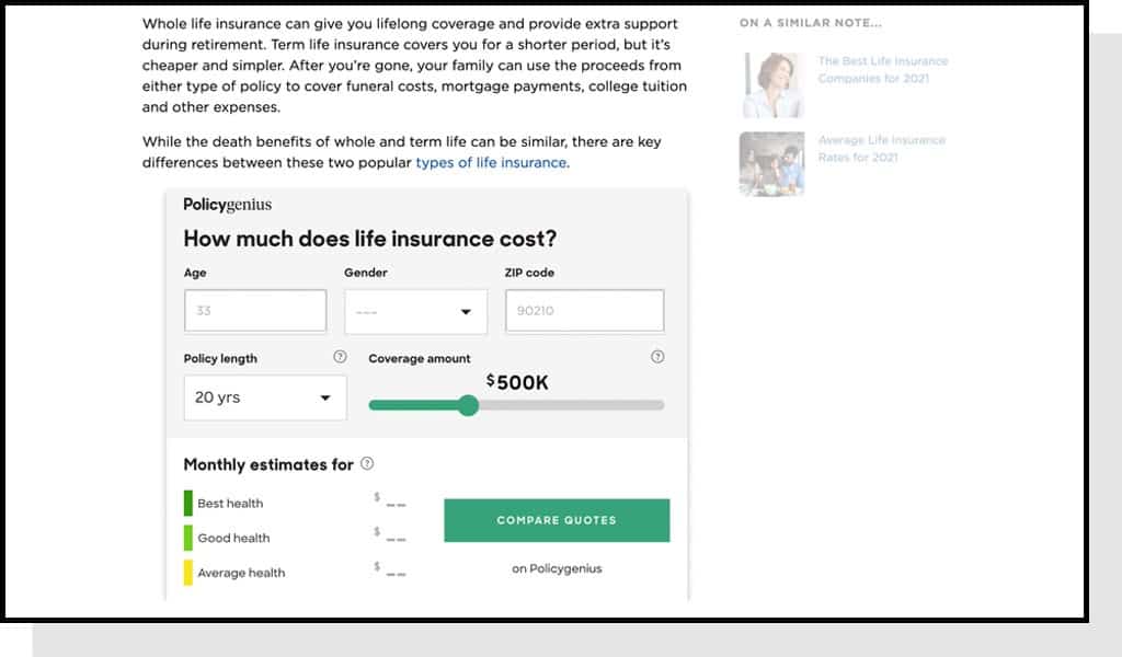
A few recommendations that we like to point to are things like charts and graphs. NerdWallet does a great job of implementing these seamless charts and elements that look really cohesive across different posts on their site.
We also recommend implementing a structure for pull quotes so that you can incorporate those throughout your article.
We also always like to recommend incorporating branded social buttons. Sounds like a small recommendation, but we just find that having that extra polish can really help make your blog stand out and look cohesive from a branding perspective.
“Last Updated”

Our second tip is to add a last updated element to your blog posts. This is great if you are a brand that is going after a lot of queries that rely on content freshness and need to be updated regularly, because when you have the last updated element on your blog posts a user automatically knows how new the content is and can therefore understand how trustworthy it is and how relevant it might be for them. There’s more opportunity for them to engage with the content and likely read through the post.
Author Bios
Once you’ve implemented these elements, we also recommend thinking about how you wanna incorporate author bios into your blog structure.

This is something that we’ve touched on more in depth in other videos and blog posts as well but worth mentioning as part of your overall blog direction because it’s just really key to think through your strategy for how you want to incorporate and highlight who’s contributing to your blog.
There’s a lot of different elements that you can use to showcase the writers. We really like to recommend incorporating a small headshot at the top of the post with a short blurb about the author and then potentially incorporating a longer bio at the bottom of the post once someone’s read through and engaged with the content. But there’s lots of different options for how you can best tackle this on your site.
Blog Read Times
Something that we’re seeing a lot that I really like is when blogs add read times to the top of articles or incorporate a sticky nav bar. This is great because it gives the user a sense of how long they’ll need to engage with the content and also gives them all a stronger likelihood of remaining engaged with your post.

Everlywell, for example, on their blog homepage incorporates a summary of how how long it might take a user to read each blog posts. And for me, that’s just helpful because I’ll know is this gonna be a quick article that I’ll just skim through or a more in depth guide that I’ll wanna sit down and read with a cup of coffee.
Adding in that element really makes your content a little bit more engaging and is more likely to keep the user on the page. Same goes for the sticky nav bar. It’s essentially just a long bar that shows you how far into the post you are.
This is great for brands that do a lot of long form content because I know when you’re reading something long, if you don’t know how much longer it’s going to last, there’s a higher chance that you’ll bounce off and go read something a little bit shorter or just go on your merry way.
Customize Stock Photography
I also recommend thinking through your strategy for stock photography on your blog. I’m sure that we’ve all seen sites that just incorporate overly stocky imagery, like “lady eating a salad and laughing.” That type of content structure just doesn’t feel elevated and premium.

So while we understand that brands might be using stock photos, I recommend thinking about a scalable strategy so that those images feel a little bit more premium on your site.
A really easy tip here is coming up with some sort of custom treatment that you can add to each hero image or just any stock photography on your site. For example, maybe it’s a custom border or color tint that will make everything look a little bit more cohesive and really align with your overall brand direction.
Comment Section
The last thing you wanna think about is your comment section. Do you wanna have one? Are you prepared to manage that content section?
This is something that is really up to each individual brand’s discretion but it’s important to think about if you have the manpower of a community manager, someone who will be responsible for responding to comments and keeping things from feeling a little bit spammy. That’s important to consider when evaluating whether you even want to add that into your structure.
We also like to ask if social media be your forum for engaging with readers? That’s an option as well if you don’t wanna put the resources towards having someone manage your comment section on your blog. And you may not even be getting comments! So running through that checklist when evaluating if this is worth your time is just really key.