
81% of consumers use the internet to research products before buying, and a great e-commerce website can help you earn more conversions.
Over a quarter of the global population is shopping online for everything from trendy furniture and clothing to groceries and home essentials. Online shoppers are an extremely valuable audience, and global e-commerce is projected to near $10 trillion USD by 2027, growing at over twice the pace of physical retail.
With mega-marketplaces like Amazon and seemingly endless online competitors, creating a user-friendly, optimized consumer experience is key to increasing total sales and order volume. So, we’ve gathered our favorite consumer website examples below and dived into exactly what we love about each.
How do we know what works? Siege Media has over a decade of experience driving organic growth for consumer brands with improved site designs, optimization, and content quality. For example, we helped Shutterfly’s blog increase monthly traffic value by $1.7 million.
- Instacart
- Purple
- Adidas
- Mixbook
- Williams Sonoma
- Tripadvisor
- Joy
- TimberTech
- Audible
- StyleSeat
- Airbnb
- Back Market
- Crate&Barrel
- PAKA
- Angi
- Girlfriend Collective
- Glossier
- Lush
- Bose
- ZOKU
- T.Patterson Surfboards
1. Instacart: Boost Sales With Localized Recommendations

Instacart is a familiar delivery service that allows users to order almost anything from local retailers and restaurants. While it’s available globally, the site does an excellent job of using your location to provide specific shopping recommendations.
Instead of having to log in and navigate to your state page, then the city page — or having to input your zip code — the site uses your general location to populate city-specific recommendations. Users with apps can start shopping with one click, which significantly improves user experience (UX) and the chance they add something to their cart.
While this level of localization isn’t necessary for most consumer sites’ optimization, localized service pages and checkouts bring significant UX value.
For example, if you sell in the U.S. and Canada, you’ll want a site that automatically updates its language, currency, and cost to accommodate the different national audiences. This builds trust with consumers and makes checkout easier, which means fewer abandoned carts.
What we love:
- Reduce the clicks it takes for a shopper to see relevant products.
- Localize websites according to user location to ease decision-making and promote sales.
2. Purple: Showcase Your Competitive Edge

Purple is one of several online mattress retailers that have made mattress delivery more convenient than ever. However, the specific one-to-one product comparisons mean Purple needs to make its case quickly and clearly to get the sale.
Without scrolling, users see pricing options and company benefits upfront. After just one scroll, we can see reviews, visual comparisons, and price options for three popular Purple mattresses. These quick features are key for e-commerce product marketing.
The homepage makes it easy for customers to start shopping — no need to navigate to a product page from the home menu (though that’s there for convenience!). The homepage also adds significant support for customers on the fence, with mattress quizzes, competitor comparisons, and product breakdowns.
What we love:
- Start shopping immediately with product specs, comparisons, and deals offered on the homepage.
- Differentiate yourself with user reviews for social proof, company warranties and trials for confident buying, and competitor comparisons.
3. Adidas: Add Product Variety with Collections
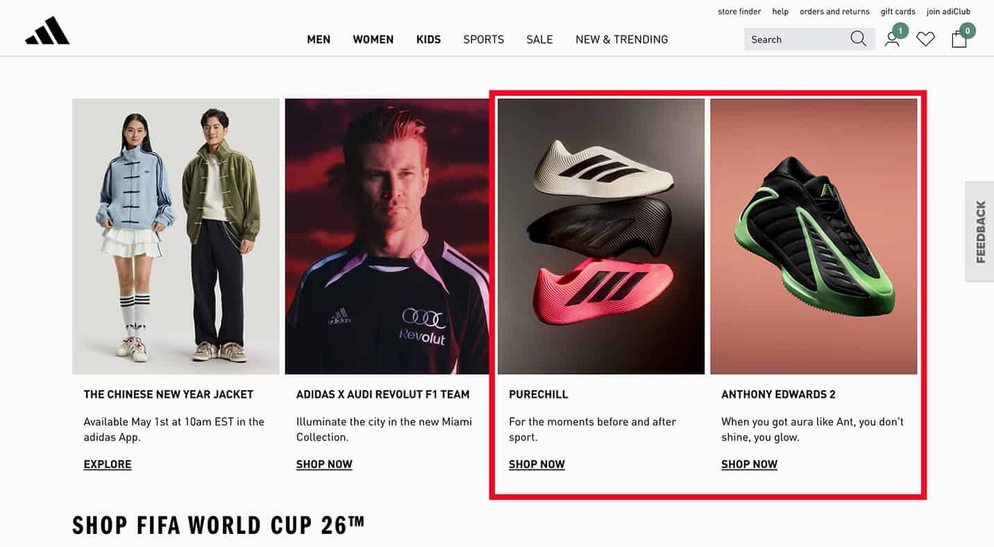
Adidas produces nearly any athletic wear you can imagine, but I probably don’t need to tell you that sneakers are the star of the show. The website homepage makes that clear by promoting a favorite shoe at the top, followed by new and best-selling sneakers below.
Beyond that, the site leans on categories to promote different shoes and products. It uses popular brand collabs like the Anthony Edwards shoe to catch your attention or speak to specific needs, like its “Purechill” selection of comfortable low-cut classics to slip-on slides.
As you scroll, the curated categories expand to showcase a broader range of seasonal essentials, like FIFA World Cup 2026™ federation jerseys. Additionally, if those initial categories don’t reflect what you need, there are several filters by gender, age, product, and more to help users easily navigate the site.
What we love:
- Collections drive “vibe-based” shopping: With recommendations based on cultural aesthetics (such as Balletcore, Y2K, and Festival Looks) and major sporting milestones like the FIFA World Cup 2026™.
- Lifestyle icons lead the digital storefront: Recommendations lead with high-demand footwear as the primary entry point before cross-selling into performance apparel and specialized accessories.
4. Mixbook: Browse with Easy-to-Use Categories

Mixbook sells customized products and gifts like designed photo books, calendars, and cards. Each category has several templates and designs to choose from, so the site uses categories to help users create and purchase products without overwhelming them with choices.
The main menu is the first touchpoint and lists the most popular products and occasions. Hover over an item and you get a dropdown of specific use cases, like products for holiday gifts or wedding planning.
As you scroll, the menu previews a smaller selection of products before diving into best sellers, themes, and visual examples to inspire your purchase. Each product page also shows design options and inspiration to make customizing your photo product easier.
What we love:
- The main menu highlights key products with the ability to select specific occasions for easy navigation.
- Categories further break down by material, purpose, and occasion to find exactly what you need.
5. Williams Sonoma: Prioritize Great Menu Design

Menu navigation is important for any website, but that’s especially true if your e-commerce site has a huge product catalog like Williams Sonoma. This retailer sells everything from kitchen gadgets to garden furniture, so intuitive navigation is essential.
The site relies on a detailed navigation menu to organize these products. Williams Sonoma’s main menu is tiered with product categories and occasions. Additionally, there’s an easy-to-use site search bar at the top of the page so users can find exactly what they need.
Further, Williams Sonoma has several brands under its name, including Pottery Barn. While it’s not the priority, the site also includes a mini menu at the top to direct users to these additional sites for more options.
What we love:
- Detailed menus with dropdowns allow users to easily navigate the site and find what they’re looking for.
- A site search bar improves user experience for products not listed in the main menu or otherwise difficult to find.
6. Tripadvisor: Promote Products with Real User Experiences

While not a traditional retailer, Tripadvisor helps users plan their next great getaway with recommended events and excursions, as well as lodging and flight options. They have a great menu and localized site, but they really stand out with their social proof.
On the homepage, you can scroll to see popular events, each showing five little green bubbles – average user review ratings – to help you choose an attraction. There are also Travelers’ Choice Awards to showcase the best, most popular experiences.
This allows users to book a trip with confidence that they’ll have a good time. This is especially valuable for Tripadvisor as alternatives like Google and Airbnb already have real user reviews.
It’s also valuable for traditional retailers competing with marketplaces like Amazon, which promote user reviews that build trust.
Many e-commerce content management systems have built-in features or plugins to help you implement review sections on your product pages, and once you have them, AI tools like Optiversal can help you use them to spin up long-tail landing pages.
What we love:
- User reviews make it easier to compare and book great experiences.
- Travelers’ Choice Awards help Tripadvisor stand out from other services that include user reviews and promote top attractions.
7. Joy: Engage Users With Creative Design

Joy has two key product categories for the big changes in your life — Joy Wedding and Joy Baby. The site helps you plan weddings and baby showers, build registries, and more.
For most people browsing this product, this is their first wedding or baby, and there’s a lot to learn. So, the site excellently showcases exactly what their product offers and how it fits your vision.
The homepage video is heartwarming and speaks to the emotion and excitement of planning these major milestones. As you scroll, you see a cute elopement moment turn into event maps, RSVP details, and calendar reminders to show all of the work that goes into planning and how Joy can help.
This creative design clarifies Joy’s offerings while also addressing what a user is likely feeling, thinking, and seeking when they open the site.
What we love:
- Unique site designs speak to the audience itself and showcase the product offerings.
- Interactive product lists visualize Joy products and how they fit into your big day.
8. TimberTech: Use Social Proof To Encourage Sales

TimberTech is a composite and PVC decking manufacturer that provides stunning, low-maintenance deck solutions. The site does an excellent job showing what makes them so great with photos, videos, and real user stories.
Once you open the homepage, you’re greeted with a video slideshow of deck examples. Below, you learn the specific values TimberTech builds into their product, then read what real owners think to build confidence that this is the decking for you. You can even order a free sample.
What we love:
- Free sample CTAs make it easy to try without risk.
- User stories and reviews build confidence in the product and manufacturer.
9. Audible: Keep Product Shopping Simple

Audible.com is a subscription audiobook service provided by Amazon, so product variety is vital for earning signups. The homepage keeps it simple and shows several audiobook covers, beginning with bestsellers.
As you scroll, you see popular categories, Audible exclusives, and more top titles before positioning Audible against other audiobook providers. This simple layout makes it easy to digest what Audible offers and browse titles to encourage users to sign up for a free trial.
What we love:
- A simple layout prioritizes the product offerings to earn new customers.
- CTAs encourage free trials to convert new subscribers.
10. StyleSeat: Split Your Site by Audience

StyleSeat serves two key and very different audiences by providing a hairstyle scheduling product and a hairstylist locator. Naturally, they designed a great consumer site that addresses those needs independently.
When you click the menu at the top left, it immediately asks you to choose between “For Professionals” and “For Clients.”
This splits the site experience by audience. It makes navigation simple and allows StyleSeat to cater its content, CTAs, and other conversion features specifically to each audience.
Once a user selects their path, everything from homepage messaging to service listings is tailored to that user type. Localized support is also built in – both clients and professionals can browse options available near them, reinforcing that personal, local touch.
What we love:
- Website navigation and services are split by audience to improve the user experience and navigation.
- Localized support allows both audiences to browse by what’s available near them.
11. Airbnb: Promote Products With Detailed Thumbnails

Airbnb also relies on localized recommendations, but it goes a step further with highly detailed product thumbnails. As soon as you open the website, you see amazing rentals near you – including photos, reviews, prices, and availability – all on a single product card.
This immediately engages consumers and sets the shopping mindset. Photos are a great inspiration, while specific features make it easy to compare getaways. With a couple of clicks, users can easily book their accommodation, and that kind of ease is one of the best ways to increase conversions.
What we love:
- High-quality photos and rental descriptions make it easy to compare options.
- Key takeaways like prices, location, availability, and more also improve user experience.
12. Back Market: Market With Your Values
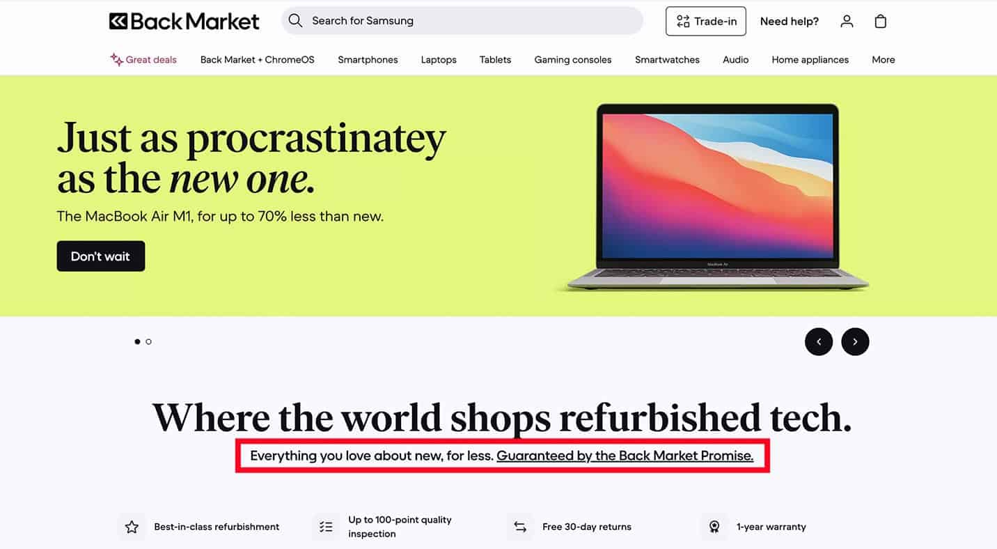
Back Market sells refurbished technology and positions itself as a sustainable alternative to buying new.
Immediately, the site claims that it offers “everything you love about new, for less, ” with a trademarked guarantee. It further reinforces how the verified refurbished tech benefits your wallet as well as the environment by reducing carbon emissions.
This values-driven messaging is smart. As a majority of consumers look for products that align with their values, leading with sustainability helps Back Market stand out against competitors and attract a loyal audience of eco-conscious shoppers.
What we love:
- Highlights their values to stand out from the competition and attract value-driven customers.
- The site ties its values to consumer benefits to encourage sales.
13. Crate&Barrel: Group Products by Price and More

Like Williams Sonoma, Crate & Barrel sells a wide variety of home products and has a robust menu navigation to support it. What we really like about Crate & Barrel’s site is how its homepage features are deliberately designed to drive sales.
First, you can easily browse items by price range, which makes shopping a breeze for budget-conscious customers. The homepage also prominently promotes current sales, seasonal items, and top products to encourage users to start filling their cart.
The more you scroll, the more you see bright, inviting photos and even subtle animations with design inspiration — you can practically shop straight from the homepage without deep-diving into menus.
What we love:
- Price-based categories encourage shoppers of every budget to build a cart.
- Homepage products are well displayed with photos and animations.
14. PAKA: Lead With Your Value

Paka Apparel designs sustainable winter wear insulated with alpaca wool, and the homepage immediately dives into what makes the product great. Videos of outdoor enthusiasts climbing rocks and hiking across glaciers show how versatile the product is. Lower, the page details the advantages of alpaca wool before showcasing products.
This helps Paka emphasize how they differ from the many outdoor apparel companies out there. It also helps connect to customer values and showcases Paka’s use case for outdoor sports.
What we love:
- Differentiates the product from other providers with use case examples and its alpaca wool benefits.
- Uses values to attract customers and boost sales.
15. Angi: Switch Up Your Search Options

Angi is a location-based service, so its homepage immediately requests your zip code to help you find qualified professionals in your area. But you can also search by projects like decks and cleaning, or industries like landscaping and roofing.
Each navigation opportunity has a different design to address shopper needs. This keeps the homepage design interesting and speaks to different customer browsing styles. While some consumers will immediately search by zip code, others might see what they’re looking for in the industry icons.
What we love:
- Navigation variety makes it easier to find what you’re looking for based on need or shopping style.
- Reviews and cost estimates address user needs immediately and ease decision-making.
16. Girlfriend Collective: Show Diversity in Product Images

Girlfriend Collective is a sustainable athletic apparel company geared toward female-presenting folks who want to get their sweat on. The site does an excellent job promoting its ethics and inclusive values through both copy and design.
Product images feature diverse models of all shapes and sizes, showing how Girlfriend Collective fits real bodies and proving activewear doesn’t have to be exclusive.
If you scroll further down, the site integrates the brand’s priority of sustainability messaging into the product journey. High-performance activewear is explicitly framed through their origin story (turning recycled water bottles and fishing nets into high-quality textiles).
What we love:
- Diverse models showcase the product in various sizes, colors, and fits.
- Sustainability messaging provides transparency into how recycled textiles deliver both style and ‘real-life’ performance.
17. Glossier: Make Checkout Easier

Glossier is a beauty brand offering skincare, makeup, and more. Their e-commerce site features clear product photos and descriptions, and it makes checkout as easy as possible with an “Add to bag” button (plus color options) built into each product thumbnail on the homepage.
Shoppers can select a shade and add a product to their cart without ever leaving the main page – a frictionless experience that many beauty brands are now adopting. Hovering over product thumbnails often shows additional product images or angles, giving more context without extra clicks.
Glossier effectively turns its homepage into a one-stop shopping experience: you discover products, read a blurb, and can immediately add to cart.
What we love:
- One-click add-to-cart functionality from the homepage drives conversions and streamlines the user experience.
- Thumbnails show additional product image previews when you hover for more information.
18. Lush: Differentiate With Create Branding and Design

Lush is another beauty brand with clear values and a very specific style, which is clear the second you open the site. The website’s design leans heavily into Lush’s unique branding: bold, handwritten-style fonts, vibrant and moody product photography, and a playful layout that immediately sets it apart from more cookie-cutter beauty retailers.
This commitment to brand personality helps Lush stand out in a crowded market. The site’s visuals and copy work together to convey a lush, indulgent experience (much like their products).
At the same time, the homepage is practical: it features product categories with thumbnail images and prices, making it easy to start shopping right away despite the artsy feel.
What we love:
- Embrace your brand with consistent style choices across your site.
- Stand out with creative photos, phrasing, and other content choices.
19. Bose: Offer a Deal with a CTA

Bose is well-known for its audio quality, and it’s also known as a rather premium product. Luckily, the site offers 10% off when you sign up for Bose communications. Not only does an offer like this encourage a sale, but it also allows you to collect customer data and stay in contact to help convert future sales.
Sprinkle CTAs with special offers and product links throughout your home and shopping pages to entice consumers and build engagement.
What we love:
- Use CTA deals to boost your sales.
- Collect customer contact information to build relationships and encourage future sales.
20. ZOKU: Sleek Design Meets Multi-Path Navigation
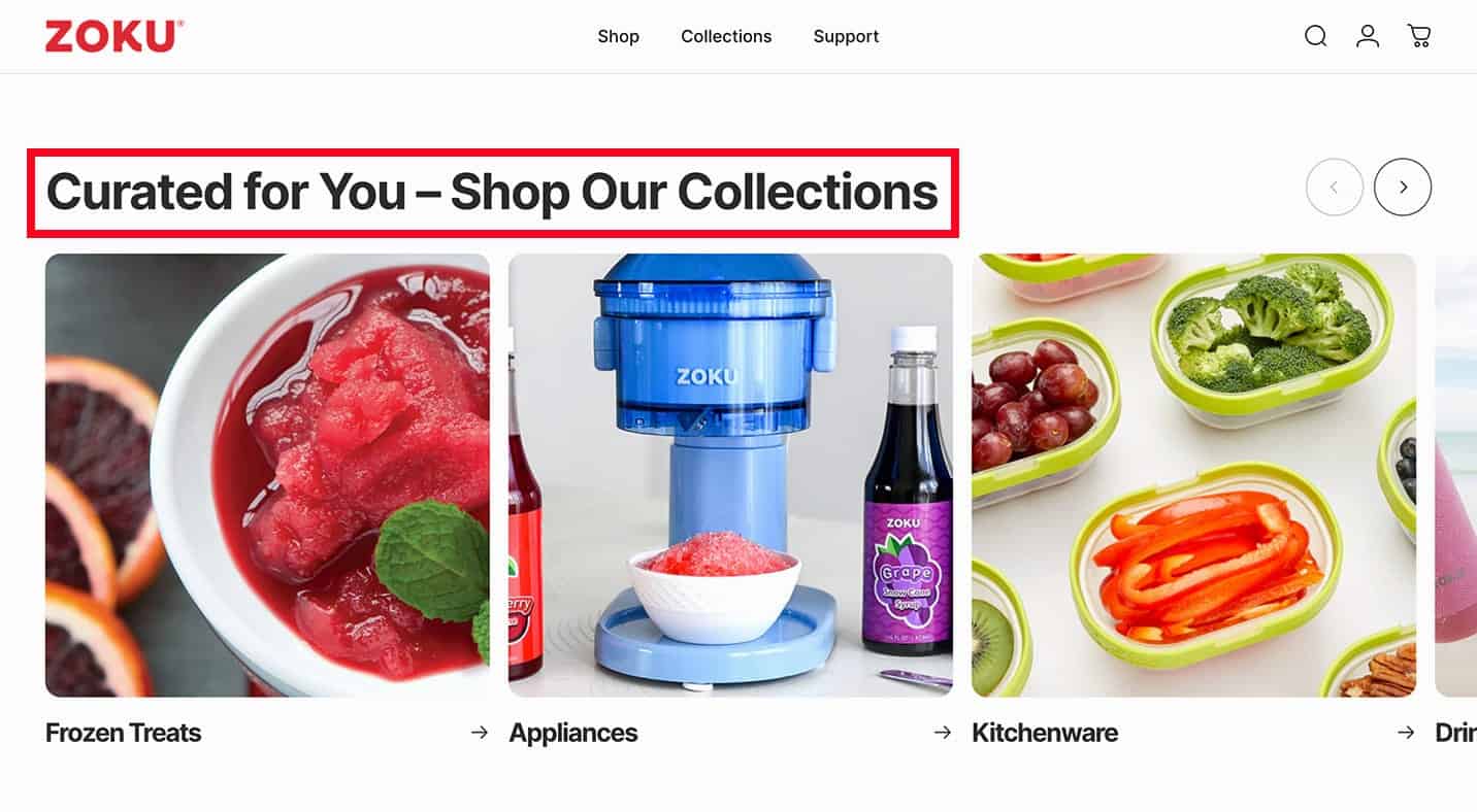
ZOKU is another lifestyle brand with clear values and a very specific aesthetic, which jumps out the second you open the site. The website’s design leans heavily into ZOKU’s sleek, functional branding. You’ll find clean lines, bright and airy photography, and a minimalist layout that immediately sets it apart from more cluttered kitchenware retailers.
Their commitment to a modern, “smart-living” personality helps ZOKU stand out in a crowded market. The site’s visuals and memory-based cart convey a fresh, innovative experience (much like their signature ice pop makers and hydration gear).
The homepage is also highly practical. Despite the high-end, design-forward feel, clear product collections and bold calls to action make it easy to discover new arrivals and bestsellers right away.
What we love:
- Product-focused navigation prioritizes core lifestyle categories (like “Drinkware” or “Kitchenware”). The website lets users quickly dive into specific product lines, closing the gap between connecting shopping intent and conversion.
- Curated collections like “Back to School” go beyond basic categories to help shoppers find items tailored to specific needs, ages, or seasonal moments.
21. T.Patterson Surfboards: Design for Diverse User Journeys
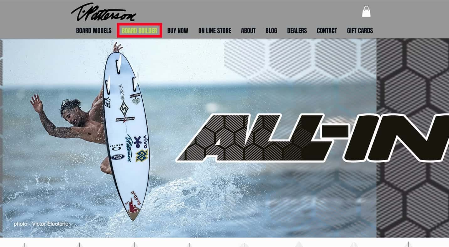
T.Patterson Surfboards is a performance-driven brand, and its homepage reflects that. The site immediately invites you to find the perfect ride by highlighting its “Board Builder” and “Stock Boards” options. But you can also search by specific board models like the “Rising Sun” and “Next Level,” or browse categories like accessories, clothing, and fins.
Each navigation opportunity has a different design to address surfer needs, which keeps things interesting and speaks to different customer browsing styles.
While some riders will immediately dive into the custom Board Builder to spec out their own dimensions, others might find exactly what they’re looking for by scrolling through the high-performance action shots or browsing the new arrivals in the online shop.
What we love:
- Interactive customization tools offer a highly personalized experience where surfers can specify exact dimensions, volume, and even custom airbrush designs.
- Performance-driven visual categorization like “Travel Step-Up” helps surfers identify the right board based on the specific wave conditions they plan to ride instead of just aesthetic preference.
4 Tenets of the Best Consumer Websites To Emulate
The best e-commerce websites make shopping simple and address key customer needs. What this looks like for your site depends on your target audience and products, but there are several ways to do it:
- Trust-building signals like customer reviews, free returns, and warranties build purchase confidence.
- Bulleted product features in thumbnails and product descriptions make it easier to compare products and competitors.
- Great navigation with filters, categories, and search bars improves user experience and optimization. Responsive, mobile-first design is a must here, as over 92.3% of internet users access the web via smartphones as of 2025.
- Optimized sites with keyword strategies, authority, and a great consumer SEO strategy have more visibility to reach more customers.
Revamp your e-commerce website to include all of these features, and we’re sure you’ll see more traffic and revenue. If you don’t know where to start, you can always partner with a trusted e-commerce agency.
Level Up Your E-commerce Website and UX
A great consumer website is designed to sell, and each of these e-commerce website examples shows specific features you can use to improve your site and drive conversions.
From e-commerce SEO to an improved checkout experience, a great consumer UX is vital for your business’s success.
For instance, integrating AI chatbots to handle common questions 24/7 can elevate customer service on your site, ensuring shoppers always get timely answers even when your team isn’t available. Mobile optimization is equally critical – with most shoppers browsing on phones, a fast and responsive mobile site will keep users engaged (and Google happy).
Want to boost your visibility on search and reach new consumers? Siege Media is here to help. We specialize in e-commerce content marketing with a team of over 110 expert content marketers, product SEO specialists, and detailed designers. Just check out our case studies to see how we can level up your next consumer strategy.