
So you’ve just completed writing your best work. You’ve done your keyword research and even constructed a catchy title. Now it’s time to add a few stock images and hit publish, right? Wrong.
By the time you’ve reached the end of this sentence, users will upload more than 180k images to the internet.
The way of digesting information has evolved, and visual mediums now play a decisive role in whether your content (and brand) succeed. Blog post images especially are more important than ever to help your content rank.
Today, a well-written post can only get you so far in the search engine results pages (SERPs). In order to be successful, you need to optimize your blog images to be engaging and complimentary to your writing.
In this post, I’m going to show you not only how to optimize your blog post images, but also how to use imagery in a way that will resonate with your audience.
Table of Contents:
- Enhance Blog Structure With Images
- Design for the SERP
- Adopt a Mobile-First Mentality
- Consider the Fold
- Avoid Embedded Text
- Abide by ADA Compliance
- Upgrade With Screenshots
- Optimize Files for Page Load Speed
- Upload Images at 2x Size
- Compress, Compress, Compress
- Implement a Lazy Loader
- Choose the Right Stock Photo
- Prioritize Pictures With People
Blog Post Image Best Practices
Odds are, you are not a graphic designer. But I’m going to let you in on a little secret:
These best practices have helped me generate hundreds of thousands of clicks for my clients — and trust me, they’re easier to implement than you think.
Don’t let design negatively impact your blog’s performance. Optimize your imagery with these 13 steps and get your content ranking.
Did You Know?
When businesses dedicate 10%-50% of their content efforts towards content design, they are 33% more likely to report successful results.
1. Enhance Blog Structure With Images
Be honest with yourself.
It doesn’t matter how well-structured your blog post is, you only have seconds to capture the attention of today’s internet user — eight seconds to be precise, according to a study by Statisticbrain.com.
Some industry authorities try to quantify an exact word count for how often to include images throughout your blog post. However, there really isn’t a perfect metric.
Instead, you can start by using images to compliment your post structure.
For example, a great spot for you to insert a blog post image is directly following an H2 header so that you can set the tone for copy in that section.
We dive more into how to structure your posts for SEO here.
Be mindful, though, and try not to plug an image into your content just for the sake of having something there.
Give every visual a purpose, but treat your blog like a YouTube video, and break up those long, drawn-out monologues with a visual to keep users engaged and help reduce reading fatigue.
Comb through your post and be your own audience. If you feel that there’s an opportunity to enhance or further help convey a point, consider adding an image.
Here is a helpful list of image ideas to break up your creative blog content and keep your audience engaged:
- Data visualizations
- Surveys and statistics
- Stock images
- eBooks and tools
- Pull quotes
- Newsletter CTAs
- Bulleted lists
2. Design for the SERP
Marketers and SEOs alike often ignore the power of imagery in regards to the SERP. According to MozCast, more than one in four results show images.
In addition to that, the Google images tab will give you a good indication of things people actually want to see in their search queries.
![]()
You should take advantage of this feature early in your writing process so you can tailor your copy around an image — not the other way around.
There’s another key element on the Google Images tab to look for when designing an image for your blog post. You’ll notice occasionally that image results for your searches contain actionable tips or relevant information.
This is a key takeaway when it comes to deciding whether to include a stock image for a topic versus something more meaningful, such as a data visualization.
Ultimately, ask yourself this: “If I remove the context from my blog post image, does it have the capability to stand on its own?”
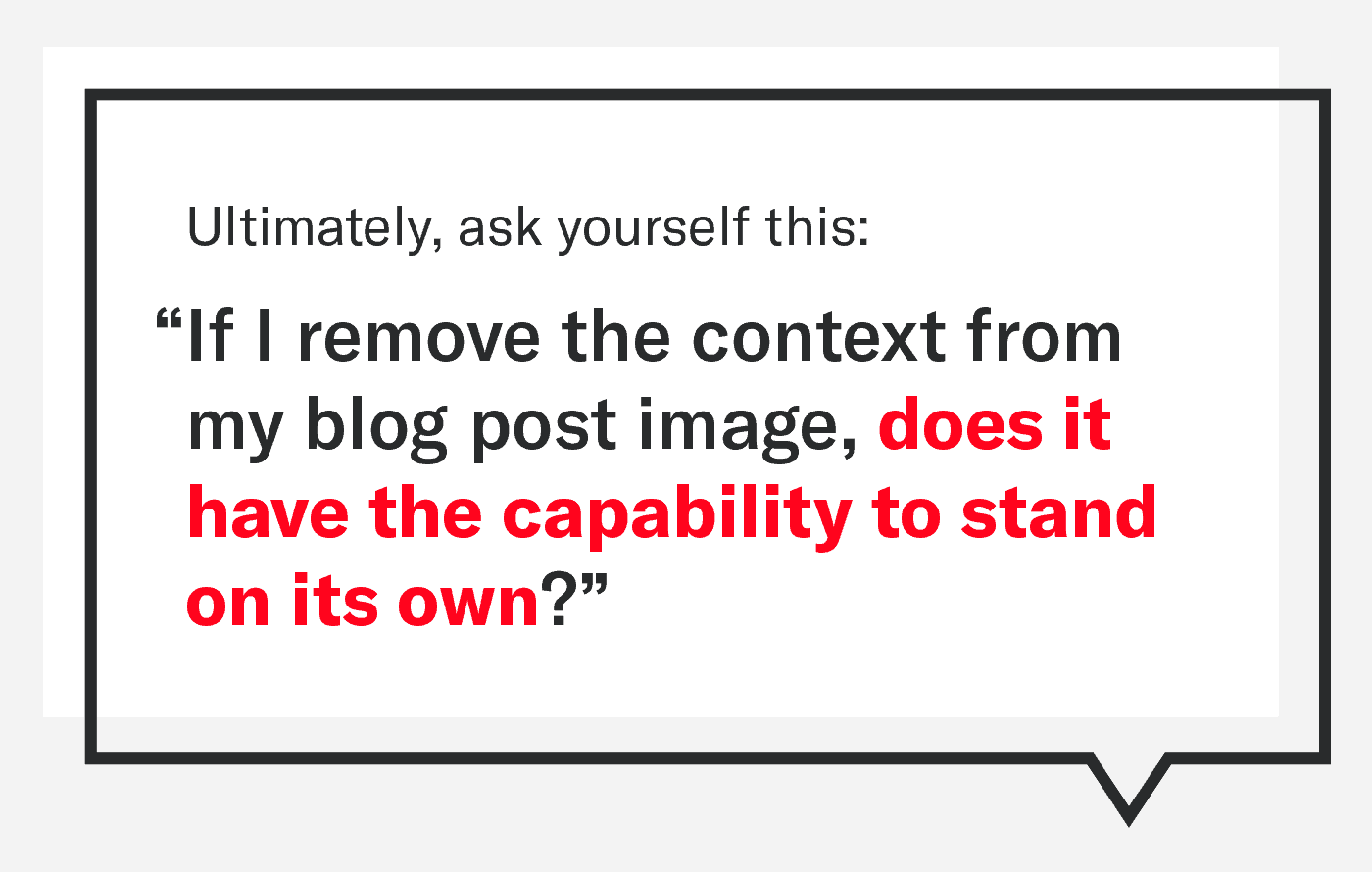
If your visual has no purpose other than to look pretty, it’s probably best to remove it entirely and focus on something that has a chance to generate clicks.
Here are some action items to help you start designing for the SERP:
- Reference the Google images tab to see what’s ranking
- Look for ways to stand out visually from what already exists
- Identify opportunities where you can elevate an existing image with key information
Do you need to create every image in your post with image queries in mind? Definitely not, but ignoring Google Images completely means you’re practically throwing away clicks.
Check out our video below for an even deeper dive on how to use Google images to rank better.
3. Adopt a Mobile-First Mentality
According to Statista, mobile devices generate nearly 60% of global web traffic, and that number is only expected to grow.
While it’s easy to first think about the desktop user experience, it’s important to keep in mind that horizontal blog images may not translate well on mobile devices — particularly the images that contain text.
53% of mobile users will close a website if it takes more than three seconds to load. (Think With Google via Siege Media’s Must-Know Content Marketing Statistics)
If any of your blog post images do contain text, check how small the font appears on a tablet or phone. Too-small text leads to a negative user experience and may actually reduce the user’s session duration.


In our list of blog design best practices, we strongly suggest that blog copy on any screen should be 16–18pt minimum to optimize user readability.
As a rule of thumb, if your blog’s desktop display is wider than 600px, your image copy on mobile could be nearing an unreadable font size.
If you want two completely different images to show on mobile versus desktop you can include both images on the page with different CSS classes like this:
<img class="mobile-image" src="PathToMobileImg.jpg" />
<img class="desktop-image" src="PathToDesktopImg.jpg" />
Then in your style.css you can hide the version you don’t want to show depending on the version of the site being displayed:
/* hide mobile show desktop */
@media only screen and (min-width: 992px) {
    .mobile-image {
        display:none;
    }
    .desktop-image {
        display:block;
    }
}

/* show mobile hide desktop */
@media only screen and (max-width: 991px) {
    .mobile-image {
        display:block;
    }
    .desktop-image {
        display:none;
    }
}
So, if you find that your blog images are difficult to read on smaller screens, create and display a mobile-oriented version instead.
4. Consider the Fold
Header images, also known as hero images, are great for conveying a visual representation of your entire article.
However, if not handled properly, a header image can actually negatively impact user experience while simultaneously forcing important keywords beneath the fold.

Consider the two examples above.
On the left, you’ll see a hero image that takes up the full blog width and pushes two precious paragraphs of content below the fold.
On the right side, you’ll see an image that retains visual significance while prioritizing the keyword above the fold.
While there’s no universal metric to calculate hero image height, I find that displaying images around 450px tall on desktop and 225px tall on mobile is often a good balance for prioritizing keywords.
One additional bonus of having a shorter hero image is that you’ll likely produce smaller file sizes, leading to faster page load speeds.
5. Avoid Embedded Text
While companies are making incredible leaps in Optical Character Recognition (OCR) technology, we’re not at the point yet where we can afford to let images do all of the talking.
While blog post images should compliment the information at hand, always ensure that certain key text is still maintained within the blog copy itself so that search engines can crawl it successfully.
Here is a list of text elements that you should avoid embedding solely within blog post images:
- Keywords
- H1s and H2s
- URLs or anchor text
While it’s okay for your images to contain the items from the list above, they shouldn’t be the only source for that information.
This is important for two main reasons:
- First, text translation tools cannot access embedded text, leading to a bad user experience for those trying to read through your article in a language that is easier for them to digest the information.
- Second, some users may not have access to view your images, and context will therefore be missing when the article jumps paragraphs without the warning of a now-missing H2.
This leads me directly into the next topic: ADA compliance.
6. Abide by ADA Compliance
A study found that about 52% of web images actually fail to meet the accessibility requirements under the Americans with Disabilities Act (ADA) Standards for Accessible Design.
Luckily, there are three actions to help optimize accessibility for your blog post images:
- Add alt text to every blog image
- Don’t forget about dark mode users
- Use proper color contrast
Add Alt Text to Every Image
Alt text (sometimes called an alt tag or alt description) is primarily used for those with visual impairments or lower internet speeds, but it’s also very important for SEO-friendly content.
If you’ve ever had a poor internet connection, alt text was likely what you saw in place of an image that failed to load. In other words, alt text is a descriptive sentence assigned to an image in order to convey context.
This description is also used by search engines to better crawl through your page and understand what your post is about, making it directly impactful in where your site ranks in the SERP.
Your CMS most definitely has a dedicated area to include alt text when uploading images, so take full advantage and add descriptions to every image.
Don’t Forget About Dark Mode Users
If you’re like me, you find the white backgrounds of most web pages and apps to be harsh on the eyes.
In 2019, iOS and Android both introduced dark mode, which inverts your screen to show white text on a black background.
Dark mode has been one of my favorite additions to mobile user experience since its release, hands down. In fact, more than 80% of Android owners use dark mode, according to a study by AndroidAuthority.
So, where does dark mode tie into blog post images? It all boils down to image transparency.
![]()
Image transparency refers to the see-through portions of an image file, which is typically a PNG file type.
Transparency in blog post images can negatively impact your user experience, because any dark text will have extremely low contrast and appear missing to a dark mode user.
Therefore, the best way to optimize images for both dark and light mode users is to add a background color (like white) behind any images containing text.
Use Proper Color Contrast
You may love the color yellow, but it’s a safe bet to assume that it won’t be readable on a white background.

While this example is more obvious, there are certainly other color combinations that fail to meet Web Content Accessibility Guidelines (WCAG), which are in place to ensure all online users have equal accessibility.
In fact, a study by WebAIM found that nearly 84% of home pages contained low contrast text, the most common accessibility issue.
While black text on a white background provides the best possible contrast ratio for text readability, don’t let that shy you away from using your brand’s colors.
When in doubt, use an online contrast checker and aim for a minimum color contrast ratio of 4.5:1.
7. Upgrade With Screenshots
Optimized imagery doesn’t always require fancy design. Sometimes, a screenshot (with a little flare) is all you need to elevate your content.
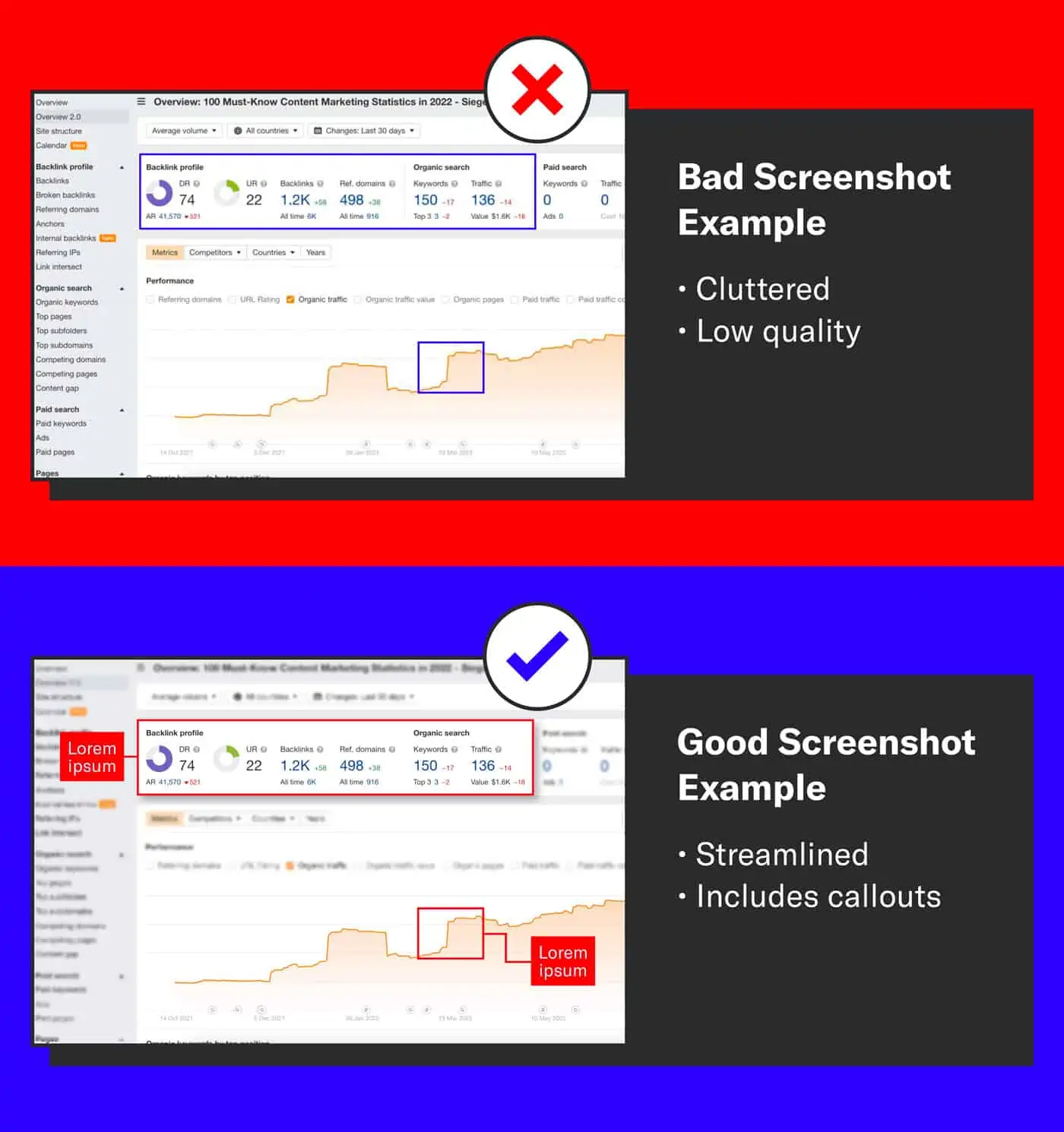
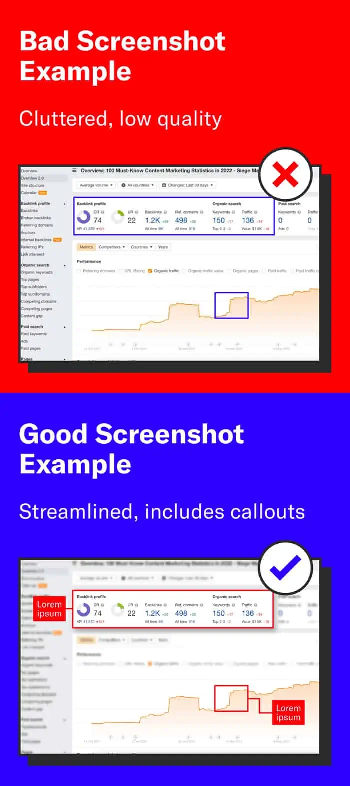
Use these three steps and start introducing a unique post image into your repertoire:
1. Take Higher-Quality Screenshots
Zoom in on your screen before taking a screenshot. Crawlable text and live charts will appear infinitely more crisp the closer you are to them.
2. Add a Border or Background Color
Include branded elements in your screenshots by adding a border or background color.
Not only do these help the screenshot stand out from the copy, they also create visual ties back to your brand.
3. Include a Callout
Introducing a circle or rectangle around an area of interest of your screenshot can increase scannability for your audience.
It will also provide context without muddying an image that already has a ton of text.
8. Optimize Files for Page Load Speeds
On average, blog post images account for more than 40% of your page load speed, according to studies done by Search Engine Land.
While this statistic can be discouraging, there are easy ways to determine whether you’re using the most optimal format for your needs or if you’re causing an unnecessary slowdown on your blog.
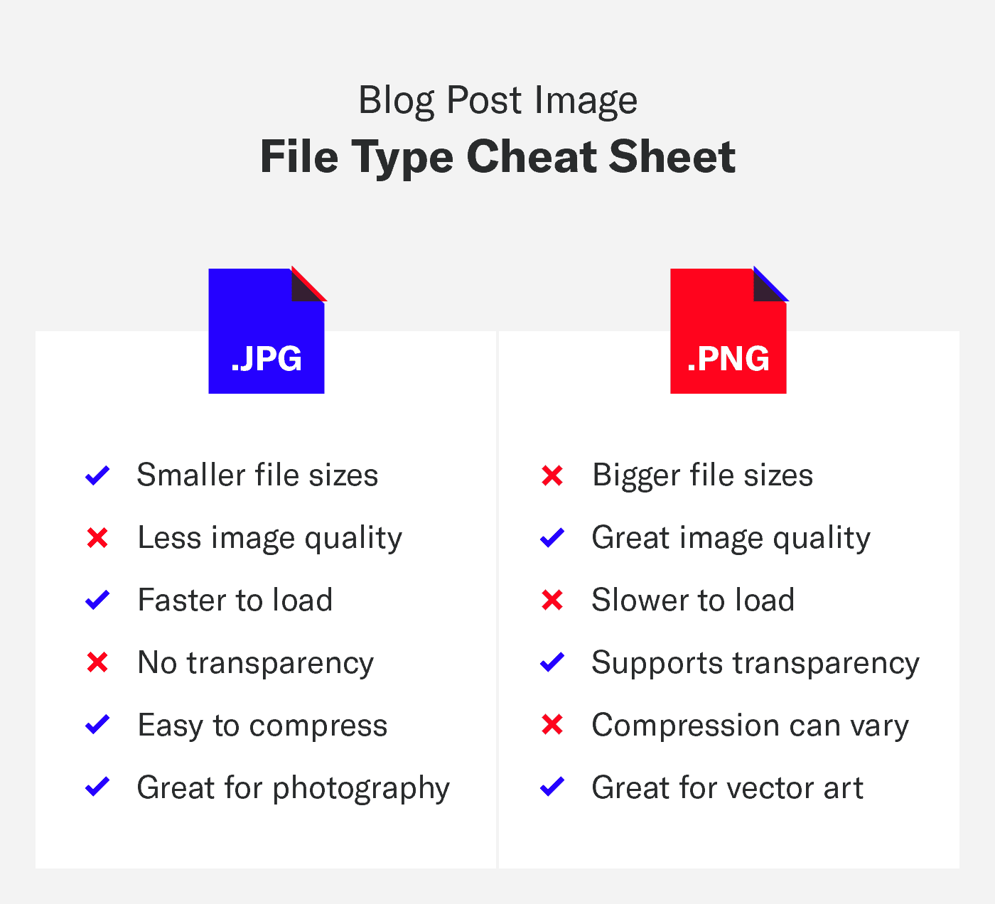
JPG and PNG are the two most commonly used image formats, and there are advantages and disadvantages when choosing between them.
In the next section, I’ll show you not only how to choose the right image format for your needs, but I’ll also give you an even deeper dive into an optimizing technique that your competition doesn’t even know about.
JPG vs. PNG: When To Use Each
Unfortunately, there’s no one-size-fits-all file type for blog post images.
JPGs and PNGs have advantages over one another, and it gets understandably difficult to keep track of their differences.
Therefore, I’ve put together a helpful list of benefits to help you determine which file type you should use to maximize your page loading times.
Use a JPG file type when:
- Your image contains stock photography
- Your image contains thousands of colors
- Image quality is not of maximum importance
Use a PNG file type when:
- Your image contains vector illustrations
- Your image contains very few colors
- Your image contains transparency
- Image quality is very important

What about WebP Files?
The WebP file type is still rather new, and even though these files tend to be smaller in size, it’s worth noting that not every browser supports them — yet.
Once the older browsers stop receiving support, you’ll start to see WebP formatted images a lot more. Until then, use them at your own risk.
Upload “Progressive” and “Interlaced” Images
I’m going to get technical for a moment.
While prioritizing file size gets us most of the way towards proper image optimization, there’s actually another image-exporting technique that often gets overlooked.
This technique affects how quickly your image physically appears on your page, and I guarantee it’s one that many aren’t putting into practice.
JPG: Progressive Image Benefits
JPG file types have the option of being saved out with two different presets: progressive and optimized.
Don’t let the word “optimized” fool you here. Always choose progressive.
Take a look at the diagram above. There is a ton of technical jargon behind this, but the TL;DR version is this:
- Progressive JPGs appear instantly and increase in clarity as the page continues to load.
- Optimized JPGs start as a chunk of blank space until the entirety of the image can be loaded.
Seeing a blank space on a website is just bad user experience with the potential of a higher bounce rate, so always export progressive JPGs for your blog post images.
PNG: Interlaced Image Benefits
In short, an interlaced PNG is the exact same concept as a progressive JPG.
An interlaced PNG is better than one that is non-interlaced, because this preset ensures that there is an image loaded immediately on the page.
Always choose the interlaced PNG preset for your blog post images.
9. Upload Images at 2x Size
Welcome to the world of Retina displays.
If you want to maximize image quality, especially on mobile, you’re going to want to start exporting your images twice as large.
They still display at 1x the size on your blog, but there’s a world of a difference in image detail when you resize a 1600px wide image into an 800px wide space.
The non-technical reason is because there are more pixels being jammed into a smaller space, thus giving the appearance of crispness.
One thing you need to keep in mind, however, is that a 2x file is going to affect page load speed due to the larger file size, but here’s a little secret:
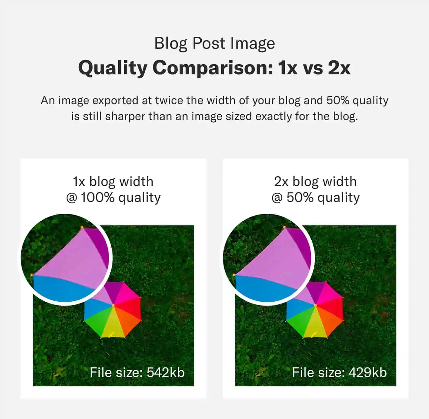

As you can see above, a 2x image saved at 50% quality will still appear sharper than a 1x image saved at 100% quality.
They’re both going to be about the same file size, but it’s those extra pixels that make all of the difference in image quality.
10. Compress, Compress, Compress
One problem you’re bound to run into is a significantly slowed down page load speed with too many blog post images.
This is especially apparent in blog post types like listicles and how-to guides, which often require anywhere from 10–20 visuals per post.
But page load speed and blog post images don’t have to be enemies.
In fact, a simple drag-and-drop into an image compression software can often reduce the file size of your blog images by 50–80% each (while still maintaining image quality).
Use the list below as your guide and compress each of your images so that they fall underneath these metrics:
- In-Post Images: Under 250kb
- Infographics: Under 1.5mb
- PDFs/Printables: Under 1mb
- Animations/Animated GIFs: Under 1.5mb
If you need a recommendation, I have found three great image compression tools that I use every day. Not only are they easy to use — they’re 100% free:
- TinyPNG makes it as easy as dragging and dropping.
- Optimizilla includes a slider to adjust image quality.
- ImageOptim has a desktop app, convenient for offline use.
11. Implement a Lazy Loader
A lazy loader is an HTML tag or plugin that prioritizes copy first so that your page loads seamlessly — especially if your blog post requires a lot of video, audio, or imagery.
Why is this important?
Loading heavier files last means your page prioritizes the copy, which looks great in the eyes of search engines.
Additionally, without loading delays from images, your blog page is going to show content almost instantaneously.
This is imperative, considering that a Think With Google study shows that more than half of your audience will leave if the site doesn’t load in three seconds.
Good news — if you’re using WordPress, you’ll find that they automatically apply a lazy loader to images with height and width attributes, but this feature is currently only available for images.
If you want the ability to apply this feature to more than just images — or maybe you’d like the ability to fine tune the controls — you’ll have to consider third party plugins.
Hubspot curated a great article full of free and paid alternatives.
12. Choose the Right Stock Photo
There are already a hundred articles in the SERP that will tell you to avoid photos that are “too stocky” or “too corporate.”
Let’s go beyond that.
Every brand has a voice, and every blog has a target audience — once you establish what yours is, leveling up stock photography will become second nature.
Start looking for ways to create a cohesive photo experience for your brand. There are easy ways to do this without spending hours on design:
- Find images with similar color schemes
- Add branded elements to photos, such as logos or shapes
- Differentiate photos with text
- Overlay a brand color on top of your images
- Use an illustration instead of a stock photo

Having trouble finding a lifestyle image that fits your needs?
Sites like Unsplash and Pexels offer free (and honestly good) stock photos for commercial use. If you have a budget, Getty is going to have an answer for 99.9% of your needs.
13. Prioritize Pictures With People
It’s human nature to respond to images of other humans.
I doubt anyone has gotten an emotional response from a laptop propped against a solid background.
Unless your brand is ironically corporate, here are some tips for finding a good pictures of people:
- Find subjects that are looking off-camera. Having eyes stare at you while you scroll can be creepy.
- Avoid photos that are overly posed. High fives are cliché.
- Scroll past photos with outdated technology. Don’t date your articles before they’re even published.
- Include diversity, but don’t ignore your target audience. Grandparents likely aren’t scrubbing through your health and fitness blog.
If a stock image is the right fit for your content, bring your audience back down to earth with images of real people doing real things. You’re going to build a lot more trust with your audience that way.
Apply What You’ve Learned
With the help of these best practices, you will be making a direct, positive impact to both your content and SEO strategy.
If you implement it correctly, you’ll start seeing faster page load speeds, better user engagement, more ROI from time spent on design, higher page rankings, and an increase in brand awareness.
If it sounds a little intimidating, just remember to trust the process. High-quality content is well worth it in the long run, and we’re here if you need us.
Check out our content marketing services and let us know how we can start generating content for your brand today.