
At Siege, we generate over $90 million in traffic value for our clients primarily through their blogs. But it’s not just the written word that’s driving these results — it’s also the blog design.
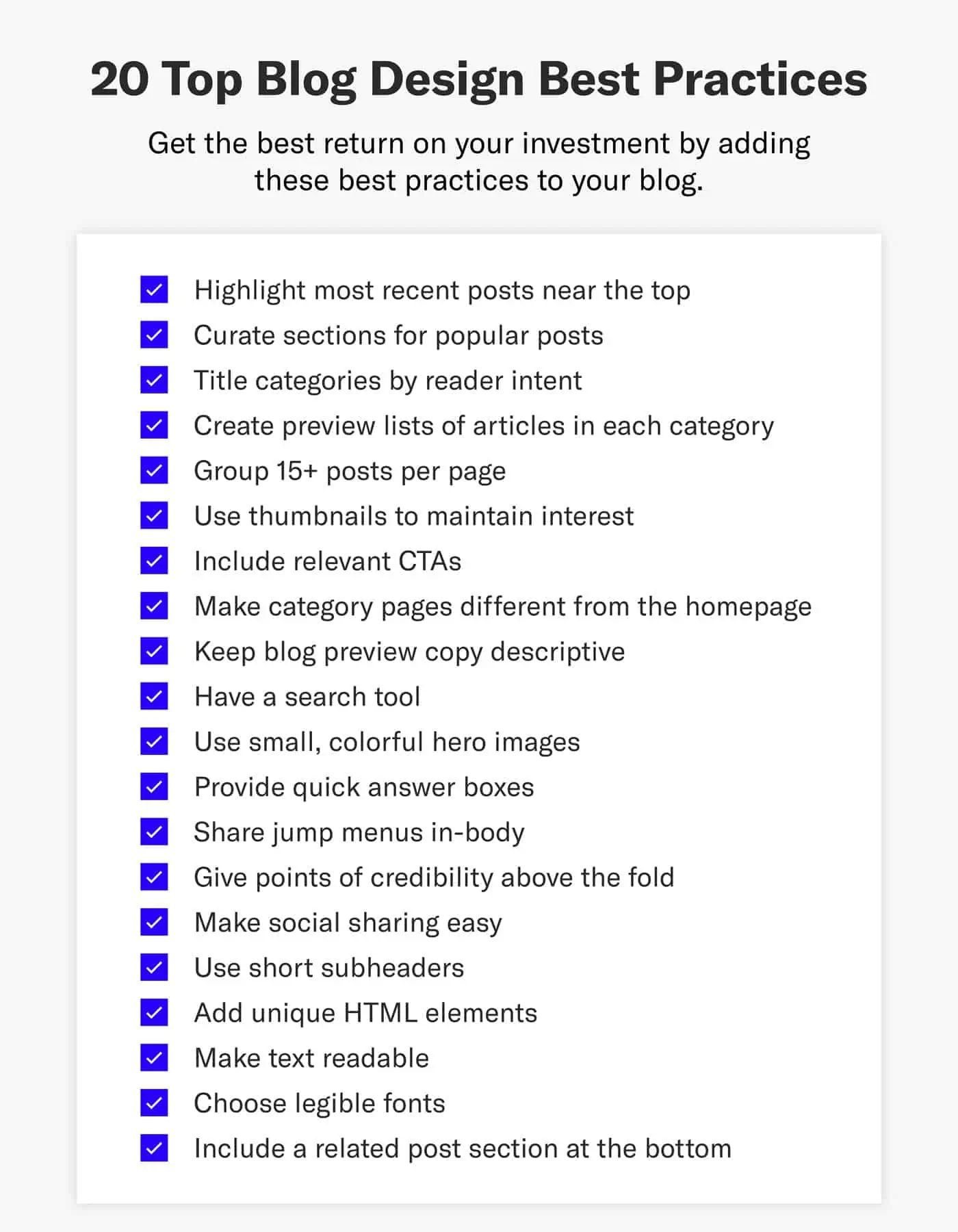
- Highlight Most Recent Posts
- Curate Sections for Popular Posts
- Title Categories by Reader Intent
- Create Preview Lists
- Group 15+ Posts Per Page
- Use Thumbnails to Maintain Interest
- Include Relevant CTAs
- Make Category Pages Different
- Keep Blog Preview Copy Descriptive
- Have a Search Tool
- Use Small, Colorful Hero Images
- Provide Quick Answer Boxes
- Share Jump Menus In-Body
- Give Credibility Above the Fold
- Make Social Sharing Easy
- Use Short Subheaders
- Add Unique HTML Elements
- Make Text Readable
- Choose Legible Fonts
- Include Related Posts Section
- Blog Design: Video Walkthrough
You see, we dedicated a lot of strategy to the blog design in order to generate the best results for our clients. Now it’s time to share the wealth so that you can provide your website visitors with the best user experience possible.
From the blog index to the blog post itself, learn from these blog design best practices to add to your success and content marketing results in 2023 and beyond.
1. Highlight Most Recent Posts
The standard blog layout used to list articles from newest to oldest. This approach has shifted to listing what’s most relevant for a blog to improve user experience.
The drawback to this is that new articles struggle to gain traction since older, more established posts get the best real estate. By creating a specific category for your newest posts and putting it at the top of the page, you can offer the best of both worlds.
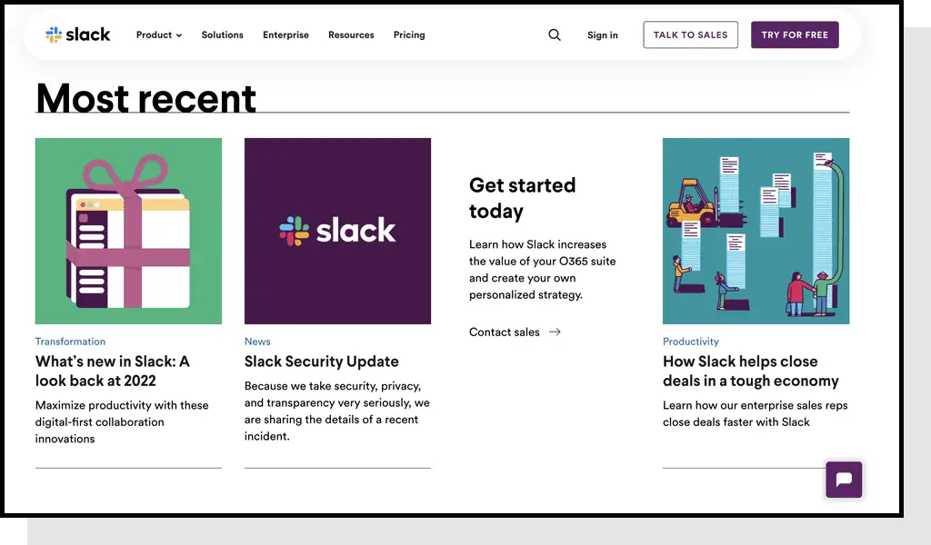
How They Do It
Slack, a popular communication program, showcases their most recent posts clearly — with additional navigation to explore the latest.
Ultimately, best performing articles can maintain their relevance while still providing the opportunity for visitors to find freshly-created content.
2. Curate Sections for Popular Posts
In addition to creating a “Most Recent” category, you can also create curated category sections.
You can think of this more as a library rather than a blog post with hand-picked content collected in sections like “Editor’s Picks” or “Most Popular.”
How They Do It
Customer service solution company Zendesk does a good job executing this blog layout strategy by having an “Editor’s Pick” section.
Now the editor has a prime place to put posts that are converting well or are particularly relevant to current events. Conversely, they could choose to use this section for posts that need an SEO boost by placing them higher in the site architecture.
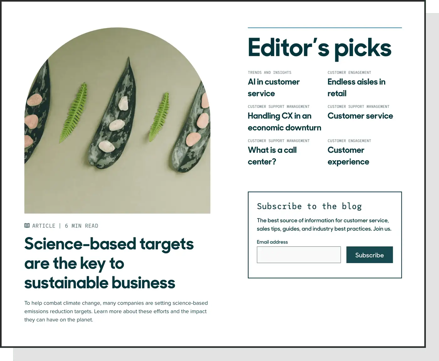
It’s important to have some kind of editorial selection where you can manually select articles that are more likely to be seen by users and Google alike.
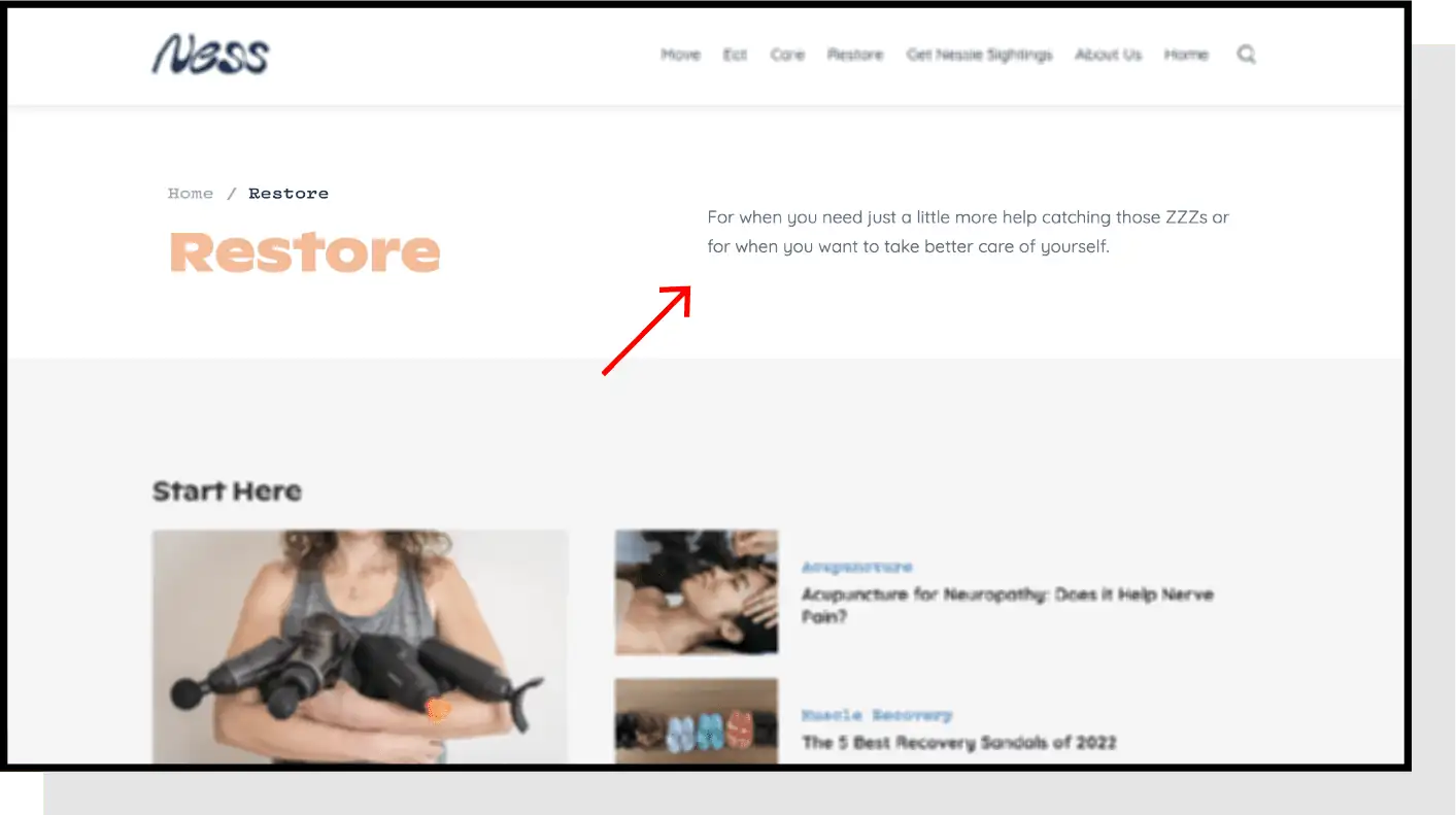
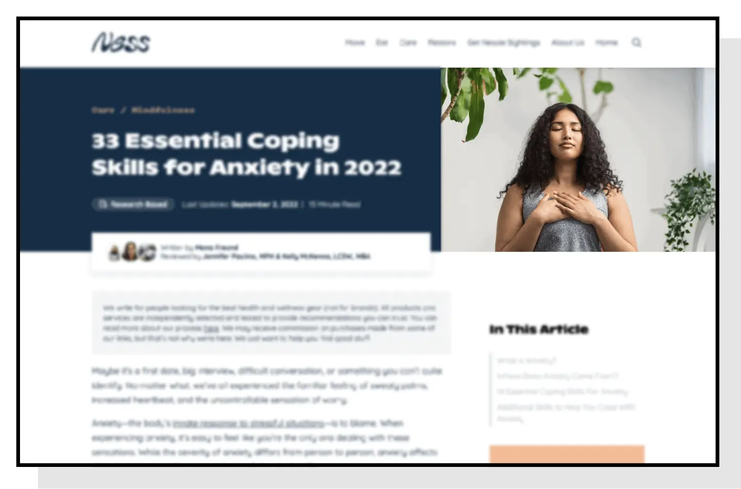
3. Title Categories by Reader Intent
A surefire way to get readers to bounce from a page is to confuse them right out of the gate with where to dive into your content. For this reason, your blog categories should be titled with reader intent, or the purpose for them visiting your site.
If you’re in a vertical where multiple buyer personas use your product, the content section should direct them appropriately. If you were to blend this content, you’d immediately be making 50% of the visible posts irrelevant to them.
When defining categories, you’ll ideally be thinking not just by persona, but also by the sub-tasks the categories are trying to achieve.
Visitors may not initially think of their query falling under your designated category, but by seeing previewed articles they’ll better understand how things are organized.
By allowing users to quickly go to a specific category, you’re enabling them to find articles that are relevant to their search intent. As a result, the overall content experience is improved and visitors are incentivized to stay on the site for longer periods.
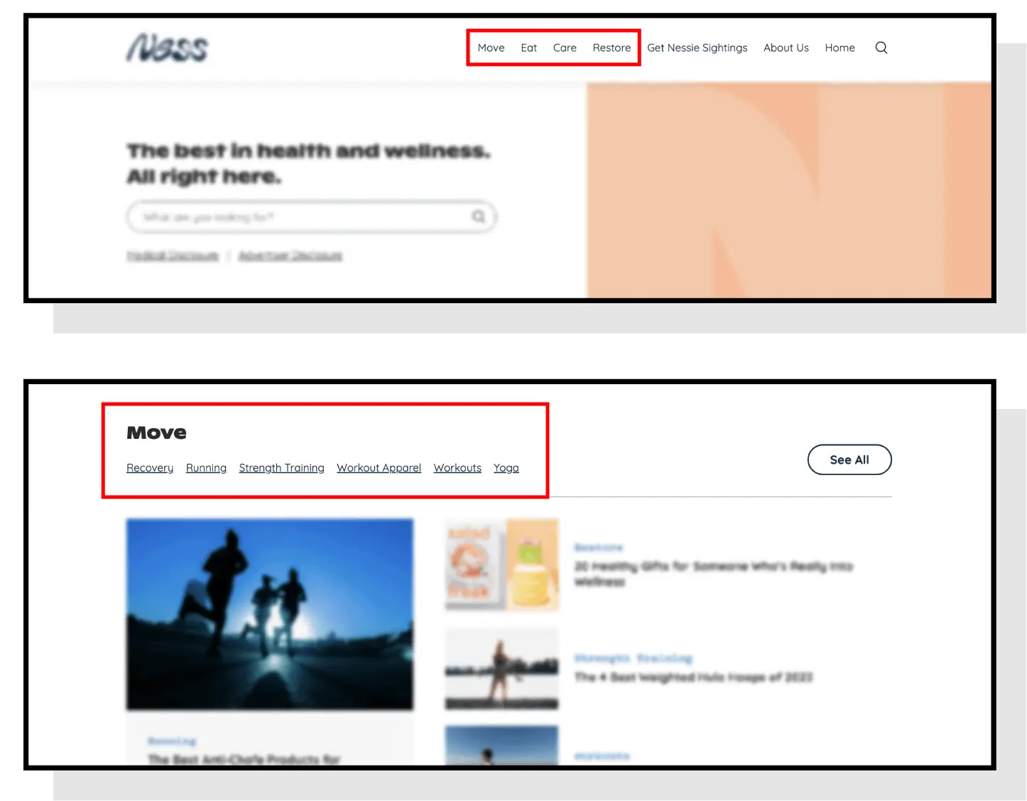
How They Do It
At the top of their blog, Ness identifies five categories for visitors to quickly find articles relating to exercise, diet, and more.
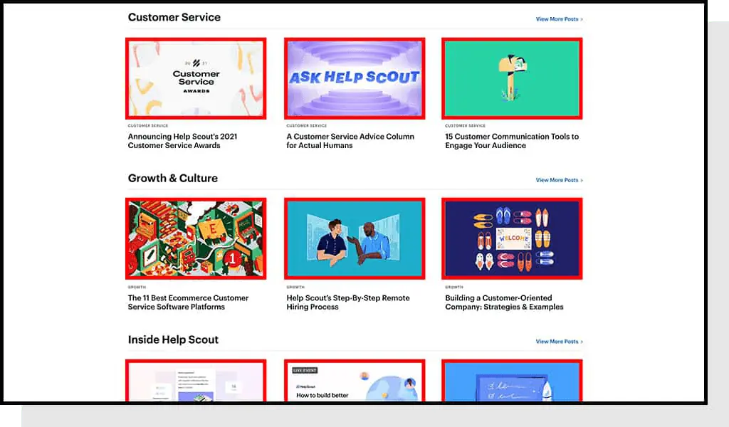
4. Create Preview Lists
To execute this blog design best practice properly, you’ll want to limit the number of categories to around three to five. Too many categories will make it difficult for visitors to find what they’re looking for, which defeats the purpose.
You can also add subcategories if the blog covers a wide range of topics and it would benefit from further organization.
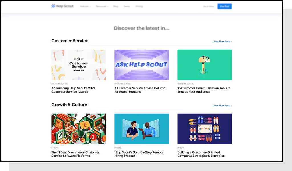
How They Do It
Help Scout includes Customer Service and Growth & Culture categories in the main blog index with a few examples for each.
If you have a hard time deciding on which articles to include as previews, you can default to whichever articles are most recent.
5. Group 15+ Posts per Page
A common misstep that blogs make is to index only a handful of articles on a page. If every page only shows six articles, they end up getting buried in the architecture.
This isn’t very constructive for search engines or users.
This blog layout best practice is to make 12-15+ posts visible per page to get more articles closer to the homepage and give users a better chance of finding something they’re interested in.
How They Do It
Ness has over a dozen articles linked on their blog’s homepage while keeping everything so tightly organized that the user won’t feel overwhelmed by their choices.
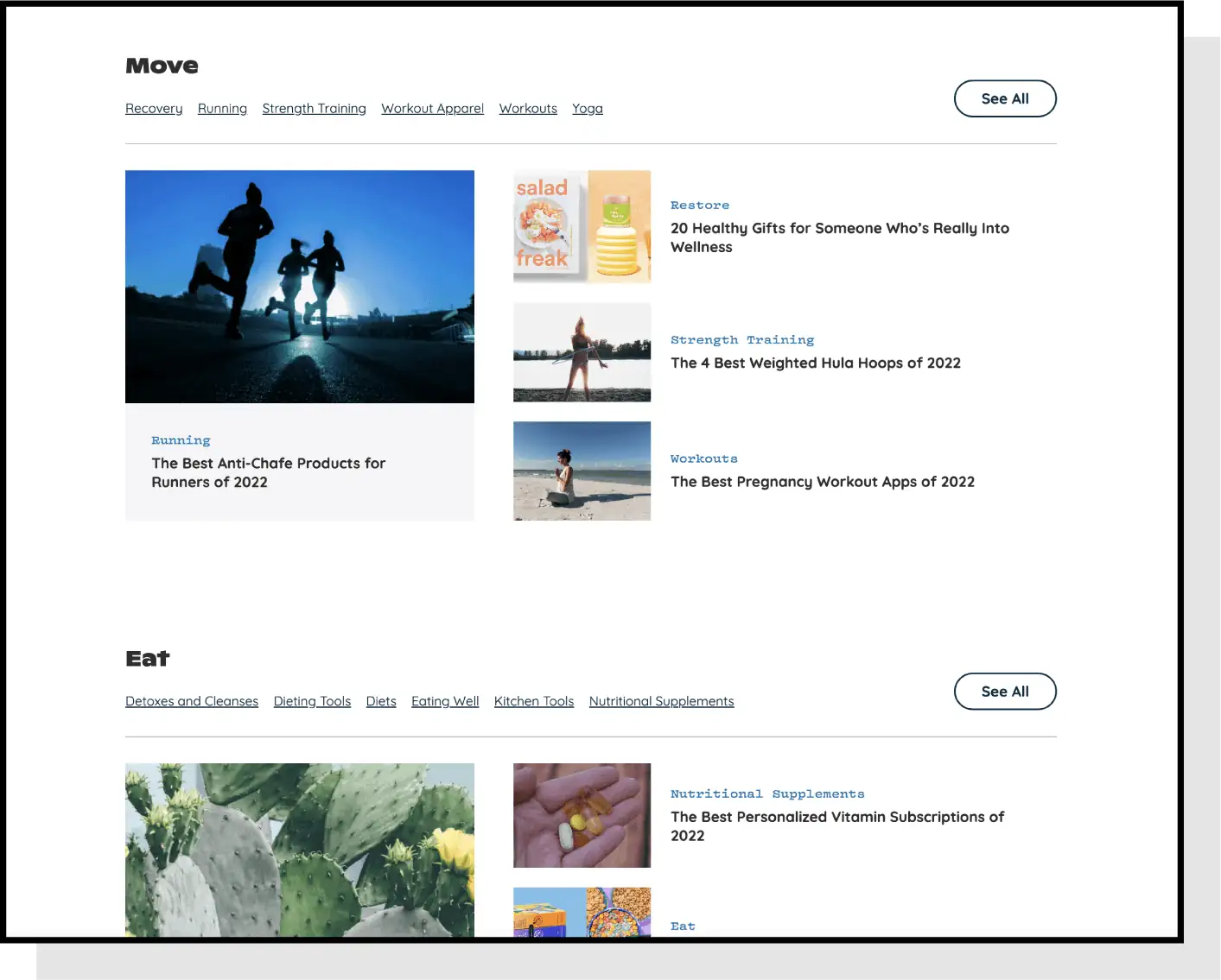
6. Use Thumbnails To Maintain Interest
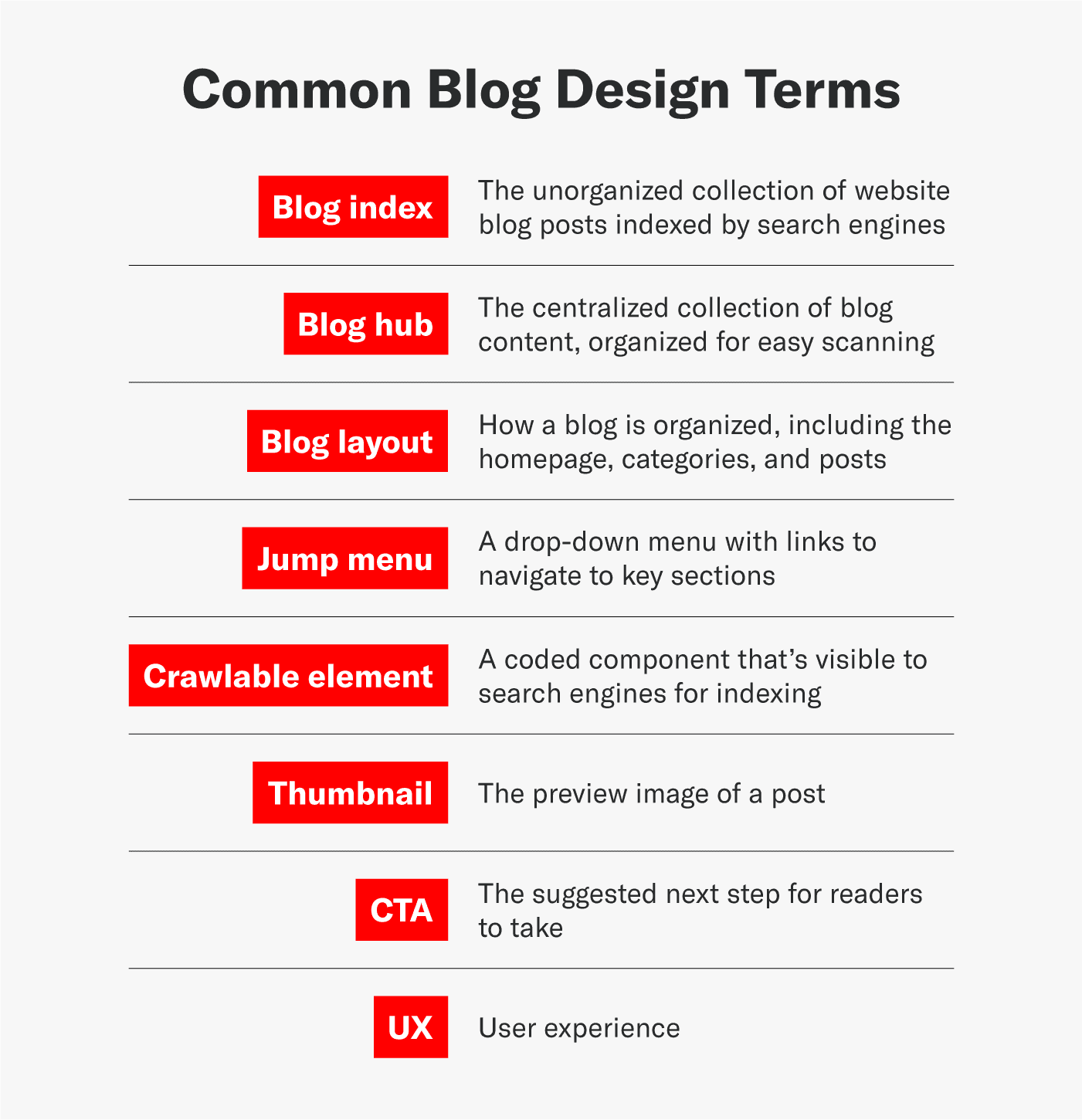
Thumbnails are small images that preview the content of a post and entice the reader to click through to it.
You’ll see on some blog layouts that a hero image in isolation can look fine. But when that same brand aesthetic is applied across 90 thumbnails, it can bore site visitors pretty quickly and lower the likelihood of them engaging with and actually reading one.
To diversify your thumbnails, consider:
- Applying different color palettes
- Occasionally using GIFs with small file sizes
- Using a mix of illustrations and stock images
If you’re consistently engaging visitors with creative page content, the chances are higher that they’ll actually click on an article.
How They Do It
Using Help Scout as another example, the articles they use as previews are accompanied by brightly colored thumbnail images. Sometimes they use GIFs to further help articles stand out.
7. Include Relevant CTAs
CTAs instruct a reader on what to do next to promote an immediate response.
Don’t just assume a visitor to your site will know which step to take next. Spell it out for them and make it easy for them to perform from that page.
How They Do It
Putting a CTA right in the middle or above the fold of a blog index, like Help Scout does here, makes it convenient for readers to act when they’ve bounced back to the page after reading an article.
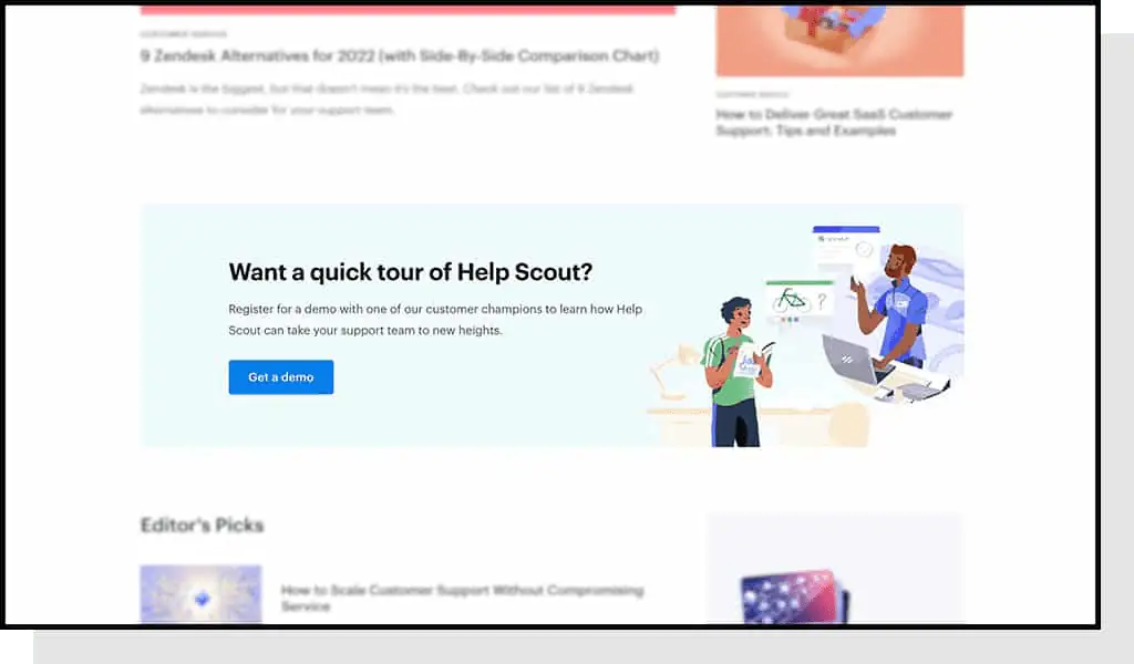
You’ll want to change up your CTAs depending on the type of content you’re creating and the types of readers it’s attracting to your site.
For instance, a top-funnel post might include a CTA for readers to subscribe to the blog since these users are likely less aware of your brand, so you’ll need to instill trust.
A bottom-funnel post might include a CTA to contact the sales team or request a demo since these readers are more familiar with your brand.
A CTA at the end is also very common and presents a less aggressive opportunity for the reader to get more information about a specific service or product, like an eBook.
Having that one-two punch of CTAs will get people into your marketing pipeline and ensure your content is leading to conversions where you want it to.
8. Make Category Pages Different
Similar to having varying thumbnails, making your category pages look different from your homepage can help promote engagement from your readers.
Giving your category page a new template, or even just a modified skin, can accomplish that visual difference and create intrigue for visitors at every step of their journey.
9. Keep Blog Preview Copy Descriptive
Give each category section a one-to-two-sentence description to further pique a person’s interest. This brings an extra layer of uniqueness to the section, adding value to users and search engines alike.
How They Do It
Since Ness has unique categories that not all visitors may be familiar with, they provide a short explanation of the purpose of each category.
10. Have a Search Tool
A search tool makes it easy for visitors to scan a blog and find the relevant articles they’re looking for. Even if your site is properly organized into categories, readers can have a hard time finding the specific article they’re looking for.
Adding a search tool will cut down on the time they spend bouncing around your blog and reduce the chances of them leaving after not finding success.
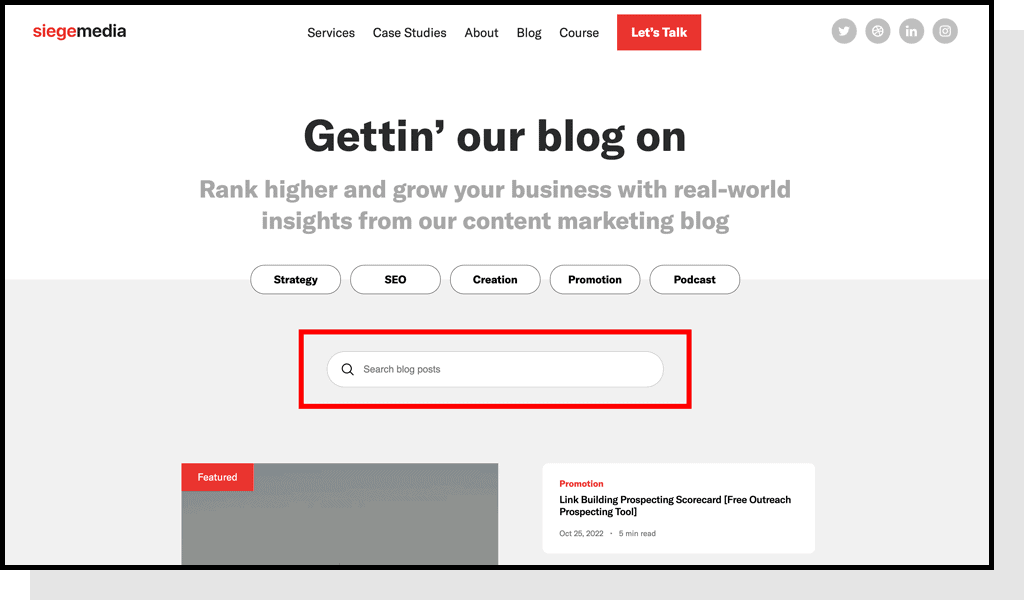
Whether you want your search tool to be a full-size bar or hidden behind an icon will depend on how often visitors use it. The more often they search for articles, the more prominent the tool should be.
11. Use Small, Colorful Hero Images
The hero image is a design term for the banner image at the top of the blog page.
With new Core Web Vitals initiatives from Google and general user best practices, blog post images need to be both small in file size and in their overall dimensions.
On desktop, banner hero images should be around 1,600 x 500 pixels. On mobile, they should be around 800 x 1,200 pixels.
A large hero might look nice, but will load slowly on poor internet speeds. People are impatient, so if your blog post is lagging, potential readers will likely go somewhere else.
To make up for the smaller hero size, include pops of color to show people that they landed on a good experience.
12. Provide Quick Answer Boxes
Quick answer boxes are a short snippet of information at the top of a blog post that summarize what a reader is looking for, and they’re becoming a core element of blog design best practices.
This is another area that serves a dual purpose: They give readers what they’re searching for and appeal to Google’s indexing.
Providing a summarized answer to a query as soon as possible indicates to the reader that their time is valuable. Plus, posting the answer to a query at the tip-top of a post also allows Google to read it quicker and can boost ranking potential by using the answer box for snippets on the SERP.
13. Share Jump Menus In-Body
Another element that’s common in high-performing posts are tables of contents that have jump-to links to lower sections.
These jump menus give readers a preview of what’s to come, while giving them an easy way to navigate to what’s of highest relevance to them.
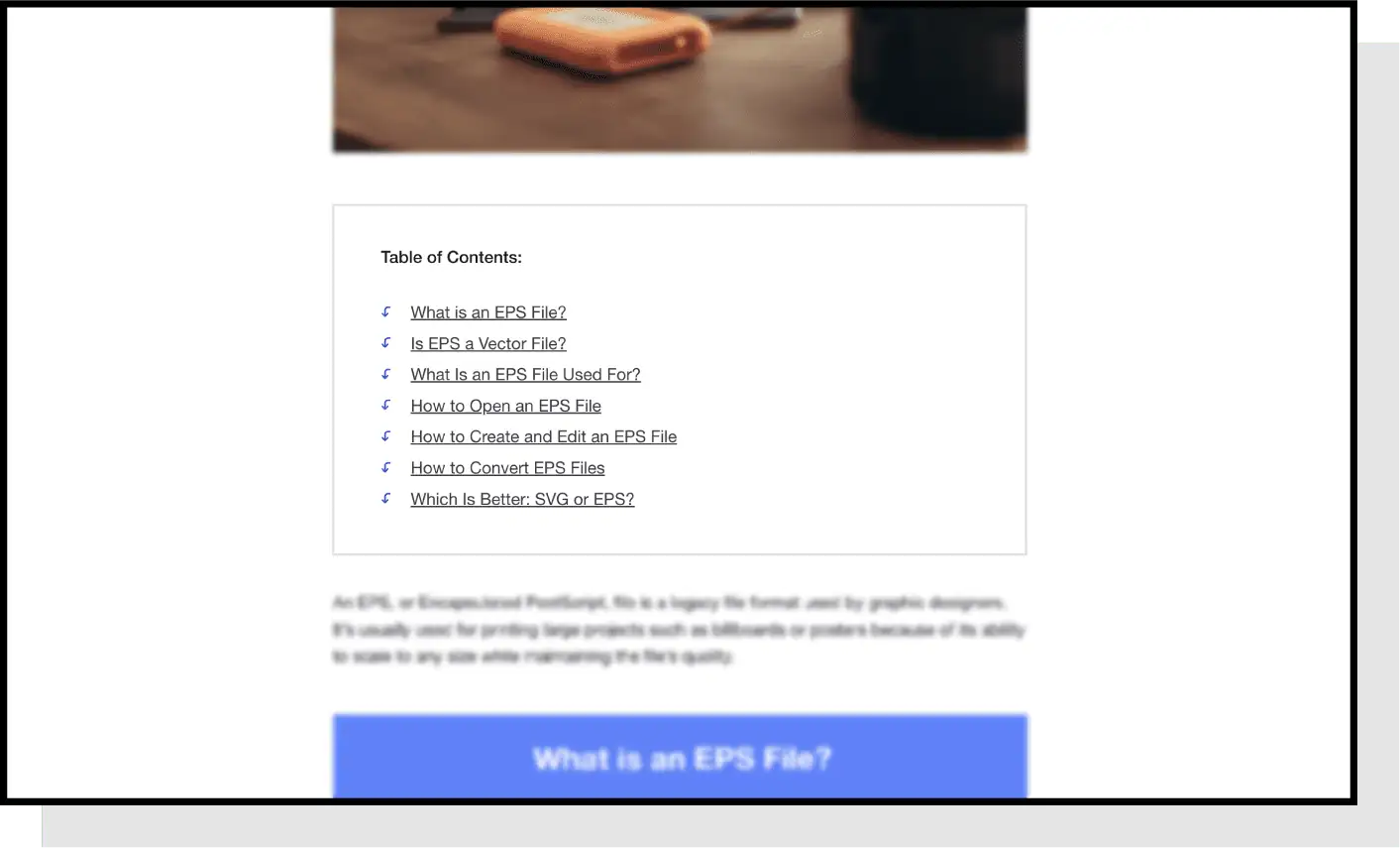
This is especially important to mobile readers who are scrolling with just their thumbs. It’s easy to lose your place on a small screen and can lead to frustration. The jump-to link avoids the need for extensive scrolling.
On top of that, Google often pulls these jump links into search results, helping you rank for long-tail keywords.
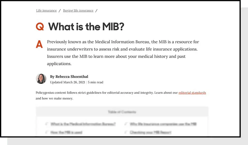
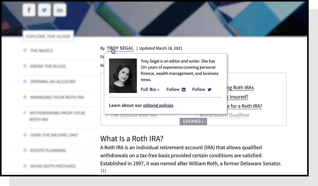
14. Give Credibility Above the Fold
Provide credentials at the top of the page to preemptively answer why your content can be trusted.
Tell the reader:
- Who wrote the article
- Their background
- The last time the article was updated
All of this information works hand in hand to boost the post’s credibility.
How They Do It
If you’re short on space, try to avoid linking to this information on another page, which would take the reader away from the content they came for.
Instead, reveal the information when the user hovers their cursor over the author’s name, as Investopedia does in the above image.
15. Make Social Sharing Easy
Many hands make light work, and one way to get more people involved in spreading your content is to put social sharing links on post pages.
The more convenient you make it for readers to share your articles on social media, the more likely they’ll do so. We include social links on the sidebar of our blog posts that stay in view as the reader scrolls.
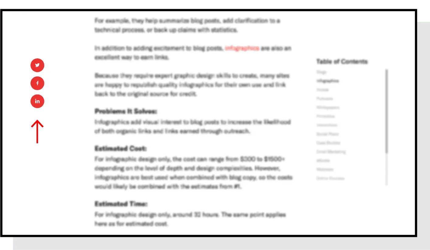
Pay attention to the platforms your target demographic is most active on and have links to those sites. That way the page won’t be cluttered with unnecessary icons.
16. Use Short Subheaders
Readers are often scanning a blog post to find the sections that are relevant to their query or spark their interest. You can aid them by making your subheaders concise and descriptive.
Another consideration to keep in mind is that your readers will be using different sized screens. If you have long subheaders in large fonts, they’ll spill over to multiple lines on small screens, making the article difficult to read.
17. Add Unique HTML Elements
HTML elements are coded components that let browsers know how to define the content on that page. Quick answer boxes are a type of HTML element, but they take many forms.
Adding other HTML elements to the blog design is critical to creating a great visual post without needing lots of images that could be expensive or slow down page load speeds.
Some common HTML elements include:
- Block quotes
- Tables
- Formatted lists
Pro Tip: You can use block quotes in a larger font or with an eye-catching color to call attention to key statements.
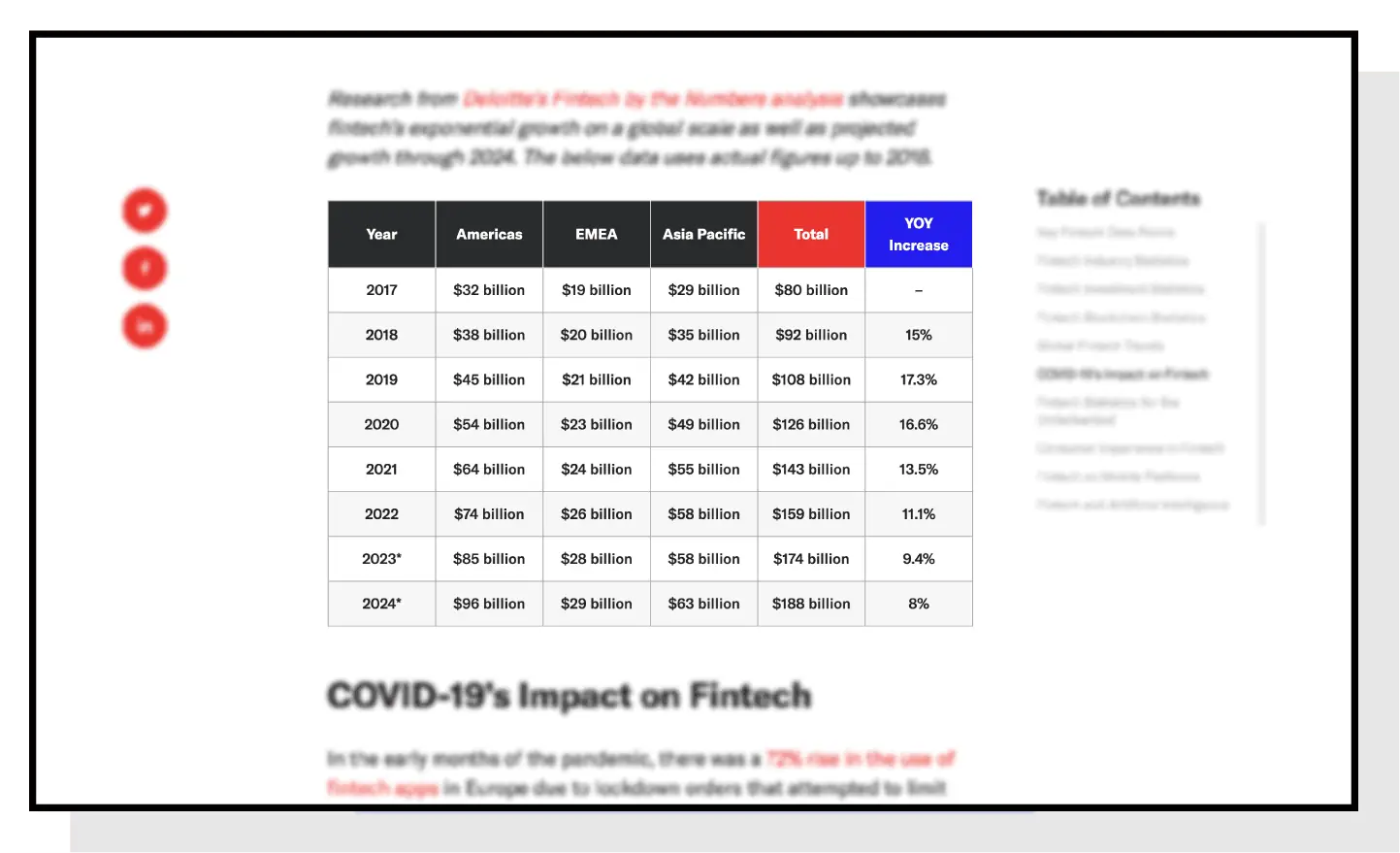
Tables can organize information into easily digestible formats. In the above example, we alternated the row colors to improve scannability and added branded colors to draw the eye.
The same approach can be applied to long lists, making them distinct when they would otherwise be made up of boring black bullets.
How They Do It
Changing the background color of key takeaway sections can further emphasize the importance of the information.
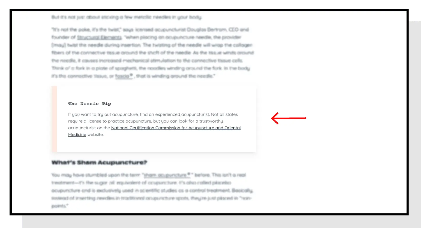
These HTML elements are increasingly being used in lieu of images that may not be necessary.
18. Make Text Readable
You want to make it easy for readers to track from one line to the next. To make this possible, keep columns from being too wide.
How They Do It
Here you can see how Floor Authority leaves a large amount of white space in their margins to help readers follow along with the copy.
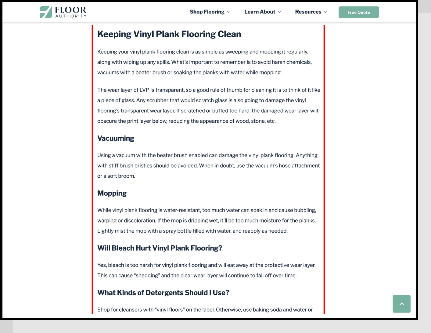
Our best practices for readability include:
- Make the font size around 16-18 pixels
- Ensure the column width makes it easy to track to the second line, ideally 650-800 pixels, or around 75 characters
- Use black text on a white background (except for special sections)
These blog design best practices reduce eye strain while helping the colorful elements pop that much more.
19. Choose Legible Fonts
People are often tempted to use eye-catching fonts, but simple text is best. The answer boxes and HTML elements will draw the reader’s eye and keep them interested, so the body text should stick to being easy to read.
Fonts like Arial, Montserrat, and Georgia are commonly used, safe options for most blogs. Stay away from fonts like Comic Sans, Papyrus, and any others that are unnecessarily stylized.
20. Include Related Posts Section
One of the best practices for blogging is to include a related posts section at the end of the blog post, spotlighting around 6 related posts.
The more posts you can include, while still keeping the section simple and easy to navigate, the better for internal linking. We recommend using a carousel with arrows for the cleanest user experience.
These featured posts should have information closely related to the topic on the page, or add greater context to some terms that were briefly mentioned.
How They Do It
The thumbnails should be small so they don’t slow down the rest of the page, but try to keep them eye-catching.

We suggest randomizing these links to posts within the same category to keep a good mix of new and old content. By keeping links in the same category, you’ll produce a silo effect for the reader, where irrelevant articles are filtered out.
On the other hand, manually selecting the links provides the added opportunity of including the most relevant articles to the readers on the page. You’ll just need to have time for this added step.
21. Blog Design: Video Walkthrough
Above is a video walkthrough hosted by Siege CEO Ross Hudgens covering the principles identified in this guide. Use it to complement what you’ve learned here to gain a deeper understanding of the content.
Master Blog Design, Reap the Benefits
Creating high-converting content and ranking well on search pages is highly competitive. By implementing these blog design best practices onto your site, you’ll be in a much better position to fill that valuable real estate.