
According to 2026 data, 31% of content marketers now budget between $15,000 and $45,000 per month for content — a sharp increase from 19% the year prior.
Your website, and especially your blog, plays a major role in how buyers research and evaluate your business. Content marketing is still going strong in 2026. In fact, 97% of content marketers reported that their content marketing program efforts are successful.
But when it comes time to build a business blog, knowing where to start can feel overwhelming. What should it include? How should it be structured? And what actually drives results? To help answer those questions, we analyzed top-performing business blogs and identified the eight essential elements they share.
As a 100+ person content marketing agency working with enterprise brands like Instacart, Hippo, and Purple, we’ve seen firsthand what separates high-performing blogs from the rest.
Let’s break down the key elements and look at some of our favorite examples.
1. Hippo
Industry: Insurance
What they do well: Audience-first education
A smart content strategy starts with a clearly defined audience. Without that clarity, content risks becoming too broad or too vague, and ultimately less effective.
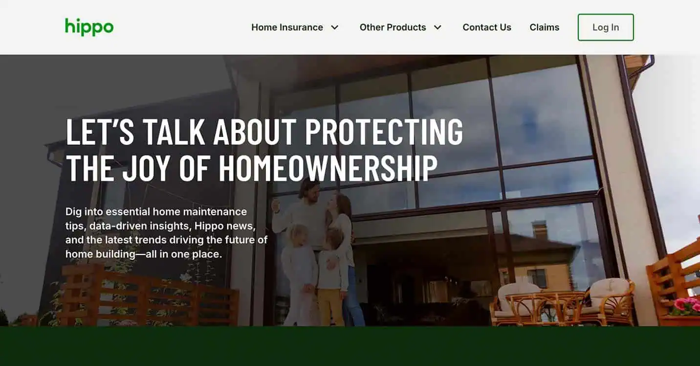
This positions the brand as a trusted advisor instead of a transactional provider.
Hippo also excels at:
- Addressing real homeowner pain points
- Publishing timely, seasonal content
- Balancing education with subtle conversion paths
The result is a blog that builds trust while reinforcing brand authority.
2. Instacart
Industry: B2C, e-commerce
What they do well: Search-driven utility
Instacart’s blog succeeds by deeply aligning content with user intent. Articles often target high-volume, practical searches tied to food, cooking, and grocery planning.
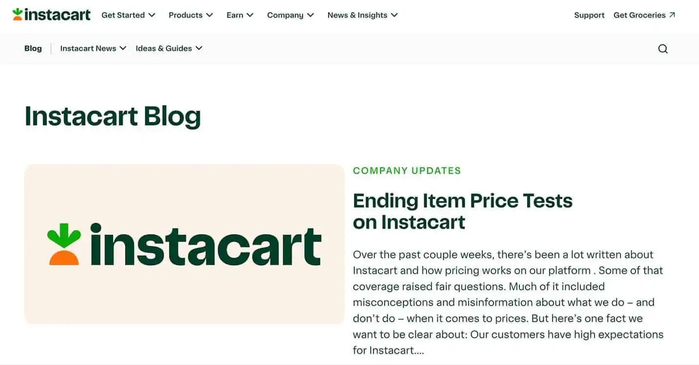
Instead of producing abstract lifestyle content, Instacart’s e-commerce marketing strategy prioritizes topics users actively search for, such as recipes, ingredient guides, meal planning, and seasonal food trends.
This approach:
- Captures organic search demand
- Supports multiple funnel stages
- Reinforces Instacart’s core value proposition
This strategy produced a measurable impact. Siege Media helped Instacart grow blog traffic value by $73K within a highly competitive recipe and food landscape by developing high-utility, search-driven tools such as cooking calculators and converters.
By meeting users where their questions already exist, Instacart turns its blog into a scalable acquisition channel.
3. Zapier
Industry: SaaS
What they do well: Product-led thought leadership
Zapier’s blog is a masterclass in topic authority. Rather than drifting into loosely related productivity content, Zapier anchors its editorial strategy around automation, workflows, integrations, and operational efficiency — areas where the company has undeniable expertise.
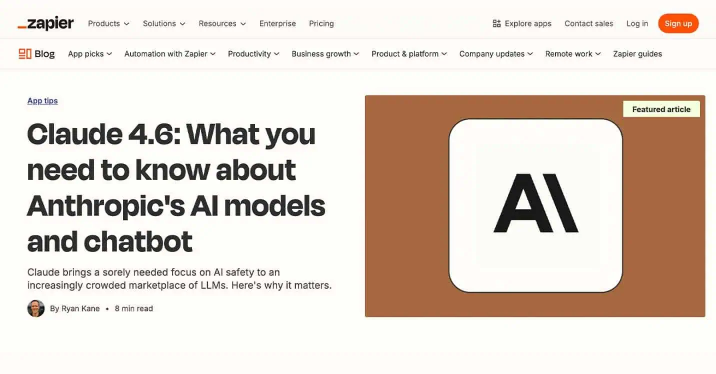
That focus has translated into tangible results. During Siege Media’s engagement, Zapier saw a $7.2 million increase in traffic value and a 290% lift in monthly organic traffic, reinforcing how strategic, bottom-funnel, and how-to content can compound results.
The approach also strengthened Instacart’s visibility in emerging search environments, where the brand now leads competitors in LLM presence and AI Overview citations. This demonstrates how utility-focused content can drive both discoverability and authority.
4. Zoom
Industry: B2B/SaaS
What they do well: Hybrid educational and customer content
Zoom’s blog effectively balances educational resources with customer-centric storytelling. The content regularly explores remote and hybrid work strategies, collaboration best practices, and industry-specific solutions, all of which align closely with the brand’s core product and audience needs.
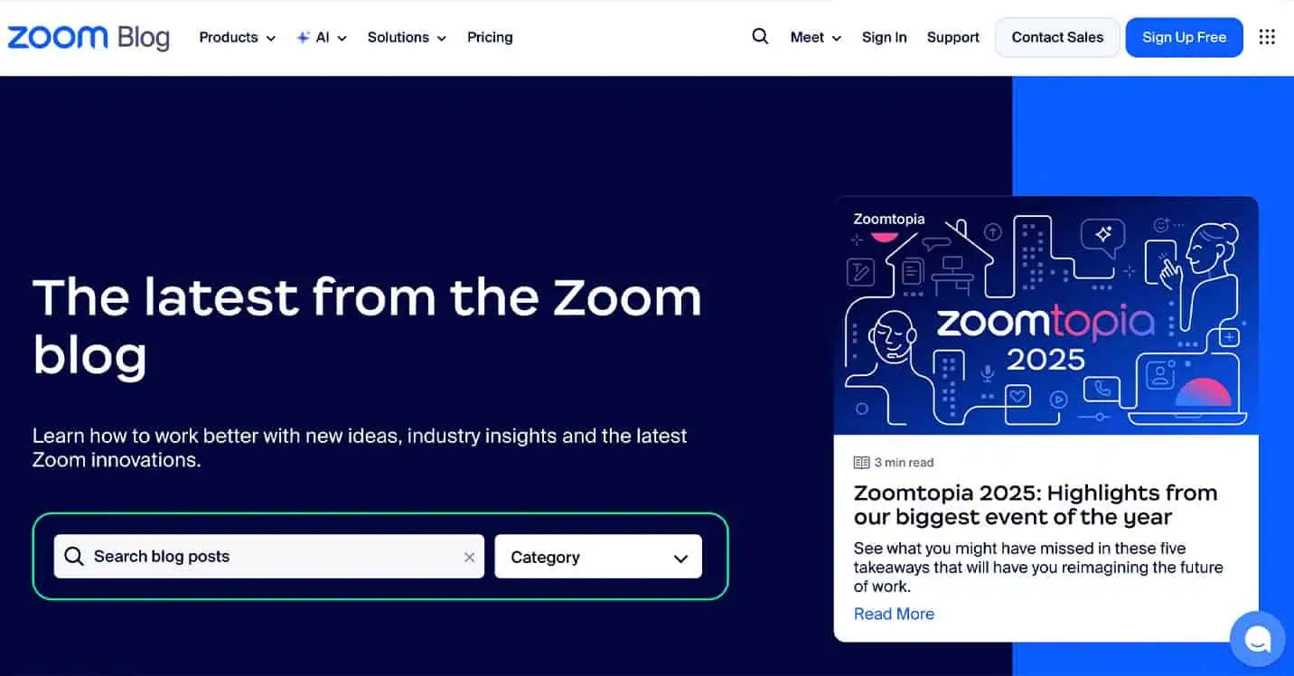
This dual focus allows Zoom to attract top-funnel readers seeking guidance while also supporting existing users looking to maximize the platform’s value. By addressing both discovery-stage questions and deeper use-case education, the blog plays a vital role in strengthening brand trust.
As a result, Zoom’s blog functions not only as a marketing channel but also as a valuable retention and customer enablement asset.
5. Blue Nile
Industry: Jewelry/e-commerce
What they do well: Seamless commerce integration
Blue Nile’s blog shows how e-commerce content can support purchasing decisions without feeling overly promotional. The editorial strategy centers on high-intent topics like engagement ring education, diamond guides, styling advice, and gifting resources — subjects that naturally align with customer research behavior.
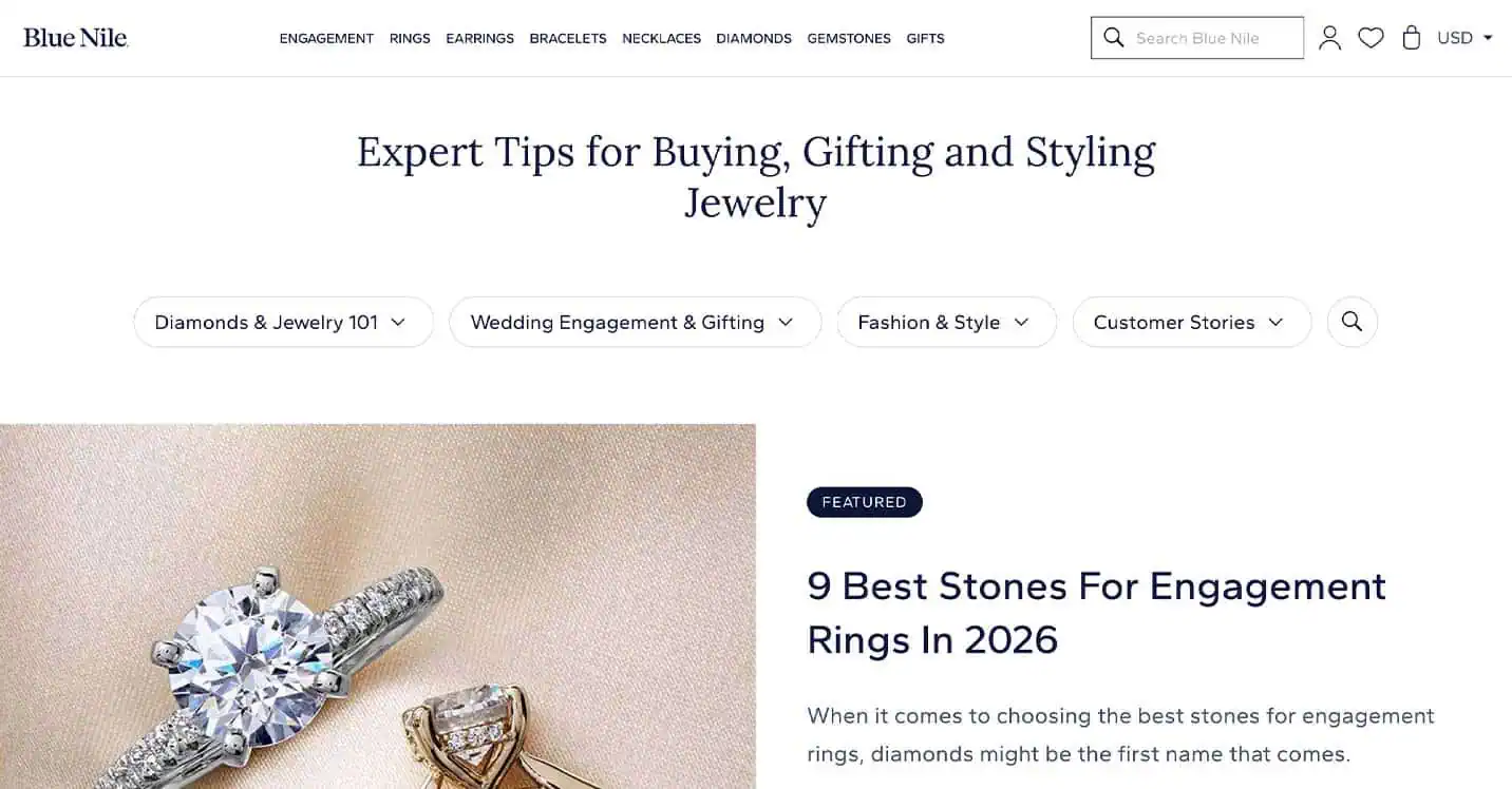
What distinguishes the experience is how smoothly content transitions into commerce. Product links feel contextual rather than disruptive, and articles work to reduce buyer uncertainty while reinforcing purchase confidence.
By leading with education, Blue Nile transforms its blog into both an SEO driver and a conversion-support asset.
6. Geotab
Industry: B2B SaaS, fleet management
What they do well: Deep topic authority
In specialized B2B industries, authority depends on relevance and precision. Geotab’s blog maintains a disciplined focus on fleet management priorities, including telematics insights, safety strategies, regulatory updates, sustainability initiatives, and operational efficiency.
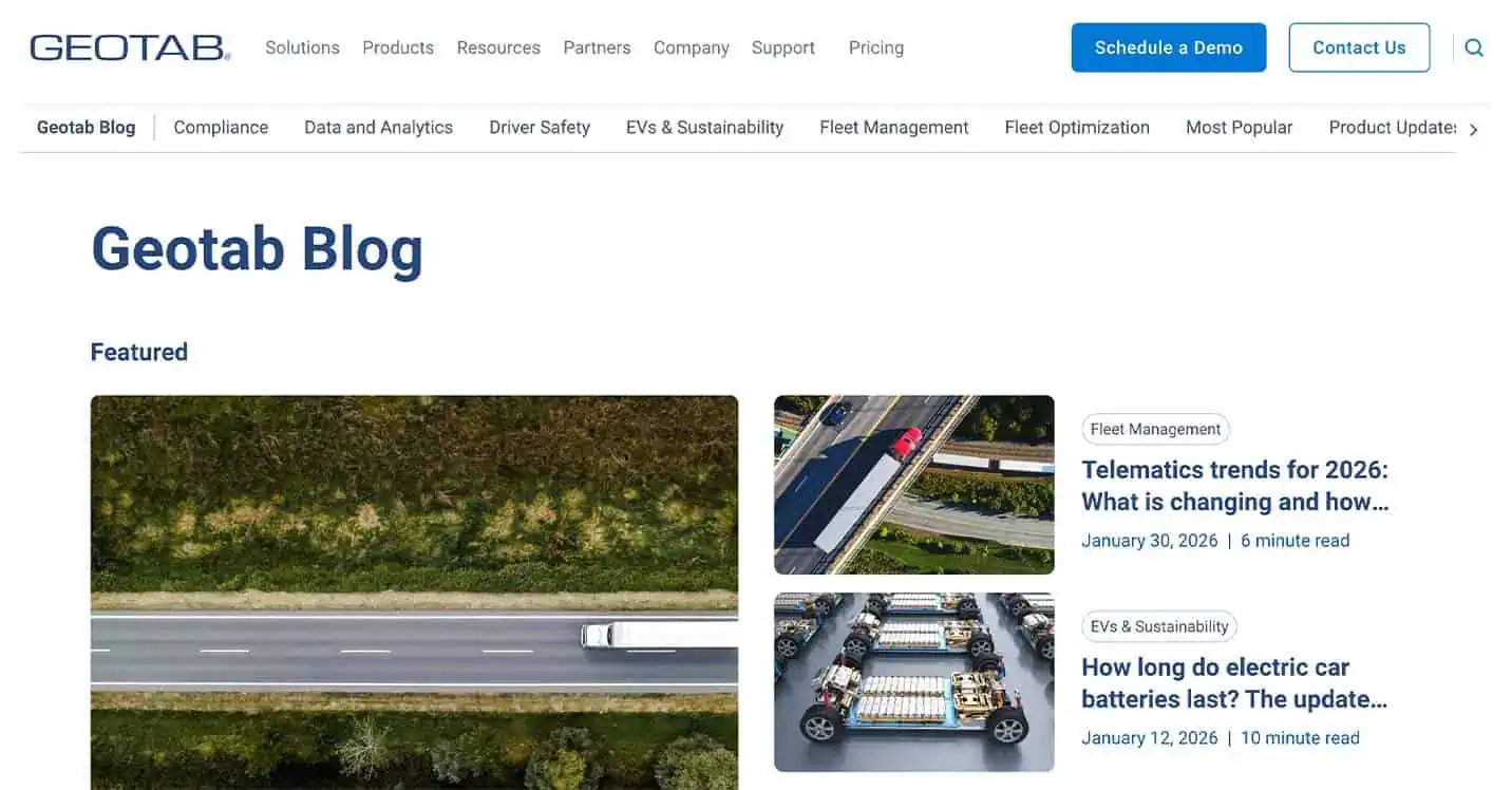
This clarity strengthens Geotab’s credibility with technical audiences and enterprise decision-makers. Rather than diluting its messaging with broad business content, the brand consistently publishes material that supports real operational challenges.
The result is a blog that functions as both an educational resource and a long-term trust-building channel.
7. Purple
Industry: Consumer goods, DTC e-commerce
What they do well: Distinct brand voice
Purple’s blog stands out through a voice that feels unmistakably aligned with its brand identity. The content blends sleep science, wellness education, and lifestyle storytelling in a tone that is approachable, engaging, and memorable.
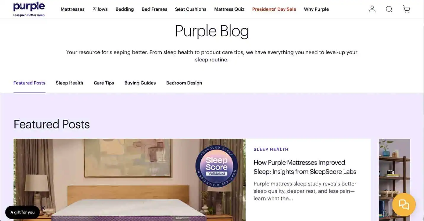
This balance allows Purple to deliver informative content without sounding clinical or overly technical. Combined with bold, cohesive visuals, the blog reinforces brand recognition while creating a more enjoyable reading experience.
Instead of serving purely as an SEO tool, Purple’s blog deepens audience connection and brand affinity.
8. Anthropologie
Industry: Consumer goods, e-commerce
What they do well: Seamless consumer blog
Retailers and e-commerce brands have to define a blog style that blends seamlessly with their product pages without itself feeling too “sales-y,” which is much easier said than done.
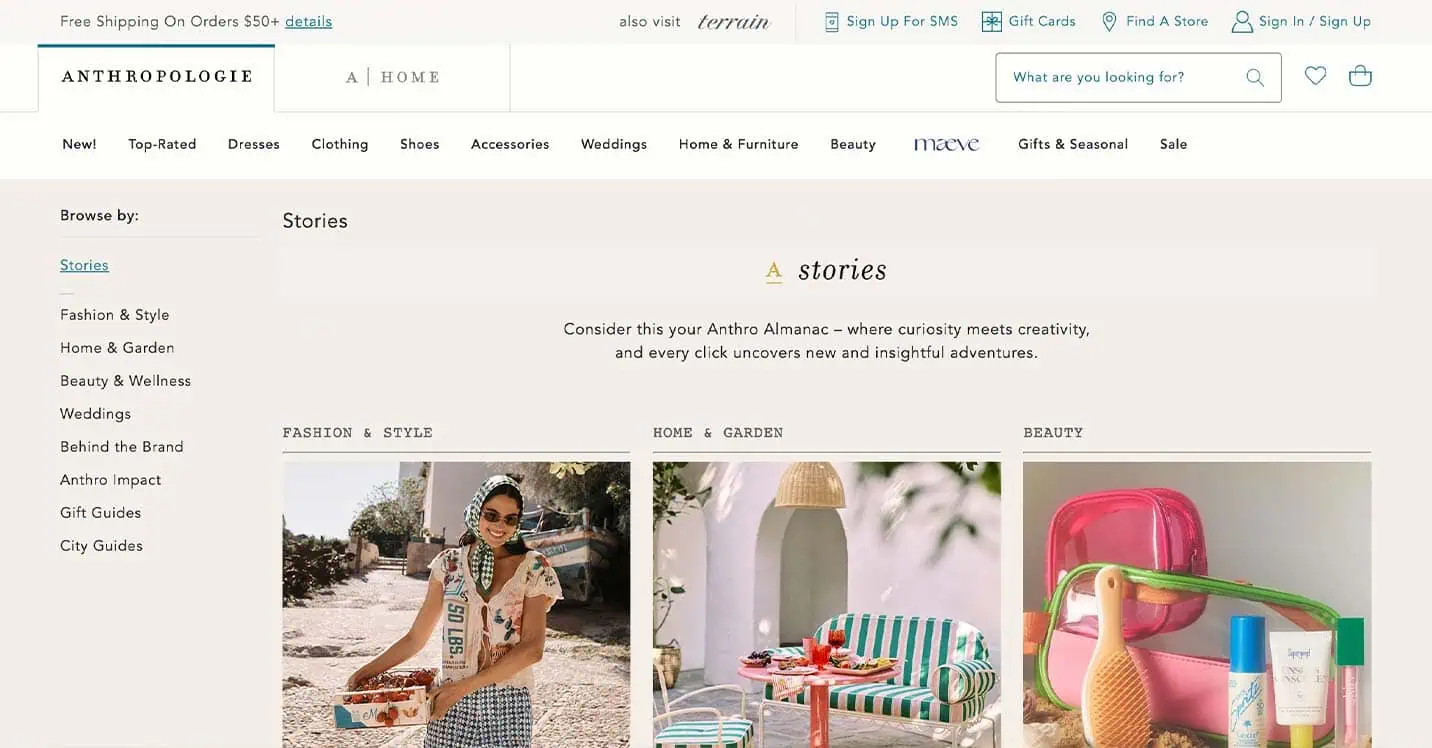
Anthropologie’s blog truly feels like a blog, not just another product page. At the same time, it stays visually consistent with the main site, so moving between the two never feels jarring. Even product photos work naturally as post headers, blending content and commerce in a seamless way.
9. VINEBOX
Industry: E-commerce, subscription service
What they do well: Hosting and travel tips
You can find some well-executed inspiration for your alternative CTAs on subscription wine service VINEBOX’s blog.
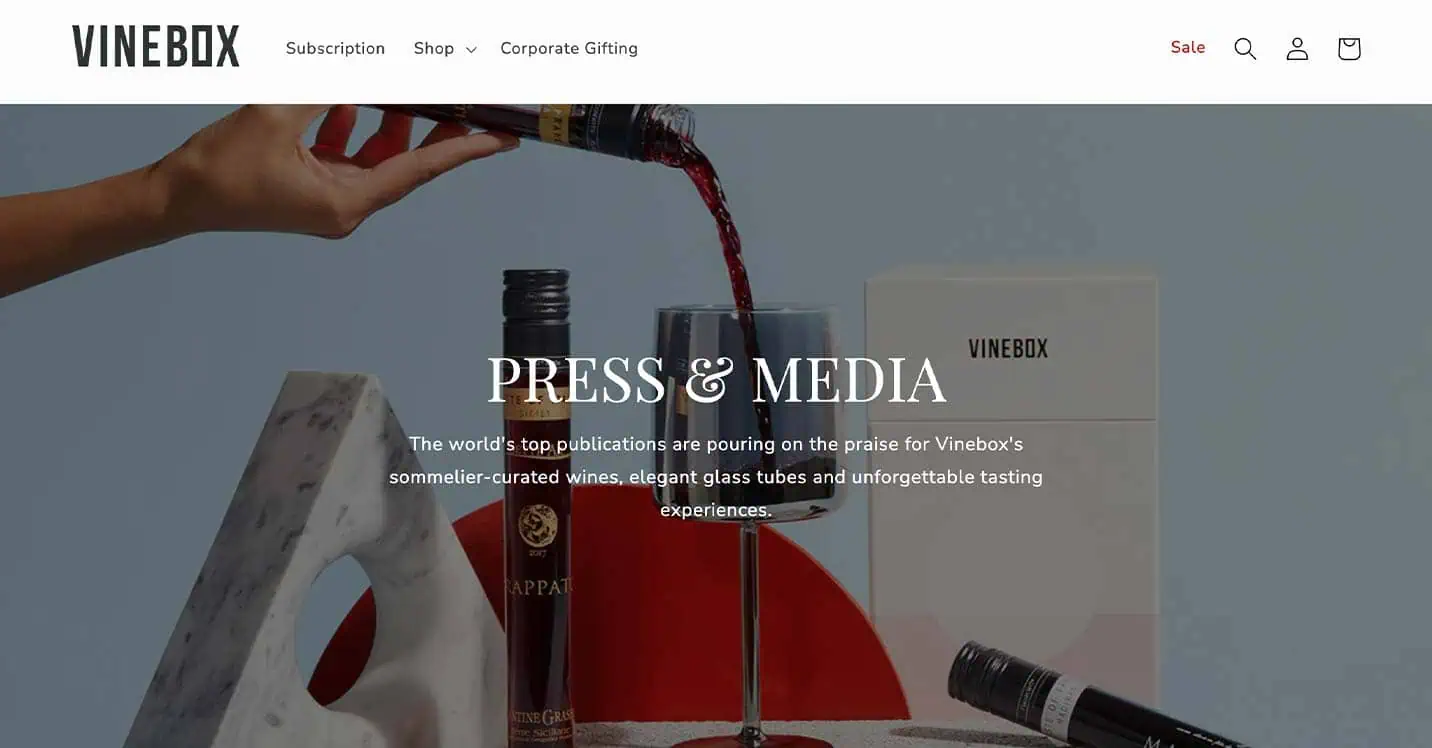
The home page’s side menu offers several click-throughs, including a product page, recommended blog posts, the brand’s various social pages, and even featured user-generated content.
10. Everlywell
Industry: Healthtech
What they do well: Health and wellness content
Talk about a defined audience: Everlywell sells an at-home food sensitivity blood test, which is an incredibly specific product with a fairly niche client base.
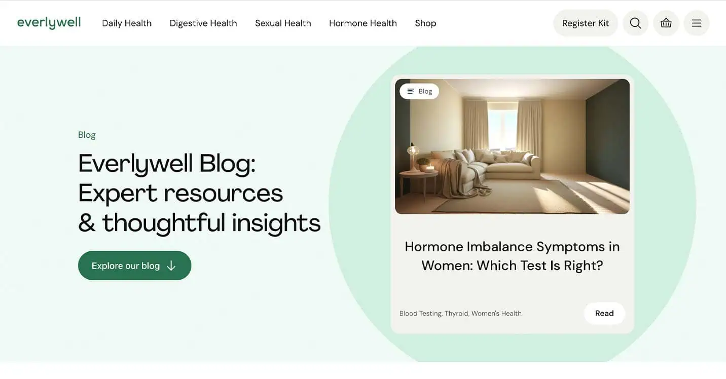
Nevertheless, their blog topics are well-curated to feel both relatable to the average reader and specific to their brand’s authority.
11. Rotabull
Industry: Aviation and airspace
What they do well: B2B blogs
The Rotabull blog offers another example of a well-defined audience, but unlike Everlywell, Rotabull leans into the reality that their product — airplane parts — isn’t relevant to the average person. Rather than trying to find a connection between aerospace mechanics and everyday life, Rotabull’s blog caters to the aviation space.
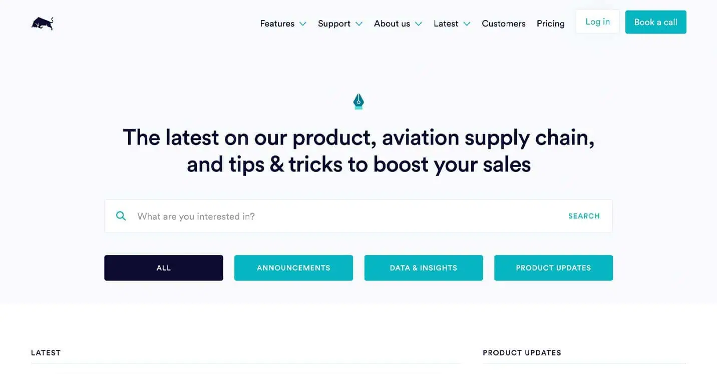
Many B2B companies can benefit from taking a page out of Rotabull’s book and avoiding attempts to relate to the average consumer, and diluting the power of their content in the process.
8 Key Elements of a Business Blog
While business blogs vary by industry and audience, high-performing blogs share several core elements:
- A well-defined audience so you can target content toward specific needs instead of creating low-converting, generalized content
- Clear topic authority with content that aligns with your brand, expertise, and audience interests
- Well-organized content pillars to organize content topically and improve user experience, navigation, and site authority
- Strong navigation for users to easily explore content by need and interest on every page
- Unified brand style to reinforce company branding, build recognition, and add visual interest
- Strategic CTAs on the blog hub and within posts to drive conversions
- E-E-A-T (expertise, experience, authority, and trust), such as author bios, publish dates, that boost credibility
- A user-friendly design with multiple ways to explore content, including categories, search, and menus
Blog Best Practices Are Worth the Investment
Investing time in structuring your business blog well and applying these best practices helps your content reach the right audience and perform better over time.
A blog that is clear, trustworthy, and engaging encourages readers to stay longer, explore more pages, and build confidence in your brand. The engagement matters.
A high-performing blog is a long-term asset. When you focus on structure, design, and usability, you support sustainable traffic growth and create more opportunities for conversions.
At Siege Media, we combine content marketing services, SEO, web design, and graphic design to build blogs that function as scalable acquisition channels.
If you’re ready to turn your blog into a measurable growth asset, explore our content marketing services and see how we can help you design and optimize a blog that drives real results.