
Slow loading times, clunky navigation, and poor accessibility drive visitors away and lower your rankings and conversions. Mobile optimization solves these challenges by creating a seamless, user-friendly experience.
Recent content marketing statistics show that over 90% of internet users report accessing the internet on a mobile phone, and nearly 60% of all web traffic worldwide is attributed to mobile queries, making mobile optimization critical.
This guide will show you how to address common pain points, improve performance, and deliver an exceptional mobile experience that gives your business a competitive edge.
Plus, we offer industry-specific tips for SaaS, e-commerce, and fintech sites.
- What Is Mobile Optimization?
- Why Is Mobile Optimization Important?
- How To Optimize a Website for Mobile
- What Do You Need for Mobile Optimization?
- How To Tell if Your Site Is Mobile-Friendly
- Industry-Specific Mobile Optimization Tips
What Is Mobile Optimization?
Mobile optimization is the process of designing or updating a website so it’s user-friendly and visually appealing on mobile devices. It incorporates on-page SEO and UX best practices to ensure the site looks and functions well across all devices, screen sizes, and orientations.
Why Is Mobile Optimization Important?
Mobile website optimization is essential because it boosts search engine rankings, amplifies click-through, improves engagement rates, and drives more conversions. Websites that aren’t optimized for mobile risk losing users and ranking lower in search results.
With over 59% of global web traffic coming from mobile devices, ensuring your site is mobile-friendly is no longer optional — it’s critical for success. To stay competitive, your site must deliver on accessibility, speed, and SEO — which we examine in more detail below.
Better Accessibility
Mobile optimization ensures your website is usable for everyone, including individuals with disabilities. Features like larger tap targets, high-contrast text, and responsive design enhance navigation for all users.
By prioritizing accessibility, you create a more inclusive digital experience that benefits all users, regardless of their abilities or devices.
Faster Load Times
Speed matters most on mobile, where slow-loading pages can frustrate users. According to Google, 53% of mobile users abandon a site if it takes more than 3 seconds to load. Mobile-optimized websites load faster, keeping users engaged and reducing bounce rates.
Improved SEO Performance
Mobile optimization contributes to higher search engine rankings. Google rewards mobile-friendly sites with better visibility in search results, driving more organic traffic. This is particularly important with Google’s mobile-first indexing.
Mobile-first indexing is a practice where Google uses the mobile version of a website to determine its search rankings. If a business’s mobile site isn’t optimized or loads slowly, it could affect how pages are indexed.
This can result in lower search rankings for websites with poor mobile performance, even if the desktop version is fine.
Enhanced User Experience
Beyond speed, optimizing your website for mobile can have additional impacts on your overall user experience.
For starters, a more responsive design and layout will allow users to interact with a proper version of your site, not a difficult-to-navigate desktop version. Additionally, simplified navigation can help them find the content they seek faster.
Browsing the web on a small screen introduces other challenges your responsive mobile site can address. Users browsing on their smartphone or tablet require larger buttons, links, and other elements that they can easily tap on with their fingers.
When creating SEO-friendly content, it’s also essential to consider that long blocks of text are more challenging to digest and understand.
How To Optimize a Website for Mobile
The following steps contribute to a positive and seamless mobile experience, ensuring your site is fast, user-friendly, and accessible on all devices.
1. Implement Responsive Design
Responsive design ensures your website adapts to various screen sizes, providing an optimal experience for every user.
Avoid using fixed-width layouts. Instead, use automatically resizing images and fluid grids to ensure your site scales perfectly across devices.
This approach helps your website maintain its usability whether viewed on a smartphone, tablet, or desktop.
2. Optimize Mobile Loading Speed
Mobile users expect quick page load times. Pages that load slowly drive up bounce rates and decrease conversions.
Compressing images, minimizing heavy file usage, and avoiding render-blocking JavaScript and CSS are some of the best ways to optimize loading speed.
Lazy loading is a technique that delays loading media files until they’re needed, such as when blog post images enter the user’s viewpoint as they scroll down. This approach enhances site performance by reducing initial load times and conserving bandwidth.
3. Improve Mobile Navigation
Navigation on mobile should be intuitive, easy to use, and visually simple. Simplify menus and reduce unnecessary steps to make it easy for users to find what they need quickly.
Prioritize key sections like home, products, or services, and avoid complex drop-downs. Ensure that buttons are large enough for tapping without zooming and that there’s no need to scroll excessively.

4. Focus on Mobile-Friendly CTAs
Call-to-action buttons should be easy to find and large enough to tap comfortably on mobile. Ensure that CTAs are visually distinct from other elements and placed prominently on each page.
Follow these best practices to create mobile-friendly CTAs that enhance usability and engagement:
- Don’t use too much text
- Use contrasting colors
- Give it plenty of padding
- Place it in an easy-to-reach spot
- Use larger tap-friendly button sizes
5. Leverage Mobile-Friendly Forms
Forms are a common interaction point, especially for sign-ups, contact, or e-commerce. Mobile-friendly forms should be easy to fill out with auto-fill enabled, feature large input fields, and use the least amount of required fields possible.
Ensure form elements are well-spaced to prevent accidental taps on the wrong fields. Additionally, you should use larger touch targets and reduce the number of steps to complete the form for a more user-friendly experience.

6. Prioritize and Optimize Key Content for Mobile Users
Place critical content, like services or products, at the top for easy access. Add a table of contents or key topics section to preview the article.
Break up large blocks of text with shorter paragraphs, bullet points, and headings to improve readability. Simplify the user experience with clear fonts, ample white space, and logical formatting. Use a simple heading hierarchy to make navigation easy.
Finally, optimize titles and meta descriptions by keeping titles under 60 characters and meta descriptions concise (150-160 characters for desktop and 120 for mobile).
7. Test Your Mobile Site Regularly
Mobile optimization requires continuous attention. Regular testing across devices and browsers ensures your site stays functional and user-friendly. Check for usability issues, monitor performance, and gather user feedback to identify potential problems.
Tools like Google Search Console and Google Analytics help track performance, while Hotjar provides insights into how mobile users interact with your site. Conducting user testing can uncover specific pain points and highlight areas for improvement.
Ensure your website delivers a smooth and engaging mobile experience with these essential best practices. Follow this cheat sheet to optimize your site for speed, usability, and performance across all mobile devices.

8. Don’t Block JavaScript or CSS
Some webmasters may block CSS and JavaScript on mobile sites to speed up crawling or save their crawl budget, but with modern SEO, these attempts are misguided.
Ensuring your webpage properly renders is critical, especially with Google’s mobile-first indexing practice.
Google looks to the mobile version of your website for indexing and ranking. If Google cannot properly evaluate your mobile site’s friendliness or content, it may lead to poor indexing and a degraded user experience.
Make sure your webpage renders accurately so search engines can understand your site’s layout.
9. Implement Schema Markup
Use schema markup to make your content stand out on mobile screens. Implementing these data bits into your site’s HTML code makes it eligible for rich snippets and SERP features.
Having rich snippets on small displays, such as product prices, site links, and images, will make your site stand out to users and take up more of their screen.
Encouraging Google to implement rich SERP features can provide a leg up on competitors who might not use markup.
Beyond mobile search, rich snippets can make your website easier for AI and voice assistants to understand, making them more likely to cite your site as a source.
10. Don’t Forget Local Searches
Local SEO techniques are critical for running a business serving a specific geographic location. Whether you have a restaurant or store or provide a specific service, you’ll want to ensure your site stands out on mobile.
More users make ‘near me’ searches on mobile devices, creating a strong tie between mobile and local business searches.
First, optimize your website for mobile traffic. Then, claim your Google Business Profile and ensure to fill it out with the proper details, including your business’s local address and phone number.
Include name, address, and phone information across your webpage, too, such as in a footer at the bottom.
11. Create Accelerated Mobile Page (AMP)
One surefire way to help your site rank within Google’s SERP is to use Accelerated Mobile Pages (AMP). A framework developed by Google, AMP helps mobile web pages render quicker, using restricted HTML, CSS, and JavaScript.
These pages are typically served from a cache, allowing them to load almost instantaneously for users.
While Google no longer requires AMP integration for certain top spots on the search results, the technology can still provide a powerful benefit against the competition.
The only downside is that using AMP can restrict design flexibility and interactive features, so balance the need for speed with a positive user experience.
What’s Needed for Mobile Optimization?
Mobile optimization requires a combination of the right tools, access to critical platforms, and expertise to implement best practices effectively. Here’s what you need to ensure success:
Proper Access to Data and Platforms
Access to key platforms is critical for assessing and implementing mobile optimizations. This includes Google Analytics, Search Console, and CMS platforms such as WordPress. These tools allow you to track mobile-specific data, measure performance, and make real-time adjustments.
Without this access, it’s difficult to identify issues and take corrective action.
Effective Tools to Uncover Optimization Gaps
Identifying mobile optimization gaps requires the right tools. Google Analytics tracks user behavior, bounce rates, and conversions, while PageSpeed Insights focuses on load times and usability.
Additionally, content marketing tools like SEMrush and Ahrefs conduct gap analysis, helping you identify keywords your competitors are ranking for that your site may be missing out on.
Expertise to Drive Results
Effective mobile optimization requires more than just generating reports; it demands expertise interpreting and acting on the data. Working with an experienced SEO agency helps you identify core issues, new opportunities, and make strategic adjustments to enhance mobile performance.
This approach ensures every optimization is targeted and aligned with both user experience and SEO best practices.
How To Tell If Your Site Is (Or Isn’t) Mobile-Friendly
Determining whether your website is optimized for mobile is crucial for maintaining user engagement and search rankings. The following signs can help you assess your mobile site’s performance and optimization needs.
Low Mobile Conversions
If mobile users rarely complete forms, make purchases, or take key actions, your site may have usability or performance issues. Poor mobile experiences — like clunky navigation or slow load times — are common culprits.
Analysis Tip: Monitor conversion funnels in Google Analytics to identify where users drop off and assess whether mobile design or performance issues are affecting conversion rates.
High Mobile Bounce Rates
A high bounce rate means users leave your site quickly after viewing a page, often due to poor mobile performance or user experience.
Google Analytics can help you identify pages with high bounce rates, while Lighthouse can point to load times or usability issues that may be driving users away.
Analysis Tip: Look at mobile-specific bounce rate data in Google Analytics to spot patterns.
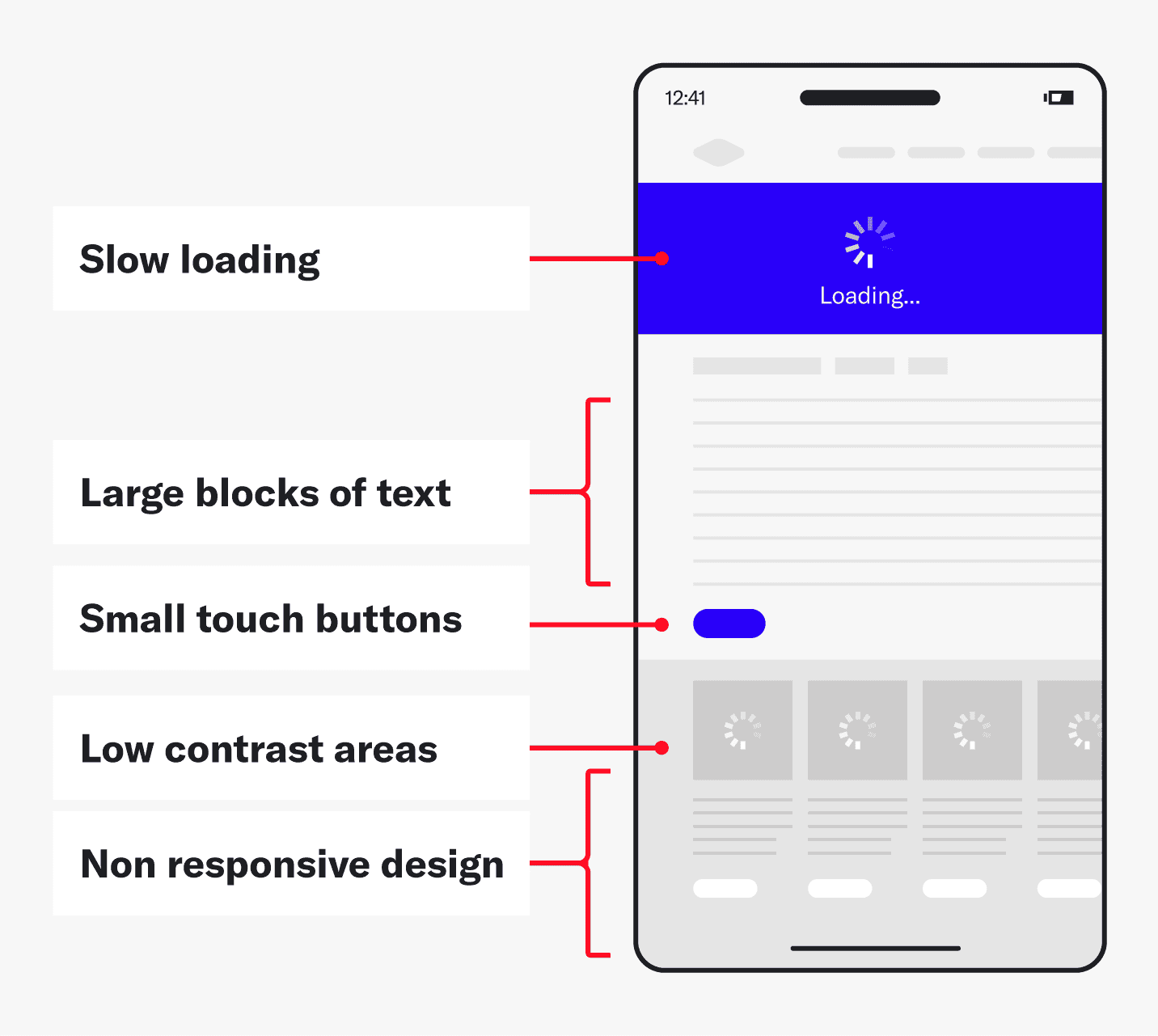
Slow Loading Times
Mobile versions of websites are inherently slower than the desktop version. However, if mobile load times are significantly slower than the desktop version or competitors, it may indicate optimization issues.
Analysis Tip: Use mobile load time reports in Google Analytics or other tools to identify performance bottlenecks and gauge how long mobile pages take to load.
Poor Accessibility and Readability
Accessibility issues such as small touch targets, missing alt text, or low contrast make it difficult for users with disabilities or visual impairments to navigate your site. This can lead to frustration, increased bounce rates, and decreased engagement.
Analysis Tip: Run an accessibility audit using tools like Google’s Mobile-Friendly Test to ensure your site is accessible.
Clunky User Experiences
Large text blocks, hard-to-click buttons, and slow load times can frustrate users and negatively impact engagement. Poorly optimized mobile layouts can make navigation difficult for viewers and increase bounce rates.
Analysis Tip: Navigate through common tasks like purchasing or signing up to check if elements like buttons or forms are easy to interact with.
Low Visibility in Search Results
A slow or poorly structured mobile site can tank your search rankings. Search engines will rank your site lower if it’s hard to navigate, takes too long to load, or isn’t mobile-friendly. This means fewer users will find your site through organic search.
Analysis Tip: Check mobile-friendliness and critical SEO mistakes with things like crawlability and structured data to determine what your site needs the most.

Industry-Specific Mobile Optimization Tips
Different industries face unique mobile challenges, but strategic optimization can help you overcome them. Here’s how mobile search engine optimization applies to common pitfalls in SaaS, Fintech, and e-commerce:
SaaS
SaaS companies often struggle with clunky sign-up forms and user retention on mobile.
To improve the mobile experience, consider adding a progress bar for multi-step forms to guide users through the process. Use in-app onboarding tutorials or tooltips to help new users navigate the app efficiently and ensure your support options, like live chat or FAQs, are easily accessible.
Simplify account creation with social logins (Google, LinkedIn) to eliminate friction for users and improve conversion rates.
Fintech
Fintech companies must balance security with usability. High bounce rates often stem from overly complicated authentication processes or inaccessible features.
Enhance the user experience by offering biometric login options (fingerprint or face ID) for faster and more secure access. Ensure that all security messages (e.g., two-factor authentication prompts) are clear, concise, and optimized for mobile screens.
Create a mobile-friendly version of your onboarding process that explains security features in simple terms, helping users feel confident in using your app.
E-commerce
E-commerce brands risk losing customers to competitors if their mobile experience feels slow or cumbersome.
In addition to compressing images and caching assets, implement one-click payments to streamline the checkout process. Focus on mobile-friendly navigation that allows users to easily filter and sort products, and reduce the number of steps in the checkout process.
Introduce features like “save for later” or wish lists to keep users engaged and coming back without having to start from scratch each time they visit.
Level Up Your Mobile Optimization
Mobile site optimization is no longer optional. A mobile-friendly site boosts user experience, improves performance, and ensures your business stays competitive.
By following the guidance in this article, you can create a seamless experience for all users across devices.
Don’t let a clunky mobile site hold your business back. Whether you’re aiming to boost conversions, enhance usability, or improve your mobile SEO, we’re here to help.
Discover how our approach to mobile optimization will turn your website into a mobile-friendly powerhouse. Contact us today to take the first step toward better performance.